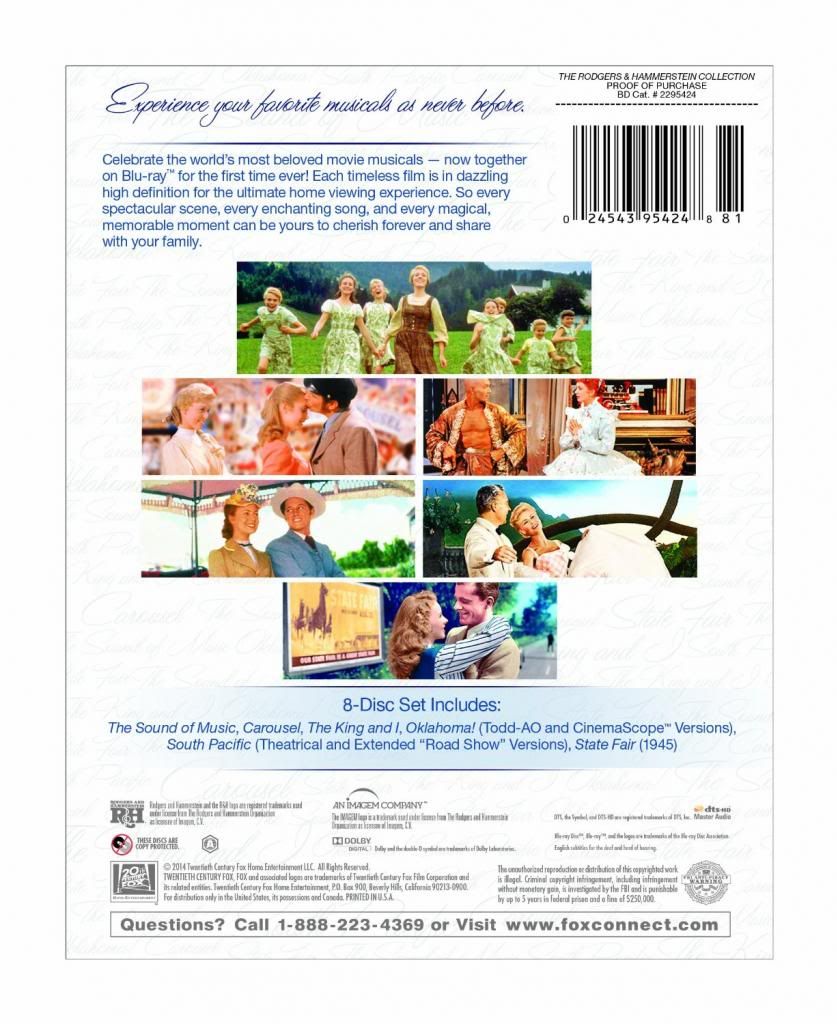
I'm horrified to hear about the King & I. I saw an HD presentation about a year ago, and it looked great! I certainly don't remember any blue tint.
The film itself tended toward browns and "sepia," but perhaps that was due to age, or maybe it was intentional. To "overcompensate" by giving it a blue tint is just wrong. I would love to see some frame grabs to check it out.
As for Oklahoma! that's great news. But King & I won Oscars for Art Direction and Costumes in a year that was filled with brilliant art direction and costume design. To see them with a good HD transfer would be dazzling. But not if everything is "blue." Ugh.
For those interested, The King and I won for Art Direction over ...
Around the World in 80 Days
Giant
Lust For Life
The Ten Commandments
ANY of those films could have been the winner. Talk about an amazing year for Art Direction!
For costumes, King & I won against ...
Around the World in 80 Days
Giant
Ten Commandments
War and Peace
Again ... incredible competition.
So I was really looking forward to this on BD. What's up with the blue???
By the way, this "blue craze," isn't new. Apparently William Friedkin was ostracized for tinting both The French Connection and The Exorcist masters for their Blu-ray releases. I've seen side-by-side frame comparisons, and they don't look at all like the original films! The blue filter fad is something that really started in the '90s and early 2000s.
Everything has that cold "Braveheart" tint to it. Great for some movies, but let's not be revisionists and decide that today's color timing is right for all past movies. It isn't, and they're wrong.
"Jaws is the Citizen Kane of movies."
blocked: logan2, Diamonds3, Hamilton22




.jpg?format=auto&width=300)