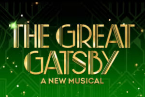
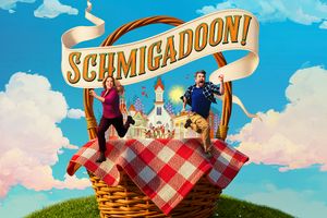
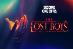
There are logos that work as art like the original Follies and the original Glengarry Glen Ross, a production that I did not like and yet have the poster framed as art on my wall.
Then there the one's that do their job of legibly telling you the title and other salient things like the actors. The best show logo in this vein to me is from Habeus Corpus by Alan Bennett which played the Beck in the mid 70s. Brick red letters on a large white circle with the same brick red as background. There was the name of the play plus about five actor's names, an author and a director that contractually had to appear. Every letter could be read from Broadway, over a long block away. Perfect.
Wicked for me, took to long to get what it was about.
I find the logo for the new Sweet Charity to be in a set of colors that makes me wish for sunglasses.
"If my life weren't funny, it would just be true. And that would be unacceptable."
--Carrie Fisher




.jpg?format=auto&width=300)
.jpg?format=auto&width=365)