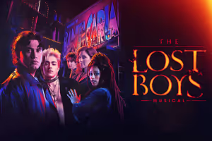
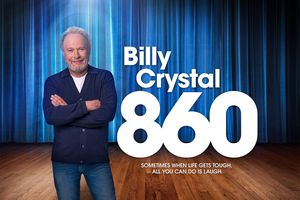
That's a fine idea, except for the part when everyone realizes that Godspell's poster was a tacky, lazy Photoshop-arama.

I'd like to see them get back to basics with the Hair poster. Revive some old trippy photography techniques a la the original, or at least do a proper digital imitation. Or do something hand-drawn, hand-painted, hand-collaged...whatever "look" could hearken back to the era of tribal, psychedelic art.
To go a step further, ditch the flower child look and emphasize the more gritty, militaristic aesthetic of the hippie era. This is something I think they should do with the production design as a whole--flowers and Indian fringe worked as dominant elements of an outdoor production, but the transfer to a dark, indoor proscenium should make more use of darker elements representative of the anti-war movement and of dirty New York, circa 1967.
For a Hair poster I designed as part of an art concentration, I did a "red, white, & blue" theme, riffing on traditional Americana the same way the show satirizes American history. They don't need to do that exactly, but I'd really like them to put some thought into rethinking the look of the show and the look of its ad campaign...too many people think Hair has to be advertised in cartoonish tie-dye colors, and that's not always the case. If this production is going to work indoors it needs to shed all associations with "nature hippies" and be strictly "city hippie".
"If there is going to be a restoration fee, there should also be a Renaissance fee, a Middle Ages fee and a Dark Ages fee. Someone must have men in the back room making up names, euphemisms for profit."
(Emanuel Azenberg)