PLAYBILL Covers of the 2014-2015 Season

Broadway Legend Joined: 2/11/14

Broadway Legend Joined: 2/11/14

Broadway Legend Joined: 2/11/14
Broadway Legend Joined: 2/11/14

Broadway Legend Joined: 2/11/14

Broadway Legend Joined: 2/11/14

Broadway Legend Joined: 2/11/14

Broadway Legend Joined: 2/11/14
PLAYBILL Covers of the 2014-2015 Season#82
Posted: 2/9/15 at 4:04pm
Looks like someone on Playbill was VERY busy this weekend!
It Shoulda Been You, An American In Paris, Finding Neverland, The King & I, Doctor Zhivago, Fun Home and Gigi are all above!
The Visit and Fun Home are my favorites - absolutely beautiful. Excited to see so much color!
Updated On: 2/9/15 at 04:04 PM
Broadway Legend Joined: 5/5/11
PLAYBILL Covers of the 2014-2015 Season#83
Posted: 2/9/15 at 6:18pmBased on twitter, Honeymoon also got a new playbill in B&W with their new logo but still with the gold back round and flying elvises.
Broadway Legend Joined: 5/2/13
PLAYBILL Covers of the 2014-2015 Season#84
Posted: 2/9/15 at 6:47pmThe GIGI playbill is pretty, but I couldn't help but LOL when I saw it.
PLAYBILL Covers of the 2014-2015 Season#85
Posted: 2/10/15 at 5:22amI would've preferred the Gigi playbill to be a drawing like in their old promos.
PLAYBILL Covers of the 2014-2015 Season#86
Posted: 2/10/15 at 5:48am
Of all the ones posted so far You Can't Take It With You is my favorite Playbill for the revivals and Finding Neverland wins hands down for the new works. Whoever designed those two did some excellent work. The King and I and An American in Paris are nice as well. I don't think it's impossible to put together a good image with photos but it doesn't seem to inspire a lot of creativity.
On the Twentieth Century's Playbill is quite a letdown. Couldn't they have at least slapped a train on it or something?


PLAYBILL Covers of the 2014-2015 Season#89
Posted: 3/3/15 at 3:19pm

I love this.
PLAYBILL Covers of the 2014-2015 Season#90
Posted: 3/3/15 at 3:28pmAre they changing the playbill design???^
Broadway Legend Joined: 10/3/14
PLAYBILL Covers of the 2014-2015 Season#91
Posted: 3/3/15 at 3:57pmI hope they are. Looks like the playbills of the 60s. Love it.
PLAYBILL Covers of the 2014-2015 Season#92
Posted: 3/3/15 at 11:46pm
I think the PLAYBILL format could use a redesign, and that looks amazing! I've always thought the white border was unnecessary and looked silly. As Fantod says it evokes the old designs nicely.
PLAYBILL Covers of the 2014-2015 Season#93
Posted: 3/4/15 at 1:25amBut if they were redesigning why wouldn't they be doing them all at once?

PLAYBILL Covers of the 2014-2015 Season#94
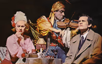
Posted: 3/4/15 at 1:29amI imagine the Playbill redesign is only for Skylight, since shows opening after it are not using the new design. I love the look of the Skylight Playbill. It's a great image, although I wouldn't want to see this style on all Playbills. It's an update of the look of the Playbill of the 1960s, which commonly had a black-and-white photo from the production and the title in white capital letters. The typeface used for the word "Skylight" here is the 1960s Playbill typeface, not the one used for the logo of the show.
PLAYBILL Covers of the 2014-2015 Season#95
Posted: 3/4/15 at 2:18am

An illustration for those unfamiliar with the old format.
Too bad it's a one-time thing, as it looks stunning.
Broadway Legend Joined: 10/3/14
PLAYBILL Covers of the 2014-2015 Season#96
Posted: 3/4/15 at 3:34amI forgot how a nice those old playbills look compared to ours today.

Broadway Legend Joined: 6/24/12


Broadway Legend Joined: 6/24/12
PLAYBILL Covers of the 2014-2015 Season#99
Posted: 3/12/15 at 3:02pm
"On the Town" is getting a new cover:

Videos