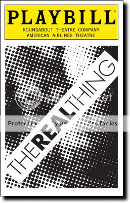
PLAYBILL Covers of the 2014-2015 Season
Broadway Star Joined: 11/2/13
PLAYBILL Covers of the 2014-2015 Season#26
Posted: 9/26/14 at 3:50pmLove that one!

Broadway Legend Joined: 2/11/14
PLAYBILL Covers of the 2014-2015 Season#27
Posted: 9/26/14 at 4:35pmDifferent for Roundabout, I love it!
PLAYBILL Covers of the 2014-2015 Season#28
Posted: 9/26/14 at 11:07pm

As of October, You Can't Take It With You will be in black and white.
Broadway Star Joined: 11/2/13
PLAYBILL Covers of the 2014-2015 Season#29
Posted: 9/26/14 at 11:13pmWow, even before they open they are switching to b&w; grosses can't be THAT bad!

Broadway Legend Joined: 6/24/12
PLAYBILL Covers of the 2014-2015 Season#30
Posted: 9/26/14 at 11:25pmAww that's disappointing... I love the color artwork!!
Broadway Legend Joined: 2/11/14
PLAYBILL Covers of the 2014-2015 Season#31
Posted: 9/26/14 at 11:42pmI'm a fan of color covers, but YCTIWY's B&W cover is one of the nicer ones :)
Broadway Star Joined: 11/2/13
PLAYBILL Covers of the 2014-2015 Season#32
Posted: 9/27/14 at 12:59amI disagree. I think that it would look a lot nicer with a higher contrast so everything doesn't mash together.

PLAYBILL Covers of the 2014-2015 Season#33
Posted: 9/28/14 at 11:03am
Wow, even before they open they are switching to b&w; grosses can't be THAT bad!
They open tonight. Still in September. They are switching to a black and white cover after they open, which is normal. With the exceptions of IT'S ONLY A PLAY and LADY DAY, it was the highest grossing straight play last week. Especially considering that a portion of the house is reserved for Roundabout subscribers, they are doing fine.
Everything in life is only for now. ~ Avenue Q
There is no future, there is no past. I live this moment as my last. ~ Rent

Broadway Legend Joined: 9/26/05
PLAYBILL Covers of the 2014-2015 Season#34
Posted: 10/8/14 at 4:46pm

Broadway Star Joined: 7/28/13
PLAYBILL Covers of the 2014-2015 Season#35
Posted: 10/8/14 at 4:52pm
^^^^ Really cool. Hopefully it will stay in color.
I think it's interesting that they aren't really making Hugh Jackman prominent in the promotional artwork. Obviously they could and nothing would be wrong with that, but it's cool that the producers and Jackman are focusing on the play. It's already been mentioned on the board, but I really admire Hugh for doing this new work in an intimate setting instead of a big, flashy musical/concert engagement.
Updated On: 10/8/14 at 04:52 PM

Broadway Legend Joined: 6/24/12
PLAYBILL Covers of the 2014-2015 Season#38
Posted: 10/10/14 at 12:25amI really like the artwork for the Elephant Man... minus the eyeball. But I kind of have this thing about not liking eyes, so maybe that is why.
Broadway Legend Joined: 10/3/14
PLAYBILL Covers of the 2014-2015 Season#39
Posted: 10/10/14 at 12:53amYeah, the eyeball is super creepy and not in a good way.
Understudy Joined: 10/5/12

Broadway Legend Joined: 6/24/12
PLAYBILL Covers of the 2014-2015 Season#41
Posted: 10/17/14 at 8:42pm
Well, it looks like the Elephant Man has new cover art... I kind of liked the old colors better with the elephants. Did they have to keep the creepy eye?!

PLAYBILL Covers of the 2014-2015 Season#42
Posted: 10/17/14 at 8:49pmI wonder why they changed it? I too liked the other one better, it seemed more like an authentic poster of the period and subject matter.
PLAYBILL Covers of the 2014-2015 Season#43
Posted: 10/17/14 at 10:58pm

November 2014, "On The Town".
Broadway Legend Joined: 10/3/14
PLAYBILL Covers of the 2014-2015 Season#44
Posted: 10/17/14 at 11:15pmThat Honeymoon in Vegas Playbill is the tackiest thing I have ever seen.
Broadway Legend Joined: 6/24/12
PLAYBILL Covers of the 2014-2015 Season#45
Posted: 10/18/14 at 12:38am
I would like the Honeymoon in Vegas one much better if it didn't have the parachuting added to it. I liked the Papermill Playhouse artwork: 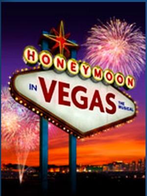
Broadway Legend Joined: 10/3/14
PLAYBILL Covers of the 2014-2015 Season#46
Posted: 10/18/14 at 12:44amAgreed. The gold background is tacky enough even without those ridiculous parachuters. The whole show just looks terrible.
PLAYBILL Covers of the 2014-2015 Season#47
Posted: 10/18/14 at 12:48amOh my gosh, I didn't even notice the parachuters at first glance! Truly awful.
PLAYBILL Covers of the 2014-2015 Season#48
Posted: 10/25/14 at 12:59pm
There's a playbill for The Illusionists out there, but I'm having trouble uploading it!
Updated On: 10/25/14 at 12:59 PM

Videos