

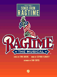
Ragtime Logo
Julian2
Broadway Legend Joined: 8/10/06
#0Ragtime Logo
Posted: 9/18/06 at 4:15pmOk, has anyone else noticed how in the Ragtime Logo, the flag completely covers up Lady Liberty's face? For some reason this bothers me.
C is for Company
Broadway Legend Joined: 7/16/05
#1re: Ragtime Logo
Posted: 9/18/06 at 4:28pmThere probably isn't an explanation to that but maybe making it seem like anyone coming here, any face in the crowd is entitled to liberty. Without putting a face to liberty it entitles all to it who come here seeking it, yet in the show this isn't the case. But still, I don't know maybe throwing out some fun guesses to something there probably is no answer to.

.JPG)

#3re: Ragtime Logo
Posted: 9/18/06 at 4:33pm
The OTHER logo is identical, but has only Liberty's arm - nothing else.
Personally, I think the headless Liberty logo is hideous. I have always thought the RAGTIME letters were hideous.


#6re: Ragtime Logo
Posted: 9/18/06 at 5:11pmI like London's picture - but not their lettering.
#7re: Ragtime Logo
Posted: 9/18/06 at 5:18pmLondon's picture is so generic, though. It says basically nothing about the show.

JohnBoy2
Broadway Legend Joined: 3/21/06
#8re: Ragtime Logo
Posted: 9/18/06 at 5:22pmI like the lettering of the original production, and hate both the lettering and the photo, of the London production. Since we're weighing in.

#9re: Ragtime Logo
Posted: 9/18/06 at 5:23pmFor some reason, I've always LOVED the RAGTIME lettering.

#10re: Ragtime Logo
Posted: 9/18/06 at 5:49pm
I think the London one makes no sense.
The Broadway one is fine.
timote316
Broadway Legend Joined: 7/20/04
#11re: Ragtime Logo
Posted: 9/18/06 at 5:51pmSame here, TBone. I actually think logo with only the arm is my favorite show logo.
Julian2
Broadway Legend Joined: 8/10/06
#12re: Ragtime Logo
Posted: 9/18/06 at 6:02pm
I like the Broadway Logo just fine, I've just always found the lack of head (found in certain renditions) really really weird looking.
See here, ye non beleivers . . .


I like them one with the flag wrapped around the arm much better. I also think the lettering looks fine, but better w/ pic than by itself.
And ya, the London one is terrible . . .

#13re: Ragtime Logo
Posted: 9/18/06 at 6:03pmI like the lettering, but not the logo. I considered looking for the windowcard once, but it's not really that pretty.
Wanting life but never knowing how
SDav 10495
Broadway Star Joined: 7/21/06
#14re: Ragtime Logo
Posted: 9/18/06 at 6:20pm
Having seen the OBC of Ragtime when I was younger, I've always thought the logo was wonderful and iconic (lettering included, in case that matters)...but I'm so glad I'm not the only one who was bothered by "headless Liberty". When the show first opened me that drove me nuts--you don't know how many hours I spent trying to catch glimpses of the poster on the set of the Rosie O'Donnell show, wondering if the head was just covered by the flag or if it had been taken out completely. I laughed when I first saw this thread because it's the first time I've ever heard anyone else express the same sentiment, and it's the first time I thought about headless Liberty in years.
You will just never ever know how insane that made me.
Julian2
Broadway Legend Joined: 8/10/06
#15re: Ragtime Logo
Posted: 9/18/06 at 6:53pm
YES! It is so lovely to find compatriots in where the h*** is that stupid head?!
RentBoy86
Broadway Legend Joined: 2/15/05
#16re: Ragtime Logo
Posted: 9/18/06 at 7:03pmIf you go to the marquee thread there's a picture of the London marquee for the show and it looks horrible - how'd the show do in the West End? I would imagine it was a flop.
bwaylvsong
Broadway Legend Joined: 7/28/05
#17re: Ragtime Logo
Posted: 9/18/06 at 7:30pmI'm in rehearsals for Ragtime now, and will try to post our logo when we get it, though that probably won't be till late November.
Jon
Broadway Legend Joined: 2/20/04
#18re: Ragtime Logo
Posted: 9/18/06 at 7:44pm

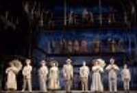
Ever notice the similarity to RAGS? The RAGTIME concept CD even had the same silhouettes of all the people on the back - which ended up being used as a staging element inthe original production.
Updated On: 9/18/06 at 07:44 PM
#19re: Ragtime Logo
Posted: 9/18/06 at 7:49pmI've noticed that before too, but never really felt like mentioning it since it's so obvious. I didn't want to get flamed.
Julian2
Broadway Legend Joined: 8/10/06
#20re: Ragtime Logo
Posted: 9/19/06 at 12:36amBuMp
mejusthavingfun
Broadway Legend Joined: 4/12/06
#21re: Ragtime Logo
Posted: 9/19/06 at 1:03amI hope they change it all when it gets revived. That entire font and design is hideous.

#22re: Ragtime Logo
Posted: 9/19/06 at 1:42amI think several piano keys would be a good logo. The white keys would alternate red and white and the black keys could be blue instead with two stars on each of them. The Ragtime text could overlay it as is, but I'd get rid of the statue of liberty.

#23re: Ragtime Logo
Posted: 9/19/06 at 5:40am
I agree the initial London design is pretty hideous. After it opened they produced a new poster with a deep purple smokey background, the same lettering in the middle and production shots around the outside. The show still closed after three months though... ![]()
I quite liked the original Broadway design.

#24re: Ragtime Logo
Posted: 9/19/06 at 10:51amfunny, I've never even given it a second thought. it has never bothered me. and the font is perfect, IMO.
Videos