

From the unintentionally inappropriate logo collection

#1From the unintentionally inappropriate logo collection
Posted: 9/22/10 at 3:01pm
And they even have a Wicked cool name!
Gravity Defyer

NYadgal
Broadway Legend Joined: 5/18/04
#2From the unintentionally inappropriate logo collection
Posted: 9/22/10 at 3:07pmAwesome.
NYadgal
Broadway Legend Joined: 5/18/04
#2From the unintentionally inappropriate logo collection
Posted: 9/22/10 at 3:08pm
This remains a favorite.
What WERE they thinking?
Bluemoon
Broadway Legend Joined: 12/28/04
#3From the unintentionally inappropriate logo collection
Posted: 9/22/10 at 3:08pmSo how many pairs did you order?
Unknown User
Joined: 12/31/69
#4From the unintentionally inappropriate logo collection
Posted: 9/22/10 at 3:13pmIs that logo because those shoes are so awesome you spooge when you see them?
#5From the unintentionally inappropriate logo collection
Posted: 9/22/10 at 3:14pmOne for each day of the week. Except Sunday. I wear sandals and socks on Sunday.

#6From the unintentionally inappropriate logo collection
Posted: 9/22/10 at 3:17pmAddy, we know what they were thinking. The question is why were they thinking it?
#7From the unintentionally inappropriate logo collection
Posted: 9/22/10 at 3:18pm


#8From the unintentionally inappropriate logo collection
Posted: 9/22/10 at 3:22pm

NYadgal
Broadway Legend Joined: 5/18/04
#9From the unintentionally inappropriate logo collection
Posted: 9/22/10 at 3:24pm
![]()
#10From the unintentionally inappropriate logo collection
Posted: 9/22/10 at 3:25pmOh. My. God.
NYadgal
Broadway Legend Joined: 5/18/04
#11From the unintentionally inappropriate logo collection
Posted: 9/22/10 at 3:26pm

They needed better spacing...
NYadgal
Broadway Legend Joined: 5/18/04
#12From the unintentionally inappropriate logo collection
Posted: 9/22/10 at 3:28pm

NYadgal
Broadway Legend Joined: 5/18/04
#13From the unintentionally inappropriate logo collection
Posted: 9/22/10 at 3:29pm
![]()
Unknown User
Joined: 12/31/69
#14From the unintentionally inappropriate logo collection
Posted: 9/22/10 at 3:30pmThe Arlington Pediatric Center stole that logo from New Birth Missionary Baptist Church!!
NYadgal
Broadway Legend Joined: 5/18/04
#15From the unintentionally inappropriate logo collection
Posted: 9/22/10 at 3:31pm

Again, the value of spacing...
Jon
Broadway Legend Joined: 2/20/04
#16From the unintentionally inappropriate logo collection
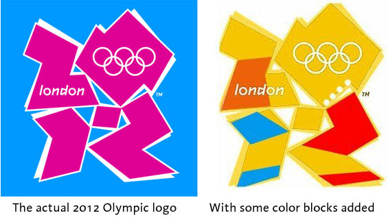
Posted: 9/23/10 at 11:23amI'm sorry - the London Olympics logo has me baffled. What dirty image am I supposed to be seeing?
#17From the unintentionally inappropriate logo collection
Posted: 9/23/10 at 11:38am
^^^
Lisa Simpson on her knees (right) giving head to Bart.
ETA: Not exactly dirty, but I dislike the new Pepsi logo:

Vita, dulcedo, et spes nostra
Salve, Salve Regina
Ad te clamamus exsules filii Eva
Ad te suspiramus, gementes et flentes
O clemens O pia
AEA AGMA SM
Broadway Legend Joined: 8/13/09
#18From the unintentionally inappropriate logo collection
Posted: 9/23/10 at 3:28pmI think the London Olympics is a bit of a stretch in the "what were they thinking" line, considering you have to do a heavy modification to it and even then, as Jon demonstrates, it's still not blatantly obvious what dirty/wrong thing we are supposed to be seeing.
#19From the unintentionally inappropriate logo collection
Posted: 9/23/10 at 3:47pm
The problem with the Olympics logo is that it's not obvious at first, but once it's seen, it can't be unseen. I haven't been able to not see Lisa Simpson giving head ever since someone first pointed it out. And this is the first time I've seen the colour mod, for the record. D:
Updated On: 9/23/10 at 03:47 PM
EVIE
Broadway Legend Joined: 7/12/04
#20From the unintentionally inappropriate logo collection
Posted: 9/23/10 at 3:56pmThanks for clearing up the Olympics logo cos I didn't see anything at first either.
ALittleNorthofKansas
Broadway Legend Joined: 6/28/04
#21From the unintentionally inappropriate logo collection
Posted: 9/24/10 at 11:42am
I must admit even with the cue I had to stretch to see the Simpson's figures, but yes I guess it is there.
All this time I just thought it was ucking fugly!
#22From the unintentionally inappropriate logo collection
Posted: 9/24/10 at 12:31pmYeesh, I bet y'all sucked at Magic Eye, too.
Vita, dulcedo, et spes nostra
Salve, Salve Regina
Ad te clamamus exsules filii Eva
Ad te suspiramus, gementes et flentes
O clemens O pia
#23From the unintentionally inappropriate logo collection
Posted: 9/24/10 at 12:34pmIn the pink and blue version, I see the guy on the right giving it up the arse to the guy on the left.
NYadgal
Broadway Legend Joined: 5/18/04
#24From the unintentionally inappropriate logo collection
Posted: 9/24/10 at 12:42pm
...I hadn't seen that image before! Sheesh, another thing I won't be able to avoid when I look at the logo again.
What a disaster that logo is.
Did you know that it's supposed to represent the numbers 2012? I had to really search to see THAT!
Videos