Shop Merch Add a Show Listing
My Shows
News on your favorite shows, specials & more!
#1

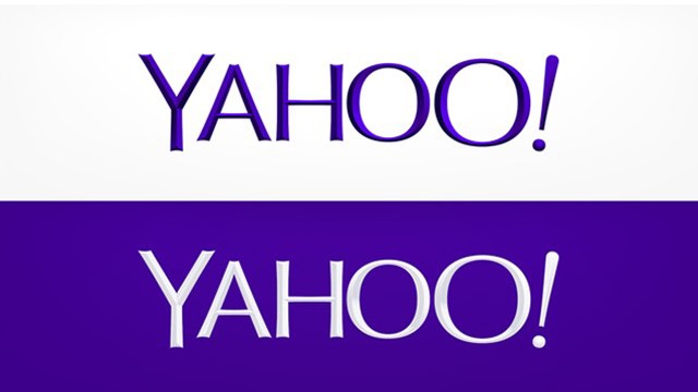
YAHOO! reveals its new logo

Seriously? This is what they came up with as an answer to a massive image makeover and rebranding? Millions of dollars to be spent ... on this?

It looks like it was designed using WordPerfect.

YAHOO! reveals its new logo

EDIT: The first thing I think about when I see something like this is "too many cooks."

WAY too many cooks. They probably hand hundreds of meetings with research and survey reports and a long chain of executive approvals to come up with something so under-designed and ordinary as this.
"Jaws is the Citizen Kane of movies."
blocked: logan2, Diamonds3, Hamilton22

Updated On: 9/5/13 at 06:51 AM

#2

YAHOO! reveals its new logo

Do you have any idea just how much they paid for an Imaging firm to come up with this? I am sitting here LMAO!

Those Blocked: SueStorm. N2N Nate. Good riddence to stupid! Rad-Z, shill begone!
#3

YAHOO! reveals its new logo

I guarantee you they threw out dozens, perhaps hundreds of better ideas. I've been in on corporate rebrands and logo redesigns for the film and TV industry, so I know the process well. No design company worth their salt would have offered this as an option up front. They would have been dialed back, reined in, and had to resubmit to devolve it to this point.

This logo is completely devoid of character, personality, originality, or uniqueness. It's an incredibly safe choice.

When your company is in trouble and you decide to do a huge makeover, "safe" and "ordinary" aren't things you should aspire to if you're looking to be noticed and stand out (again).

WAY too many cooks weighing in on this one. It's so apparent.
"Jaws is the Citizen Kane of movies."
blocked: logan2, Diamonds3, Hamilton22

Updated On: 9/5/13 at 07:21 AM

#7

YAHOO! reveals its new logo

Somehow, when they did the 30 days of alternate logos, I thought it would lead up to a new logo that was clearly better than the other ones. But it's not. There's nothing distinctive about this logo. I actually like many of the old ones more, particularly the very first one.

The new logo is really bland and not very "friendly"-looking.

The Yahoo logo page says, "We wanted a logo that stayed true to our roots (whimsical, purple, with an exclamation point) yet embraced the evolution of our products." This new logo isn't whimsical at all. And I don't understand the second half of the sentence ("embraced the evolution of our products"). What does that even mean? It's all corporate double-talk.


"What was the name of that cheese that I like?" "you can't run away forever...but there's nothing wrong with getting a good head start" "well I hope and I pray, that maybe someday, you'll walk in the room with my heart"

Updated On: 9/5/13 at 08:25 AM

#10

YAHOO! reveals its new logo

They were using a new logo each day for 30 days, promising to choose one at the end.

Some of them were cool, some tacky, some ugly, some perfect.

And the one they went with looks like the old logo only even more boring.
....but the world goes 'round
#11

YAHOO! reveals its new logo

^ I was just going to say, what is so new about this logo? It looks very much like the old.
"I don't want the pretty lights to come and get me."-Homecoming 2005 "You can't pray away the gay."-Callie Torres on Grey's Anatomy. Ignored Users: suestorm, N2N Nate., Owen22, master bates
#12

YAHOO! reveals its new logo

^ Progress!

I love the visual message:

"We're pretty much like we were before, only more boring now."
"Jaws is the Citizen Kane of movies."
blocked: logan2, Diamonds3, Hamilton22
#13

YAHOO! reveals its new logo

it looks like a 1st grader can up with that logo. seriously boring and cheap.
A Chorus Line revival played its final Broadway performance on August 17, 2008. The tour played its final performance on August 21, 2011. A new non-equity tour started in October 2012 played its final performance on March 23, 2013. Another non-equity tour launched on January 20, 2018. The tour ended its US run in Kansas City and then toured throughout Japan August & September 2018.
#14

YAHOO! reveals its new logo

Really? All those days of different logos, and they thought that was the best choice?
#15

YAHOO! reveals its new logo

I've been having trouble with my Yahoo! email today and yesterday--pages timing out or emails not displaying. Perhaps this is what they mean by "the evolution of our product."
Coach Bob knew it all along: you've got to get obsessed and stay obsessed. You have to keep passing the open windows. (John Irving, The Hotel New Hampshire)
#16

YAHOO! reveals its new logo

And I was just hacked this morning. Everyone in my address book got an email saying I was traveling abroad and there was a hotel fire and I lost everything and needed money.


Thanks Yahoo!!!
"TheatreDiva90016 - another good reason to frequent these boards less."<<>> “I hesitate to give this line of discussion the validation it so desperately craves by perpetuating it, but the light from logic is getting further and further away with your every successive post.” <<>> -whatever2
#17

YAHOO! reveals its new logo

SH*T Diva, that wasn't you?

Well then who the hell did I send that replacement Stryker dildo to?!
....but the world goes 'round
#18

YAHOO! reveals its new logo

Let me know if it worked, Diva.
"What can you expect from a bunch of seitan worshippers?" - Reginald Tresilian
#19

YAHOO! reveals its new logo

I've always found corporate identity design to be really interesting; the daily logo page is great. I'm not sure that they didn't select the best of the options shown.

I'm not convinced that graphic design is Yahoo's biggest problem. Amazon's logo is as ugly and stale as they come--it doesn't keep me from using the site on a daily basis.

I'd say the folks at Yahoo should be spending as much--or more--time and money coming up with compelling reasons for me to remember that Yahoo.com still exists.

What is the point of Yahoo? Is it just a collection of web-based services? I used to use babelfish.com for language translation. At some point it turned into babelfish/yahoo or something like that, and shortly after that it stopped being easy to use.

As far as I'm concerned, Yahoo is a vestigial remnant of the early days of the Internet, and a new logo isn't going to change that.

I couldn't get the link to the daily logo page to work, so I'm re-posting it here.


Yahoo daily logo
You think, what do you want? You think, make a decision...

Updated On: 9/5/13 at 06:28 PM

#20

YAHOO! reveals its new logo

Well, if we had to pick from that bunch, I like Day 10 the best (of that bunch). At least it feels more "deliberately active" and less "boringly balanced."

I'm not even sure what I mean by that ... but yeah, that's what I mean by that.

YAHOO! reveals its new logo
"Jaws is the Citizen Kane of movies."
blocked: logan2, Diamonds3, Hamilton22
#21

YAHOO! reveals its new logo

YAHOO! reveals its new logo

Yeah Bestie, that one is the best of the lot.

I know why they didn't pick this one though, no one under a certain age can read cursive.

#22

YAHOO! reveals its new logo

Hmmm... Saddled as they are with a corporate name that is, basically, a redneck cri de coeur, I'm not sure that there's any benefit in a logo that emphasizes the redneck enunciation---"ya-HOOO"--as the shift between the 'A' and 'H' does in day 10.
You think, what do you want? You think, make a decision...
#23

YAHOO! reveals its new logo

Apparently, Yahoo is having a major melt down right now.

My inbox says I've received new mails. When I click on my mail box, I see the emails for a second and then they all dissapear and I get a message saying I have no emails.

Here's what their operator, Manish says:

Manish: There is a yahoo event going on. you will be able to login to att.com/olam but not in emails account.

Manish: There is an ongoing outage, and our network engineers are working on it.

Manish: It will be resolved within some time.


"TheatreDiva90016 - another good reason to frequent these boards less."<<>> “I hesitate to give this line of discussion the validation it so desperately craves by perpetuating it, but the light from logic is getting further and further away with your every successive post.” <<>> -whatever2
#24

YAHOO! reveals its new logo

I'm not sure that there's any benefit in a logo that emphasizes the redneck enunciation---"ya-HOOO"--as the shift between the 'A' and 'H' does in day 10.

That's why I like it. It reminded me of their "jingle" (if you can call it that). It had personality and was memorable.

But yes, they embraced their "inner redneck" years ago with that music stinger. I think this logo goes nicely with it.

And come to think of it, I'm not sure there's a different way to shout that word that makes sense. You might call someone a YA-hoo, but you wouldn't shout it (exclamation point) that way.

It's part of who they are. Otherwise, the name of their company should change.
"Jaws is the Citizen Kane of movies."
blocked: logan2, Diamonds3, Hamilton22
#25

YAHOO! reveals its new logo

Yes, either steer into the skid with "ya-hooo!" or entirely away from it with the cursive one, which I shockingly liked.
Anything other than the thing they came up with, which... I thought they had just gone back to the original in a different color, and I don't think they wanted that.
I stand corrected, you are as vapid as they say.

BroadwayWorld TV


Ticket Central
Hot Show
Tickets From $58
Hot Show
Tickets From $71
Hot Show
Tickets From $71
Hot Show
Tickets From $71