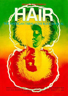
Hmm...well I will say I think Amy Guip's style is appropriate for this production. I would have liked a "darker" angle, but the bright colors are rather attractive in hard times. (I hate how people analyze everything through the lens of the economic crisis these days, but that was the first thought that struck me.)
Still though, that typeface...having studied a lot of typefaces as kind of a nerdy pastime, it bothers me that this one doesn't look like anything from 1968. Too angular, as I said before. The concept is appropriate--big bold capital letters aligned in blocks--but the typeface itself looks all wrong. Like if they had to advertise using only that title, which they will have to on some materials, it would give you the wrong idea about the show.
But I'm glad they have a design, and I can't wait to see the show. (Cast member is the awesome Allison Case, by the way.)
"If there is going to be a restoration fee, there should also be a Renaissance fee, a Middle Ages fee and a Dark Ages fee. Someone must have men in the back room making up names, euphemisms for profit."
(Emanuel Azenberg)
Updated On: 11/20/08 at 02:04 PM