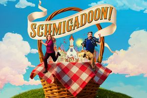
I have no desire to embarrass you, especially publicly, but here are my comments as a professional designer/marketing director:
There is nothing original about the arrows you have used for the title of the show - they were used on the book cover that was printed at the time of the movie's release as well as in promotional materials for the film.
As has been mentioned, the Nederlander logo is too large and is placed in an awkward position.
The font used for "Catch it" - a good tag line - doesn't work with the font used for the title of the show, and it is virtually the same size. I don't know where to look, so as a consumer I will be confused - what is the name of the show? Where is it playing? What the hell is that big N thing? What is this about?
It basically tells me nothing, nor does it intrigue me enough to find out.
Whatever you may think of the LA CAGE... logo, it is all of a piece and works as a strong branding image for the production.
That said, you do seem to have a flair for graphic design but you have a lot to learn, especially about informational hierarchy and typography.
I would suggest you take a few courses geared for HS students. Check out F.I.T's "Saturday Live" program. You might discover something about your own talents, and have some fun as well.
Cheyenne Jackson tickled me. AFTER ordering SoMMS a drink but NOT tickling him, and hanging out with Girly in his dressing room (where he DIDN'T tickle her) but BEFORE we got married. To others. And then he tweeted Boobs. He also tweeted he's good friends with some chick on "The Voice" who just happens to be good friends with Tink's ex. And I'm still married. Oh, and this just in: "Pettiness, spite, malice ....Such ugly emotions... So sad." - After Eight, talking about MEEEEEEEE!!! I'm so honored! :-)