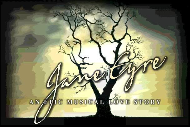
As if it were a Tony Award catagory...
Personally, I like the logo for Aida.
Updated On: 7/2/06 at 07:51 PM
Stand-by Joined: 6/20/06
i kinda like wickeds.. b4 dorothy dropped in one.....but i dont relly know many more...
Wicked's logo has the ability to capture an audience of all ages by using that one word.
As corny as it was, I liked Little Women's.
"Generations have read the book; this one will sing it!"
Not to be rude but.. those are slogans. Not logos.
Broadway Legend Joined: 5/15/03
HOW NOW DOW JONES
Sheer brilliance!
Even though you were talking about Wicked's slogan, ActingAndy, I will say that it has a good logo too. The green and white contrast is very striking.
Broadway Legend Joined: 1/3/05
Miss Saigon- with the face and the helicopter
Broadway Legend Joined: 12/31/69
Follies, which will open next year's Encores! season.
Broadway Legend Joined: 9/12/04
I think the CATS logo is one of the best I've ever seen. Yellow eyes of a black cat with human figures as pupils of the eyes. Simple and effective at the same time.
Broadway Legend Joined: 7/22/03
ASPECTS OF LOVE, MISS SAIGON and WICKED are all clever and catchy. DIRTY ROTTEN SCOUNDRELS, SPAMALOT and AIDA are all gorgeous... INTO THE WOODS rocks, too.
Chorus Member Joined: 2/19/06
Both the original and the revival "Follies" poster logos were brilliant, but I think I prefer the second one too.
i love wickeds it works so well,i also love rents logo and the uk fame logo is fantastic
Carrie, Side Show, Woman In White, Saigon, Les Miz are 5 of my favorite logos!
WHY this perfect logo has been since changed to that dreadful, cartoonish artwork is beyond me.
Updated On: 7/2/06 at 01:40 PM
The second Follies looks like it's a science fiction movie to me.
I will always love the Carrie logo. Brilliant.
The Rent logo perfectly captures the way of life for theese people(artists etc).I like it
lol
And yes i also love the carrie logo.A classy logo for a not very classy show hehe
Updated On: 7/2/06 at 01:43 PM
Broadway Legend Joined: 9/29/04
I love Little Shop's logo. It's certainly not creative, but it just fits the show so well.
"WHY this perfect logo has been since changed to that dreadful, cartoonish artwork is beyond me. "
I agree, the other one is atrocious.
Broadway Legend Joined: 11/2/05
Not a musical, but this is my favorite.
I don't care for the CARRIE logo. The EVITA logo is a classic, but I wish they had created a different one for the revival. I also like THE LION KING, BEAUTY AND THE BEAST, and SUNSET BOULEVARD.
I like how the Evita logo was re-imagined with colors more evocative of Latin America for the new London revival...not a new logo, but still creative I think.
A lot of the logos of the big '80s mega-musicals were brilliantly done because of the power they have--Phantom, Les Mis, Cats, Miss Saigon--but I think that's more from a marketing standpoint. I really like them all, but I don't know if I'd call them creative.
I think I might have to agree, the original Rent logo (in fact the entire look of the original marketing campaign) was really well done. It's especially apparent when you look at the Rent Bible--it doesn't count as a logo really, but they got the "look" down perfectly and were very creative in how they presented the show. I don't mind the new pink-brown-blue campaign, but it's definitely missing something that was there in the original.
Broadway Legend Joined: 9/4/05
Very creative
Videos