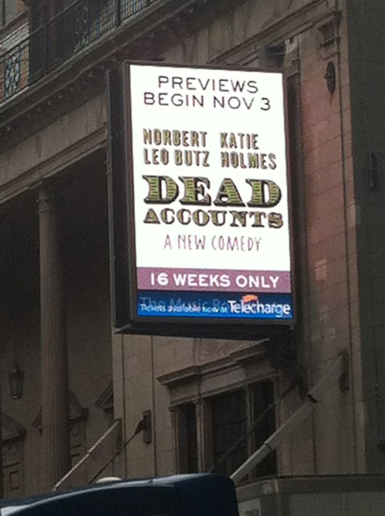
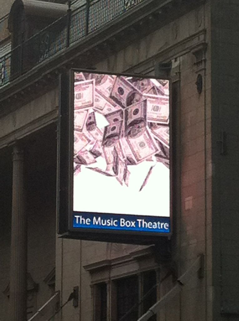
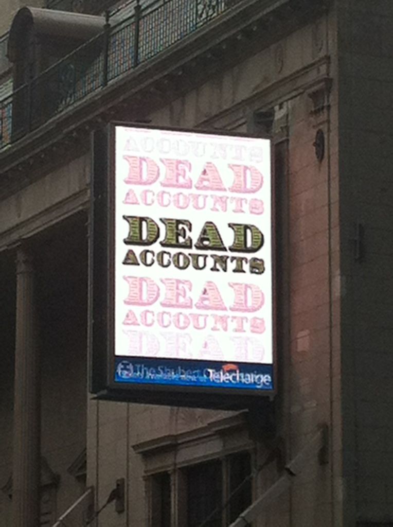
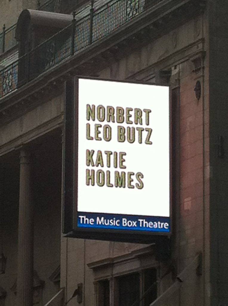
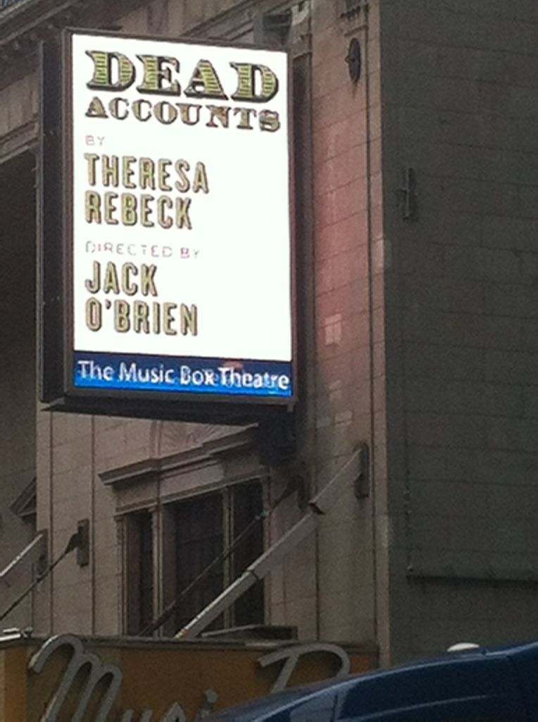
Not unless they start distributing Playbills on tablet computers.
What they really should have done is left the marquee itself alone and used that big empty wall for the LED, where they usually just put the larger size ad for the same show.
I was able to take some better pictures today. The marquee is now changing like Poppins Marquee. There are 2 supports ontop of the marquee where hopefully the Music box logo will return
Updated On: 10/3/12 at 02:25 PM
These will look dreadful on the TONY telecasts. They'll have to keep running the opening credits of THAT GIRL to generate any excitement.
Christ that LED looks awful. Just a total washout. There goes every little kid's picture memories of Broadway.
Broadway Legend Joined: 11/8/11
^ its more so the fact the poster can't take a photo for his freaking life, I've snapped plenty of good ones
Broadway Legend Joined: 3/4/04
I'm with broadwayguy2; it's really the loss of the theatre logo that hurts. Marquee art in LED format as opposed to paper isn't a terrible thing.
Play it again- All the photos have been taken on my IPhone on my way to work. I find it photographs better on my digital camera but in the evening the iPhone can only register a big ball of light. These last pictures I wasn't trying to capture the shows artwork itself,as I'd had in previous posts, but capturing the return of the Music Box logo ontop of the marquee
Your pictures have been great TheaterBoy7777, but even the best pictures look like you're taking a picture of a television. The loss of clear, vivid color and print is evident. But to be fair, it could be just this is a bad example with all the white being used - the Mary Poppins generally looks okay - but it just doesn't feel right somehow.
PS Thank you updating with the Music Box logo back where it should be!
That is hideous and will look awesome when it glitches the **** out and you're left with no marquee for a while. It's not even like the theatre pays to have the marquee changed so why bother?
Videos