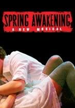
I like the Victorian quality of the old one--the original logo is actually what made me interested in finding out what the show was about, and when I found out I was
really excited--but I see why the sexuality of the new one better serves the show.
I'm gonna go out on a pervert limb here and say that I think the perfect balance between the two would be showing more of the Victorian girl in the old logo (she's clearly naked), kind of like it's creepy Victorian porn. That would at least allow the logo to keep some of the character that I think the new one lacks.
"If there is going to be a restoration fee, there should also be a Renaissance fee, a Middle Ages fee and a Dark Ages fee. Someone must have men in the back room making up names, euphemisms for profit."
(Emanuel Azenberg)




.jpg?format=auto&width=300)





