what's YOUR favorite SHOW LOGO/ARTWORK?
Posted: 7/27/08 at 7:13pm
Posted: 7/27/08 at 7:32pm
I like the Les Miserables logo. I love the blue/white/red coloring to match it along with the colors of the French flag. I think a lot of people don't know it is Cosette either, and the look of the picture adds to the somber tone present in much of the show, yet is very engaging.
Updated On: 7/27/08 at 07:32 PM
Posted: 7/27/08 at 8:21pm
See, it's dark. It's disturbing. It's beautiful. It's half boy, half horse. Half religious, half sexual. You couldn't have a more perfectly descriptive poster for the play if you just wrote a synopsis on a big sheet of paper. And that wouldn't be anywhere NEAR as pretty.
Updated On: 7/27/08 at 08:21 PM
Posted: 7/27/08 at 8:31pm
one of my favorites is...
Posted: 7/27/08 at 8:46pm
Posted: 7/27/08 at 9:34pm
Posted: 7/27/08 at 10:18pm

Woman in White!
I think it's absolutely perfect. The image almost represents the digital projections they used...it also shows the title character over her "secret" in the musical over Blackwater lake!/near Limmeredge House if you see the B'way logo!
Posted: 7/28/08 at 12:17am

Miss Saigon and Pacific Overtures.
"After silence, that which comes nearest to expressing the inexpressible is music." Aldous Huxley
Posted: 7/28/08 at 12:29am

However bad it was, I have to admit that The Pirate Queen logo is amazing.
It was awesome. - theaterkid1015
Posted: 7/28/08 at 12:48am
What I like about them is that you can just show either of them and people would know what show is being advertised.
And, as for people not knowing that the Les Miserables logo is in fact a picture of cosette. I remember walking in Shubert Alley during the time of the revival. There was a Les Miserables poster there and there was a mother and her daughters talking about who it was in that picture and they were trying to figure it out. One of their guesses was that it was Eponine.
Posted: 7/28/08 at 1:11am
Really cool and pretty
Posted: 7/28/08 at 12:31pm
Not my favorite of all time, but one I haven't posted in any of the older threads that deserves a mention.
Updated On: 7/28/08 at 12:31 PM
Posted: 7/28/08 at 3:37pm

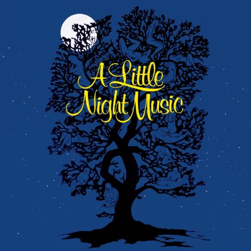
I LOVE the Witches of Eastwick Logo!
Explains how the show contains love thorugh the love heart, and the added twist to the story is shown as well though the devil tail and the flames. Also the use of red to signify passion, lust and the devil. Very cleverly designed and what I think is very a beautiful logo. Also I love the Sweet Charity 2005 logo too, very retro! LOL!
Updated On: 7/28/08 at 03:37 PM
Posted: 7/28/08 at 4:25pm
Posted: 7/28/08 at 5:33pm
CapwTwirl, when I went to get my ALNM windowcard framed, I made an offhand comment to my mother about "I hope they don't get weirded out by the naked people..." to which she replied "...naked people?" I love how it makes people do a double-take.
BroadwayWorld TV

