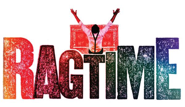
Joined: 12/31/69
well.... we have been told this production will be scaled down from the original, no?
I'm sure they'll redesign the logo before the show opens on Broadway.
For what it's worth, I don't think there's ever been a major production of Ragtime with good logo design. I hate the OBC art and don't think that it represents the show all that well, and the London art was vaguely pretty but, again, said nothing about the show.
Broadway Legend Joined: 7/30/09
It looks like the logo that MTI would make for a "junior" edition of a musical. They take most of the logo, and use a font appealing to toddlers to write the name of the musical and "Jr."
You mean the show isn't about the Statue of Liberty?!
The only "bad omen" is the people trying to stir sh*t up over petty stuff like the logo and how 8 years is "too soon" for a revival.
UGH! When you have a set design that is as interesting and innovative as that, shouldn't the poster reflect the LOOK of the show?
This poster looks like something from the actual Ragtime era. And that's not a compliment in the days of digital imaging.
P
Broadway Legend Joined: 10/6/04
geez... they might as well just use the Comic Sans font!
ASSRAG: THE MUSICAL
Judging from the shocking red in the poster...
ON THE RAG: The Musical
P
Broadway Legend Joined: 11/8/08
I actually kind of like it.
i wish they would do something like "N2N" did on the outside of the theater, with close-ups of historical figures (the real evelyn nesbit, houdini, etc)...and maybe work that into the logo.
anybody have the london logo used? I've never seen that...
http://www.aboutmaria.com/ragtime.html
That Rgtime logo looks like something I rode at Six Flags in the late 70s.
Seriously, these people have never heard of Art Nouveau? That gorgeous era that was actually of the same period as the story? There are so many incredible works for inspiration. They could start with...oh, I don't know...Louis Comfort Tiffany perhaps?!?!
Idiots.
But even if you didn't want to go American and use Tiffany, come on! Art Nouveau is so perfect for this show.
That second to last photo of the tree is lovely, Matt.
Seriously, they could use either the Statue of Liberty or even Evelyn Nesbitt as the typical Art Nouveau "Goddess" central figure and then build on the image around that with other characters from the show. I wish I could draw or I'd do it myself and send it to the producers.
It's not a logo, it's a graphic design.
Broadway Legend Joined: 2/15/05
When does the marquee go up?
Broadway Legend Joined: 12/31/69
Updated On: 8/7/09 at 01:02 AM
i'm so confused....
Swing Joined: 8/6/09
I must agree, it's quite dreadful. How dissappointing. I hope the awful logo doesn't reflect the quality of the production in ANY way. I adore Ragtime and I'm thrilled it's coming back.
I've just seen this new version...
Where'd you find that, everythingtaboo?
The rainbow coloring doesn't fit the production at all. It's all far too... modern.
Ugh. From bad to worse.
Videos