It was forwarded to me. Not sure if it's final, or just the Broadway placeholder.
Where is this production going to play? Soho?
Have the graphic designers not seen the show? Do they not know what the show is about??
ETA: Unless it's just a placeholder, it's official, as it's on the telecharge group sales page.
Updated On: 8/7/09 at 12:53 PM
I actually really like it. How do you figure that it doesn't represent what the show is about?
I would have designed the logo to look like a piece of vintage ragtime sheet music.
The logo is very modern, and distinctly un-American, with all the colors of the rainbow represented and (presumably) Coalhouse, with his arms up.
The show is a turn-of-the-century, patriotic American musical about the interactions of three American families from different backgrounds whose lives intersect with each other, and with real historical figures. The musical has themes of religious and racial prejudice, injustice, and as I said, Americana. Tell me, how does the logo represents that?
Updated On: 8/7/09 at 01:13 PM
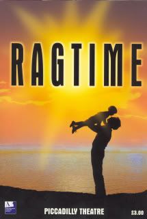
I don't mind the logo having a slightly modern look, as it is meant to appeal to a contemporary audience. Still, the typeface is reminiscent of the turn of the century, with it's embossed ink look. All the colors of the rainbow are not represented, but actually different shades of red and blue, which makes it distinctly American. The fact that it is different shades of the American colors is representative of the melting pot of cultures which the show depicts the collision of. The image of Coalhouse is distinctly Christ-like, which is appropriate, because of the martyr-like role he plays in the story. He is sacrificed in the name of the noble cause of racial and ethnic harmony.
I think the logo actually says a lot about the show and is infinitely more interesting than Tiffany glass or ragtime sheet music.
NO NO NO NO THIS IS NOT APPROPRIATE. God, I hope it's a work in progress.
(Disclosure: I am a former art director.)
It's too glittery, too modern. I know it's not actually glittery and is supposed to look "worn," but at first glance, it just looks like a soccer mom's had too much fun with the embossing powder on her coffee clatch invitations. Why is it sans serif? Why does it look more appropriate for Fame or Footloose? Nothing about it says "turn of the century," unless you mean the 2000s.
Coalhouse at the piano is actually quite interesting -- I like the look and feel of that part of it. But the type treatment? No, it's gotta go.
I actually love it. Ah well...
It's not good but not as bad as that for the London production:
What is this musical about: ?
What period is it set in: ?
Where does it take place: ?
Updated On: 8/7/09 at 04:36 PM
Scripps! Could you resize that, please?! (Also, I posted a link to it earlier in the thread anyway.)
All the colors of the rainbow are not represented, but actually different shades of red and blue, which makes it distinctly American.
If you look closely, all the colors are there. Yellow, orange, green an purple are not actually shades of red and blue. They are secondary colors that involve either one or both of the primary colors, but they are not shades of primary colors. And the use of the rainbow as a symbol of the American "melting pot" is as cliched as it is horribly out of touch and more connected with the gay liberation movement than American racial heterogeny. The block lettering I guess is supposed to be old typeface lettering, but the stylized use of color and graduated fonts are too modernized and ultimately weaken the suggestion of anything of the period. There is nothing about it that is evocative of anything uniquely American or turn-of-the-century.
The image of Coalhouse is distinctly Christ-like, which is appropriate, because of the martyr-like role he plays in the story. He is sacrificed in the name of the noble cause of racial and ethnic harmony.
The Christ-like depiction of Coalhouse is trite and, if intended, terribly misguided (much like Coalhouse was for most of the second act). Jesus was not a terrorist and didn't threaten to blow up or harm his oppressors in a vengeful rage. And I guess that's supposed to be a piano? It's really hard to tell and quite generic. Other than the fact that it appears to have what might be a black man and what could be the top of an upright piano (or part of a window, or a chalkboard, or virtually any partially rectangular object), that design is about as specific to the show as a photo of Bristol Palin's box of unused maxi-pads.
The London one looks like it says, "Regime". Ooo... a musical about a cruel dictator? That sounds interesting!
Resized!
Sorry - I overlooked your link Lizzie.
Updated On: 8/7/09 at 04:42 PM
Broadway Legend Joined: 11/8/08
It'd be nice to see them take a more literal approach
That's better. When you look at the programme cover for the London production you can tell that Ragtime is clearly set in the 1970s:
Updated On: 8/7/09 at 05:05 PM
At a distance, that London Ragtime image (which I agree is the absolute WORST) looks suspiciously like the iconic Dirty Dancing lift. Or perhaps the show is simply about throwing children into the ocean.
This is what the London Ragtime logo reminds me of:
Updated On: 8/7/09 at 05:27 PM
As usual, Barbra did it first!
(Did someone say "Dirty Dancing"?)
Videos