

Does anyone else not "get" the new COMPANY logo/poster?
ByMySide25
Stand-by Joined: 5/17/04
#0Does anyone else not "get" the new COMPANY logo/poster?
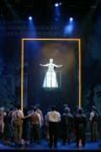
Posted: 10/20/06 at 8:14pmI'm trying to figure it out. The box thingys are driving me crazy.
Ciaron McCarthy
Broadway Star Joined: 10/15/06
#1re: Does anyone else not 'get' the new COMPANY logo/poster?
Posted: 10/20/06 at 8:20pmThey're ice cubes.
ByMySide25
Stand-by Joined: 5/17/04
#2re: Does anyone else not 'get' the new COMPANY logo/poster?
Posted: 10/20/06 at 8:23pmAH! Thank you. Now that makes more sense. It's still a little boring to me though.

#3re: Does anyone else not 'get' the new COMPANY logo/poster?
Posted: 10/20/06 at 8:23pmI'm frankly not sure what they represent... but they're set pieces in the show.
TheMecca
Stand-by Joined: 3/19/06
#4re: Does anyone else not 'get' the new COMPANY logo/poster?
Posted: 10/20/06 at 8:28pmThey probably make up the stage or sets or something, as I've seen them alot in that one preview shot of the cast.
#5re: Does anyone else not 'get' the new COMPANY logo/poster?
Posted: 10/20/06 at 8:38pmMaybe they represent the party. Have you ever been to one where there was no ice? Just a theory.
Vita, dulcedo, et spes nostra
Salve, Salve Regina
Ad te clamamus exsules filii Eva
Ad te suspiramus, gementes et flentes
O clemens O pia
neddyfrank2
Broadway Legend Joined: 12/23/05
#6re: Does anyone else not 'get' the new COMPANY logo/poster?
Posted: 10/20/06 at 8:45pmI thought that they were the cubes that are the set.

#7re: Does anyone else not 'get' the new COMPANY logo/poster?
Posted: 10/20/06 at 8:50pmKind of OT...but I walked by the theatre when the set was being moved in and I didn't see any ice cubes...
#8re: Does anyone else not 'get' the new COMPANY logo/poster?
Posted: 10/20/06 at 8:53pmProbably because they haven't gone into tech yet and you sort of need your main props when you rehearse a show. I promise you they're set pieces.

SDav 10495
Broadway Star Joined: 7/21/06
#9re: Does anyone else not 'get' the new COMPANY logo/poster?
Posted: 10/20/06 at 10:39pmWhere did the design team find such a big ice cube tray?
#10re: Does anyone else not 'get' the new COMPANY logo/poster?
Posted: 10/20/06 at 10:57pmIt was probably leftover from the HONEY, I SHRUNK THE KIDS prop department.
Vita, dulcedo, et spes nostra
Salve, Salve Regina
Ad te clamamus exsules filii Eva
Ad te suspiramus, gementes et flentes
O clemens O pia
#11re: Does anyone else not 'get' the new COMPANY logo/poster?
Posted: 10/20/06 at 11:04pmDoes anybody know just how big the new ones actually are? I know they took the little ones from Cincinnati, and those will still be in the show, but there are other big ones now, too.

CurtainPullDowner
Broadway Legend Joined: 11/4/04
#12re: Does anyone else not 'get' the new COMPANY logo/poster?
Posted: 10/20/06 at 11:12pm
Aren't they slippery to perform on?
and play instruments too?
#13re: Does anyone else not 'get' the new COMPANY logo/poster?
Posted: 10/20/06 at 11:15pmI'm under the impression that they'll be sitting on them, rather than standing or walking. And, um, they're not ACTUAL ice cubes, so I'll venture a guess that they're not slippery. But yeah, of course you would think they were.
#14re: Does anyone else not 'get' the new COMPANY logo/poster?
Posted: 10/20/06 at 11:19pm
What?!?
They're not real?
What the...?
ETA: You know, I was thinking. Maybe they're not supposed to be giant ice cubes. Maybe they're just big transparent blocks.
Vita, dulcedo, et spes nostra
Salve, Salve Regina
Ad te clamamus exsules filii Eva
Ad te suspiramus, gementes et flentes
O clemens O pia

#15re: Does anyone else not 'get' the new COMPANY logo/poster?
Posted: 10/20/06 at 11:24pmcan someone post the new logo?
CurtainPullDowner
Broadway Legend Joined: 11/4/04
#16re: Does anyone else not 'get' the new COMPANY logo/poster?
Posted: 10/20/06 at 11:26pmThanks for clearing that up.
#17re: Does anyone else not 'get' the new COMPANY logo/poster?
Posted: 10/20/06 at 11:30pm
suzycat -- www.companyonbroadway.com has pictures of the version with the cast. There are different incarnations of it, vertical and horizontal.
This is the bare-bones logo:

... but sometimes it's vertical, too.

#18re: Does anyone else not 'get' the new COMPANY logo/poster?
Posted: 10/21/06 at 12:01am
I really hate it.
They are going for the "trying to balance romance, commitment and sex in the city that never sleeps" approach, but the poster doesn't say ANY of that. They could have done something much more sophisticated, sexy, and New York. I think a hotter poster would without a doubt attract more tourists to the piece.
I realize the show is about about 30 somethings and up, I'm not saying they should try to make it look like an ad for an MTV show. But sophisticated black and white photos of this hot cast on the streets on New York or something to that extent, using the tag line they have been using, would sell the show a lot better.
I don't know who producers are hiring to create the artwork for their shows, but there has really been a lot of lackluster stuff lately.
Updated On: 10/21/06 at 12:01 AM
#19re: Does anyone else not 'get' the new COMPANY logo/poster?
Posted: 10/21/06 at 12:03amThe actual "poster" has the (pretty damned sexy) cast on it, but that's just far too busy to put on a marquee.
#20re: Does anyone else not 'get' the new COMPANY logo/poster?
Posted: 10/21/06 at 12:05am
I know, the poster is what I was talking about above. I should have made that clear. :)
I think what I described above, or something like it, would have made a much more effective poster.

#21re: Does anyone else not 'get' the new COMPANY logo/poster?
Posted: 10/21/06 at 12:06am
I really dislike the logo as well... IMHO, it's flat out ugly, AND it's not going to sell the show what-so-ever. They've been trying to sell these amazing shows to the lowest common denominator (EX- calling ACL the first reality TV show), and if they’re going to do that with Company (with Sex and the City), might as well go all out Doyle.
Anyway, it’s not going to do as well as Sweeney because Sweeney attracted younger people because teens love horror movies, and (apparently) Manoel Felciano. Company is… about marriage and thirty somethings. Not going to be something for the teens… and Esparza could be their fathers.
Hate to rant on like this... what the hell inspired this?
LizzieCurry: No, you're more memorable
#22re: Does anyone else not 'get' the new COMPANY logo/poster?
Posted: 10/21/06 at 12:07amI once had a pretty damn sexy cast after I fractured my arm. Of course, it only became so after I spiffed it up.
Vita, dulcedo, et spes nostra
Salve, Salve Regina
Ad te clamamus exsules filii Eva
Ad te suspiramus, gementes et flentes
O clemens O pia
#23re: Does anyone else not 'get' the new COMPANY logo/poster?
Posted: 10/21/06 at 12:11am
I would honestly like to know who said,
"What about if we have the cast sitting on a bunch of clear cubes! THAT will sell our show!!"
Give me a break. I'm very excited about this revival (one of my favorite shows in the world) and I was very excited about what the poster would look like (I love collecting window cards as many do). Needless to say my heart dropped when I opened up the Season Preview Arts & Leisure section only to find the current poster.
#24re: Does anyone else not 'get' the new COMPANY logo/poster?
Posted: 10/21/06 at 12:14am
Sondheim Geek, Raúl and Manoel are the same age. So, I don't really see your point with the age attraction thing, besides the fact that plenty of teenagers are attracted to actors who are old enough to be their fathers. His age doesn't stop him from getting young fans... and dude, he's not that old.
I can't believe you think Sweeney sold because of teen fans. It had a hand in the success (probably mostly by word of mouth), but I don't think that was THE reason the show lasted as long as it did. I don't think Company will run as long as Sweeney did for other reasons, but we'll see. Yeah, teens love horror movies, but Company is so, so much more accessible to all kinds of people. It's sexy. Teenagers like sex. So by your standards, it's gonna do really well?
I'm sorry, but your points are pretty weak.
I'm sure it was lovely, SM2. =P
On another note, the show goes into previews in a little over a week. I'm sort of baffled by the almost total lack of press and publicity.
Videos