Once's New Logo Design
Once's New Logo Design#1
Posted: 6/23/14 at 9:27am
Anyone walk by Once lately? I noticed that they've forgone their usual gold and black logo designs and have a completely new design? Noticed their website has the new design too:
http://www.oncemusical.com/
Can't find pictures of their new pictures and ads online yet though.
Is it common for shows to change their "look" this far in their run? I know that Bridges had completely changed their logo/design further into their short run, but I guess I never really thought about other shows doing this in the past.
Broadway Legend Joined: 7/29/08
Once's New Logo Design#2
Posted: 6/23/14 at 9:28amI love the new ad campaign. I think it's a last-ditch campaign to sell tickets.
Once's New Logo Design#2
Posted: 6/23/14 at 9:31amYeah I agree about loving it - it definitely caught my eye as I walked by the theatre.
Once's New Logo Design#3
Posted: 6/23/14 at 9:35am
I like the new design a lot.
I only saw the show once in the last week of previews but I left incredibly moved. I know the show has it's haters but I don't think I've seen a musical that has moved me in the same way that Once has. I left the theater crying, feeling heartbroken and uplifted at the same time.
It was actually kind of wonderful when I saw it. During Falling Slowly Reprise, in front of my was an older woman by herself. The end must have stuck a cord with her because she was blubbering, crying even harder than I was. There was a younger guy (mid 20s maybe) sitting next to her and her looked at her and put his arm around her and gave her a hug. She then just hung onto his arm for the rest of the show. Was just a nice, moving moment.
It's had a nice run but I really hope it survives. I do want to see it again.
Once's New Logo Design#4
Posted: 6/23/14 at 9:36am
Is it common for shows to change their "look" this far in their run?
It's not a major change, but yes, most shows try to freshen up their advertising every few years. The big moneymakers don't do as much because they generally don't have to.
Once's New Logo Design#6
Posted: 6/23/14 at 10:35am
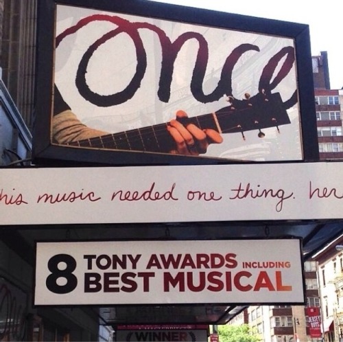
Selling ONCE on its music (which lets them add Oscar and Grammy to the Tony and Oliviers they won) is a smart move. I hope it's not too late to save the show, but the new ad campaign is dynamic and appealing.
Featured Actor Joined: 7/30/13
Once's New Logo Design#7
Posted: 6/23/14 at 10:42am

Attached (I think( is a picture of the new marquee
Once's New Logo Design#8
Posted: 6/23/14 at 10:46am
I like the West End production's new design more, personally..
http://www.oncemusical.co.uk/
Once's New Logo Design#9
Posted: 6/23/14 at 10:50amOh, I agree thespian geek.
Once's New Logo Design#10
Posted: 6/23/14 at 11:00amThanks Playbill! I really like the new logo. A definitely welcome refresh
Once's New Logo Design#11
Posted: 6/23/14 at 11:04am
Not a fan of the new London design. Never understood their affinity for "shiny" letters. And the photo is really static and dull.
Once's New Logo Design#12
Posted: 6/23/14 at 11:16amI love the "Gold" letters in the London design. Gorgeous and goes with the song.
Broadway Legend Joined: 6/21/06
Once's New Logo Design#13
Posted: 6/23/14 at 12:19pm
It's not really a new logo. It's just in a different application.
Just like the Phantom's mask going from a black background with a rose to the current blue background or Les Miz's Cosette having the flag behind her to a more abstract image.
Once's New Logo Design#14
Posted: 6/23/14 at 12:46pm
I thought the original logo was one of the best I've seen. But this isn't bad either. Keeps with the theme.
Newsies is closing, so it's at least lived it's competition from its season.
Once's New Logo Design#15
Posted: 6/23/14 at 12:52pmThat London website and logo treatment looks so tacky. Which, I guess, works for the West End audience.
Once's New Logo Design#16
Posted: 6/23/14 at 12:59pm
"Not a fan of the new London design. Never understood their affinity for "shiny" letters. And the photo is really static and dull."
Agree completely. The U.S. picture feels vibrant and alive. Let's hope it helps them keep going.
Once's New Logo Design#17
Posted: 6/23/14 at 1:46pmLondon tends to do that with their logos. Just take a look at the Wicked redesign for the West End.
Once's New Logo Design#18
Posted: 6/23/14 at 2:17pmI didn't like this show at all, but the new logo looks great.
Once's New Logo Design#19
Posted: 6/23/14 at 2:30pm
"That London website and logo treatment looks so tacky. Which, I guess, works for the West End audience."
I just snorted a little at this (and felt mildly insulted!)!
Once's New Logo Design#20
Posted: 6/23/14 at 3:15pmAnyone else get the email to "Celebrate Once 2.0?" It makes me think of all of those versions of Scarlet Pimpernel.
Once's New Logo Design#21
Posted: 6/25/14 at 12:19amYeah I agree, this new logo campaign makes me want to go see it again.
Once's New Logo Design#22
Posted: 6/25/14 at 1:36am
The only thing more boring than the show was the movie version.
Saw it on a naughty version so thankfully did not pay much to see it. Mrs R wanted to see it and was glad we saw the naughty version and saved some money on it. Big disappointment all around.
Broadway Star Joined: 12/23/12
Once's New Logo Design#24
Posted: 6/25/14 at 2:49amRoxy, a man of your age who can't figure out how ignore actually works, I can't even IMAGINE you know how to procure bootlegs...
Videos


