I don't think there's any cohesiveness to these costumes at all. They're okay if you're doing a children's show, not a family show, but "kiddie" children's show.
The lion looks like a Steiff stuffed animal. Why is Dorothy's hemline so messed up? It's long in back and shorter in front and too long in general. It hangs on her terribly. And the only reason I say that is she's so closely resembling the MGM look when no other character is doing that. So why mess up her hemline and make it look sloppy? The Wizard has something resembling an Afro, and the witches look modern, Vegas glitzy awful. The Tinman and Scarecrow look like unfinished ideas. And why dress the Scarecrow the same color as the lion? They're both primarily the same tan color, giving the principal quartet a dull, monochromatic feel.
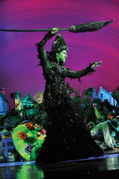
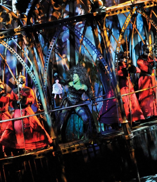
One of the things I love about the "Wicked" costumes is that they feel like they're "of a time period," even if you can't put your finger on which one. They exist in their own world, in their own time. They seem to follow their own rules cohesively. It's a realistic approach to fantasy design. (Also look at Star Wars, Lord of the Rings, or Tim Burton's Alice In Wonderland for cohesive costume design in a fantasy setting.)
This Oz feels pieced together with no cohesive look or idea behind it. Almost as if different designers had tackled each of the characters separately without discussing it together first. And by designers who care more about their own cleverness than serving this classic story.
I'm not a fan of the "children't theatre" approach to The Wizard of Oz. It bores me and instantly alienates me. This doesn't look like a "story for all ages" any more than a Fisher Price toy that says "Ages 2 to 8."
"Jaws is the Citizen Kane of movies."
blocked: logan2, Diamonds3, Hamilton22
Updated On: 3/2/11 at 02:57 AM





.jpg?format=auto&width=300)





