'ALMOST FAMOUS' officially opens on Broadway this November
Three's Company
Swing Joined: 7/19/22
#25'ALMOST FAMOUS' officially opens on Broadway this November
Posted: 7/19/22 at 11:47am
Bill Snibson said: "Haha. Rage inducing! It just feels lazy and cheap and gives you zero idea of what the show is. I actually think its even worse then the artwork for “The Devil Wears Prada” which is so awfully messy."
FWIW, someone on the Devil Wears Prada board noticed they changed up their logo a couple weeks ago.
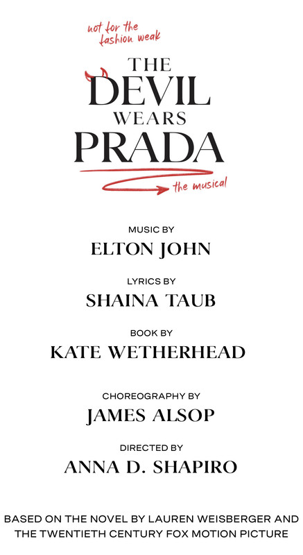
I agree leading with the purple is such a weird choice here. Seems like a producer thing probably– sunset colors would have been the obvious choice.
Zeppie2022
Broadway Legend Joined: 7/12/22
#26'ALMOST FAMOUS' officially opens on Broadway this November
Posted: 7/25/22 at 10:44pm
Loved the movie and will try to get to NYC later this year to see it. I hope they keep the original songs (written by Crow and Nancy Wilson) that were sung by the band (Stillwater) in the movie.
#27'ALMOST FAMOUS' officially opens on Broadway this November
Posted: 8/16/22 at 1:01pm
They changed the artwork we were discussing earlier this summer. It's better.
#28'ALMOST FAMOUS' officially opens on Broadway this November
Posted: 8/16/22 at 1:21pm
The former artwork made me not want to see this. Them going back to the artwork they had in California was the move.
BETTY22
Broadway Legend Joined: 12/29/13
#29'ALMOST FAMOUS' officially opens on Broadway this November
Posted: 8/16/22 at 2:31pm
It's so interesting my non-Broadway friends LOVED IT. LOVED LOVED LOVED
My friends who love Broadway and see lots of shows didn't like it at all.
Maybe, it will bring in a whole new audience.
#30'ALMOST FAMOUS' officially opens on Broadway this November
Posted: 8/16/22 at 2:33pm
That sounds like the audience response to the early days of Beetlejuice.
#31'ALMOST FAMOUS' officially opens on Broadway this November
Posted: 8/16/22 at 8:37pm
Good on them for changing the artwork. I wonder if they saw this thread or the criticism in general.
#32'ALMOST FAMOUS' officially opens on Broadway this November
Posted: 8/16/22 at 8:52pmI'm not gonna lie, I did like the purple in the old artwork. But, I think this artwork represents the show much better.
Dolly80
Broadway Legend Joined: 5/15/11
#33'ALMOST FAMOUS' officially opens on Broadway this November
Posted: 8/17/22 at 10:38amThat new artwork is boring and obvious. Such a shame.
Videos
