'ALMOST FAMOUS' officially opens on Broadway this November
#2'ALMOST FAMOUS' officially opens on Broadway this November
Posted: 7/7/22 at 4:58pm
I’m curious about this one. Saw the movie but don’t remember it that well. I find the artwork/logo rather cheap looking, tbh
#3'ALMOST FAMOUS' officially opens on Broadway this November
Posted: 7/7/22 at 5:26pm
The artwork is dreadful. I understand it’s the vintage Rolling Stone magazine font but it’s ugly, hard to read, and won’t sell the show.
#4'ALMOST FAMOUS' officially opens on Broadway this November
Posted: 7/7/22 at 5:30pm
Right? It looks like it should be for a HS production of “Forum”. Can’t imagine what the other options must have looked like if this was the winner. Eeek!
#5'ALMOST FAMOUS' officially opens on Broadway this November
Posted: 7/7/22 at 8:20pm
I don't even know why but that artwork actually pisses me off.
#6'ALMOST FAMOUS' officially opens on Broadway this November
Posted: 7/8/22 at 1:23am
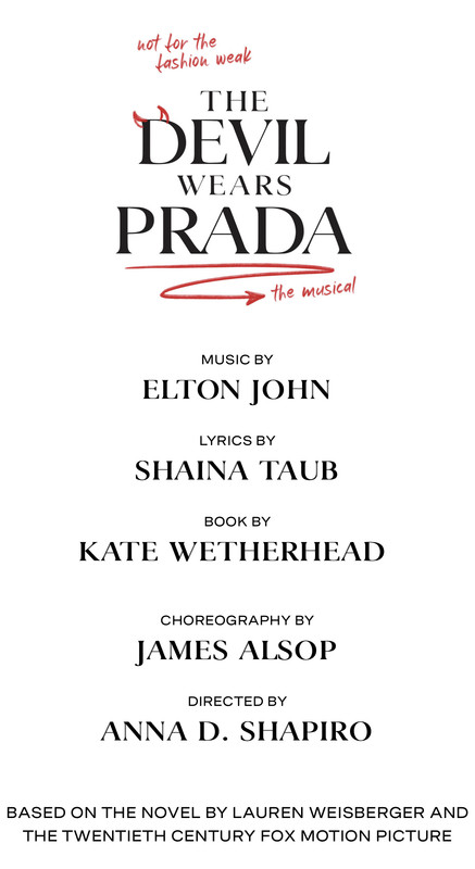
Haha. Rage inducing! It just feels lazy and cheap and gives you zero idea of what the show is. I actually think its even worse then the artwork for “The Devil Wears Prada” which is so awfully messy.
OhHiii
Broadway Legend Joined: 4/30/16
#7'ALMOST FAMOUS' officially opens on Broadway this November
Posted: 7/8/22 at 7:03am
Some of the worst broadway artwork I’ve seen in years. It’s almost nauseating. The colors make absolutely zero sense. There are at least 5 different fonts in the main billing. I think it could have been helped tremendously by using a more sunset color palette in yellows and oranges. Often, you can tell what a producer has directed those who develop the artwork into and this just shows a complete and utter lack of taste….I could go on and on lol. I also HATE the Kimberly Akimbo art as it’s evolved from the scrabble pieces. Show merit aside, truly awful they’ll both be on marquees this fall.
rattleNwoolypenguin
Broadway Legend Joined: 10/11/11
#8'ALMOST FAMOUS' officially opens on Broadway this November
Posted: 7/8/22 at 9:01am
How do you improve the movie soundtrack though?
That's what makes me skeptical of this production. The needle drops in the original film are what make the film.
#9'ALMOST FAMOUS' officially opens on Broadway this November
Posted: 7/8/22 at 9:38am
What was the buzz on this out of town? Is this supposed to be any good?
OuttaTowner
Broadway Star Joined: 5/30/05
#10'ALMOST FAMOUS' officially opens on Broadway this November
Posted: 7/8/22 at 9:41am
Most reviews for the San Diego production were very strong with a couple of outright raves.
#12'ALMOST FAMOUS' officially opens on Broadway this November
Posted: 7/8/22 at 10:04am
OuttaTowner said: "Most reviews for the San Diego production were very strong with a couple of outright raves."
Awesome! And thank, Taffy, for the link to the reviews. For some reason I thought this was received tepidly at the Old Globe. Glad to hear that wasn't the case!
ElephantLoveMedley
Broadway Star Joined: 10/14/21
#13'ALMOST FAMOUS' officially opens on Broadway this November
Posted: 7/8/22 at 11:17am
Agreed with the artwork criticisms. It would've been very on the nose, but I would even prefer it if they did a photo shoot with Solea to replicate the movie poster, which is just so iconic and recognizable.
#14'ALMOST FAMOUS' officially opens on Broadway this November
Posted: 7/8/22 at 12:10pm
I love, love the movie poster, to the point where I knew the iconography of it even before I saw the film.
Similarly love the SCHOOL OF ROCK movie key art (replicating a Rolling Stone cover) more so than the stage art.
#15'ALMOST FAMOUS' officially opens on Broadway this November
Posted: 7/8/22 at 12:33pm
Maybe the artwork is just a placeholder until the fall? IIRC, a couple of years ago the revival of West Side Story changed their artwork right before opening.
#16'ALMOST FAMOUS' officially opens on Broadway this November
Posted: 7/8/22 at 1:01pm
I honestly thought the art was great when they premiered the show in San Diego.
#17'ALMOST FAMOUS' officially opens on Broadway this November
Posted: 7/8/22 at 1:20pm
It’s better than the Broadway art that’s for sure.
#18'ALMOST FAMOUS' officially opens on Broadway this November
Posted: 7/8/22 at 2:21pm
The San Diego artwork is 1000x’s better. Wonder why the change
#19'ALMOST FAMOUS' officially opens on Broadway this November
Posted: 7/8/22 at 2:28pm
David10086 said: "Maybe the artwork is just a placeholder until the fall? IIRC, a couple of years ago the revival of West Side Story changed their artwork right before opening."
Doubt it. This art has been out maybe 3 months now and they had a whole pandemic to revise.
#20'ALMOST FAMOUS' officially opens on Broadway this November
Posted: 7/8/22 at 2:48pm
Does anyone happen to know why Colin Donnell was replaced? My friend said he was perfect in the role and I know from an interaction I had with him that he was planning on transferring with it.
#21'ALMOST FAMOUS' officially opens on Broadway this November
Posted: 7/8/22 at 3:02pm
jenn328 said: "Does anyone happen to know why Colin Donnell was replaced? My friend said he was perfect in the role and I know from an interaction I had with him that he was planning on transferring with it."
Isn't he on a TV show?
Jarethan
Broadway Legend Joined: 2/10/11
#22'ALMOST FAMOUS' officially opens on Broadway this November
Posted: 7/8/22 at 4:50pm
I got an email promising reduced price tickets through to Nov 2nd. When I went on-line, I saw nothing cheaper than post- Nov dates. I was annoyed, so I didn’t buy anything. Anyone else run into this. It was definitely a legitimate e-mail.
#23'ALMOST FAMOUS' officially opens on Broadway this November
Posted: 7/8/22 at 4:59pm
The prices on some seats are lower, barely. It was a much bigger difference when it was still going to the Barrymore.
Updated On: 7/8/22 at 04:59 PM#24'ALMOST FAMOUS' officially opens on Broadway this November
Posted: 7/8/22 at 5:00pm
ErmengardeStopSniveling said: "jenn328 said: "Does anyone happen to know why Colin Donnell was replaced? My friend said he was perfect in the role and I know from an interaction I had with him that he was planning on transferring with it."
Isn't he on a TV show?"
Yea, isn‘t Colin filming an Amazon series in Australia or New Zealand? Probably a scheduling issue not to mention a bunch more money! Haha
Three's Company
Swing Joined: 7/19/22
#25'ALMOST FAMOUS' officially opens on Broadway this November
Posted: 7/19/22 at 11:47am
Bill Snibson said: "Haha. Rage inducing! It just feels lazy and cheap and gives you zero idea of what the show is. I actually think its even worse then the artwork for “The Devil Wears Prada” which is so awfully messy."
FWIW, someone on the Devil Wears Prada board noticed they changed up their logo a couple weeks ago.
I agree leading with the purple is such a weird choice here. Seems like a producer thing probably– sunset colors would have been the obvious choice.
Videos
