HOLY POOP!!! I never saw the face, at first I thought it was some type of Vietnam symbol, then a heli, now a face!
"You never really understand a person until you consider things from his point of view - until you climb into his skin and walk around in it."
To Kill A Mockingbird
If I remember correctly, some of the original TV commercials actually showed real footage of a silhouetted helicopter in front of a sun, then overlayed the logo on top of it. At least that made the helipcopter part more obvious at the time.
a) i think this is funny because i've always known about both.
but b) to those of you who think it's a symbol. there is a vietnamese character in the logo that carries some sort of significance to the show in that picture. this was said once by the creators of the musical because they had it included in the design, but it supposedly hard to spot and they have refused to say what it truly is.. common guesses are the usuals: truth, honor, love... once i heard it was actually the character for sun and moon. but let it be known, you all are right. there is a helicopter, face, and a meaningful vietnamese character (definition unknown)!
i really think you guys should watch THE HEAT IS ON IN SAIGON... it's on DVD too... with the making of miss saigon.. you can see a very young lea salonga audition for KIM and see the creators and director fall in love with her... awww... anyways... there's a section on the creation of the logo... you can see all the really BAD designs they used to have... well they mention how the graphic designer and cam macintosh wanted the face in there somewhere along with the helicopter... they originally had it in the sun in the background and then the graphic artis put it where it is now... they said the genius thing about the design is that once you see the helicopter and the face.. you'll always see it... anyways... such a great making of DVD of the show... could have been better but good nonetheless
so did I darcey......and I'm amused there are people who never saw the helicopter.....the face is harder, but the helicopter does everything except smack you in the face
It is ridiculous to set a detective story in New York City. New York City is itself a detective story...
AGATHA CHRISTIE, Life magazine, May 14, 1956
Haha, I'd seen both of these things since I first saw the show, when I was 12! I noticed the face first, the helicopter kinda requires a bit more imagination.
If Lincoln were alive today, do you think he'd be pleased with his tunnel?
Vietnamese actually uses the Latin Alphabet (a legacy if decades of French Rule). Just a random factoid I thought you'd all enjoy.
I always saw the helicopter. I am suprised alot of other people did not. I remember when I first noticed the eyes I though I was so dumb for noticing it the first time. But saying that I did notice it pretty early on though.
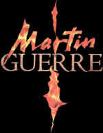
I had always seen both the helicopter & the face, but it reminds me that just the other day after having seen it so many times, I finally realized that the logo for Martin Guerre is actually two faces. I had thought it was just a flaming cross!
When I was a teenager, I had the "Miss Saigon" poster over my desk for several years, and I don't think that it was until after several months of seeing it there that I was finally like, "Wait a minute--there's a face in there!" So I can relate.
The face is to the right of the helicopter's body, but right above the fin.
I've always seen the helicopter (what else could it be? It's too blobby to be a Vietnamnese character), but it took me years to realize there's a face in there too. One of the best logos for a musical, ever.
BlueWizard's blog: The Rambling Corner
HEDWIG: "The road is my home. In reflecting upon the people whom I have come upon in my travels, I cannot help but think of the people who have come upon me."
I've always seen both - it did take me a little longer to notice the faces in the new Martin Guerre logo though. Incidently, if you turn the logo for the original Martin Guerre upsidedown, the stylised face turns into a man.
quote: "Now I feel like a twit. Can you help me with the faces in the Martin Guerre albums?"
From the 1999 recording: The black spaces on the either side of the cross form two faces in silhouette. Neat! I don't know about the earlier album, I don't have that one.
I never noticed that about the Martin Guerre logo. When you posted this last night, I grabbed my program...and slapped myself because it now seems so obvious.





.gif?width=300)





