It's probably because their Ebert and Roper and how many thumbs matters to people.
And, just out of curiosity, which Times quote?
this was posted on the anthony thread..i think its soo much better then what they made.
I'm not so crazy about the artwork either, but it's the movie that really matters, right?
Amazon has it on their website! (they confirm the release date of Feb. 21st).
ETA: SueleenGay, that would take a LOT more than 2 discs.
ETA: On Amazon's page they have cool info like goofs, trivia, etc. Some of it is interesting, although a lot of it isn't news to RENTheads.
RENT dvd on Amazon
Updated On: 1/9/06 at 06:18 PM
I disagree that the other looks better...I think that the movie artwork really stands out. That design is more along the lines of what they did with Broadway...doesn't really match the previous artwork for the film. They went more towards the colors for the film artwork, and I think it's vibrant and will catch people's eyes.
Broadway Legend Joined: 12/26/05
I think Ebert and Roeper are on the dvd cover because they're very well known. Of course, so is the NY Times, and they actually gave a great review, so I don't know....
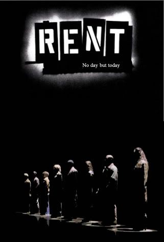
I'm not sure a shot of La Vie Boheme would have worked. Then it would have probably featured Mark, and as mush as I love him, and think that, if there has to be one person named as the main character, it would be him (he's, essentially, the narrator, at least in the play), again, it wouldn't be an ensemble picture. Wow, that was a huge sentance.
And the highlights cover is my favorite, too, although I don't like how the size of the pictures isn't equally proportioned.
I like the artwork. Wish Anthony Rapp would weigh in with his thoughts and more info. :)
I'm the one who made that. I decided to put a picture to the idea.
And, I DO like it. But, there's something about it that's...off...
I think the cover is absolutely fugly.
Broadway Legend Joined: 9/11/03
I almost wet myself.
Broadway Star Joined: 12/20/05
I guess I'm in the minority, but I really like it. It's got large, full-length pictures of everyone, the name is easily seen and recognizable, and the colors are bright and eye-catching. Should attract quite a bit of attention when put on the shelves. Eyes are automatically drawn to bright colors and people will definitely notice this one.
Though I don't expect to see it on shelves around here, what with a lesbian couple on the cover (I'm pretty sure the other gay couple won't be recognized by the store keepers here
heh). Ah well, I was planning on ordering it anyway.
Understudy Joined: 11/23/05
I actually like the cover - it's eye catching. It flows with branding past RENT marketing materials have (broadway and film - with the exception of the newest broadway campaign), yet it can also stand alone.
I don't know how I feel about the duo-tone skin poor Wilson and Jesse ended up with though. They seemed to spare everyone but them. And is it me, or does Wilson looks uncomfortable in his shot?
And, while I understand the alphabetical ordering on the cover, am I the only one wants to reorganize them so the names match the photos in the color strip??
xM3L24x, that looks like the reject from A Chorus Line DVD.
I never said I was some kind of designer.
Hehehe
It's a good thing I have thick skin and can take jokes.
It's not the best cover, obviously, it's just something along the lines of what I and many others were thinking of.
Here's what I posted in another thread: I can definetly see their thoughts while designing it.
Bright. Bold. BAM!
For the general people, it's a good cover to be able to see and take an interest in. They'd walk by, see it, and ask: "What's that?"
And, the way they don't match up annoys me a tad.
Broadway Legend Joined: 11/8/05
My 2 cents: I like it. *ducks* But seriously, I like it because it is colorful, looks like it could be the cover of Mark's film, and is all around just pretty. I am sick of the poster and all the variations of it, so it's great that they changed it up.
Don't duck! I like it too! We'll stand stronge together, alot with the other people who like it.
3 letters:
W...T...F..?
That is all.
I'm not that fond of it either. I think the poster is bright and catchy enough.
Maybe Benny and Mimi are on the spine as another relationship that needs to be depicted. Although they don't do that for Maureen and Mark. But then again Maureen and Mark do not get together during the course of the year.

It maybe the same artwork used on the poster and the 2 Disc soundtrack but it's still miles ahead and much preferable to what the folks over at Sony Pictures Home Entertainment came up with. This artwork is just as colorful and not the eyesore of what will be hitting stor shelves on 02/21.

looks kinda like the "Kids" dvd with MORE colour
Updated On: 1/9/06 at 08:09 PM
It looks like my preschool education: blocks, blocks, blocks, fingerpainting, blocks, crayons, and blocks.
double
ahhhh, attack of the multiple posts!!!
Totally in the minority, but I really like the cover. It is differnt that what is on the shelves of your local video store and I like how they mixed it up a little bit.
I hope they have a RENT special like they did on the Phantom dvd where it went back to the very beginnings of the show's creation and shows behind the scenes footage and exclusive footage from the show. I still want a RENT MOVIE BIBLE but I guess that will never come to light.
anyway, in the grand scheme of things it really isn't *that* important. i'm certainly not going to lose any sleep over the cover. i'm just looking forward to this release to finally see goodbye love (in it's entirety) and halloween.
Updated On: 1/9/06 at 08:21 PM
Videos