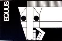
God, that's disturbing. Why does it make my stomach hurt? I love it
Broadway Legend Joined: 12/31/69
I'm surprised they are running any ads at all- it will sell out on buzz alone.
I've long adored this. It sums up the entire play in one beautiful, disturbing image. I have the poster and the t-shirt, and they make me constantly happy. :3
I don't get the original London one--I see the horse, am I supposed to see something else?
Updated On: 4/12/08 at 04:56 PM
That's the only other way I can see anything, except I don't know why the mouth is messed up.
it think it's brilliant
Brilliant, disturbing, provocative....just perfect.
That's the only other way I can see anything, except I don't know why the mouth is messed up.
Alas, the first (and only) answer that came to mind is a) probably (hopefully!) inaccurate, and b) not suitable to say on a family-friendly board. How sad! ;_;
The original logo always reminded me of the horse from Guernica.
Thought people would want to see how it looked in the West End last year, several stories tall over the Gielgud.
I think I'd walk into traffic if I saw the ad that big over a theatre. It's haunting, beautiful... and makes me wish I could find a company that ships window cards to Canada.
The 1977 Richard Burton movie.
This is more disturbing than any other.
....but what a cast!
The logo (the one w/Radcliffe, not to be confused with the original London one) is bloody brillant. Some designer definitely earned their pay for that one.
1. I continue to love this logo the more I look at it.
2. Does anyone else see Christ imagery? Both due to the pose itself but also the 'crown of thorns' look around his head?
want to see it up close....and bigger. (the poster, not what you naughty minded folk were thinking!)
Featured Actor Joined: 2/25/08
I actually really love this one. It was very nicely done.
Just wanted to mention, it looks like the Broadhurst signage for EQUUS is up today!
I think its really beautiful and chilling
Oooh, someone get a picture of the marquee!
dramamama611, your #2 was my first thought exactly. Glad to know I'm not alone.
Understudy Joined: 5/17/08
I think the ad is very inspired. I'm so upset that I won't be able to see it...Equus is one of my favorite plays. It would have been nice to see if Radcliffe does the role justice.
Updated On: 6/27/08 at 01:22 PM
IMO the ad is brilliantly artistic It may be my all-time favorite ad for a stage play. I would actually consider buying it, having it framed and hanging it in my apartment. Can't begin to imagine how someone couldn't appreciate its creative brilliance.
The best logo I've seen in a long time.
Good to see they didn't choose the route of THE COUNTRY GIRL, which used what looked like photoshop graphics and the names of its stars as its major selling points. And look what happened, Country GIrl is doing terrible business. Serves them right.
This ad would interest someone who didn't know anything about Harry Potter, and I think thats really great.
Updated On: 6/27/08 at 02:52 PM
Griffiths has the leading role so shy shouldn't he be given first billing? Radcliffe should give his agent a bonus for getting him equal billing. The role doesn't deserve it.
I think it's a stunning graphic: evocative, beautiful, and disturbing.
I'd likely buy it just as a superb example of poster art--even without seeing the show (though I confess I snagged tickets as soon as they went on sale!)
Videos