Favorite and Least Favorite Artwork
#75re: re: re: re: re: re: re: re: re: re: re: re: re: Favorite and Least Favo
Posted: 1/2/10 at 12:35pm

But I hate the old one...It looks like everyone's got epilepsy
#76re: re: re: re: re: re: re: re: re: re: re: re: re: re: Favorite and Least Favo
Posted: 1/2/10 at 12:42pm
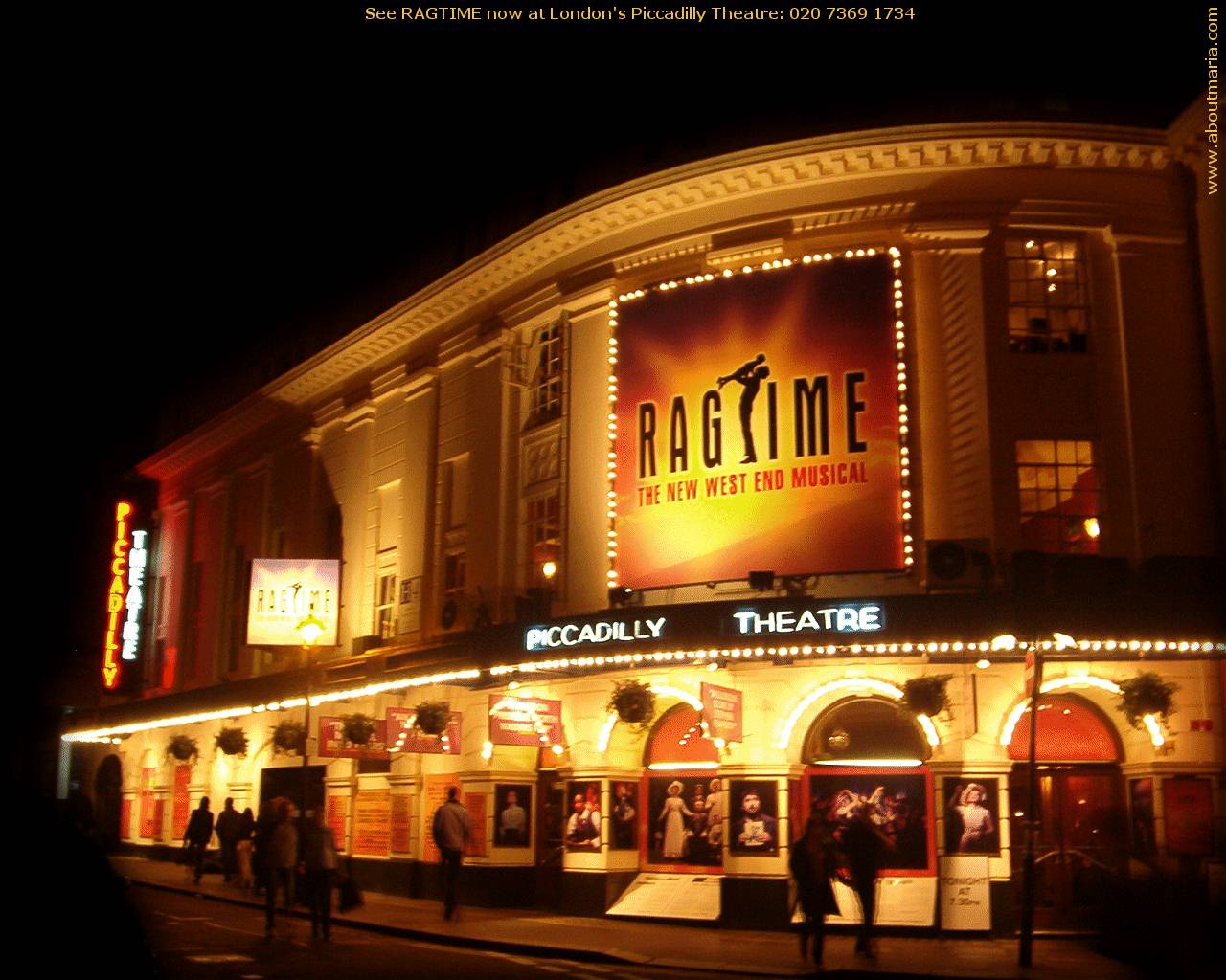
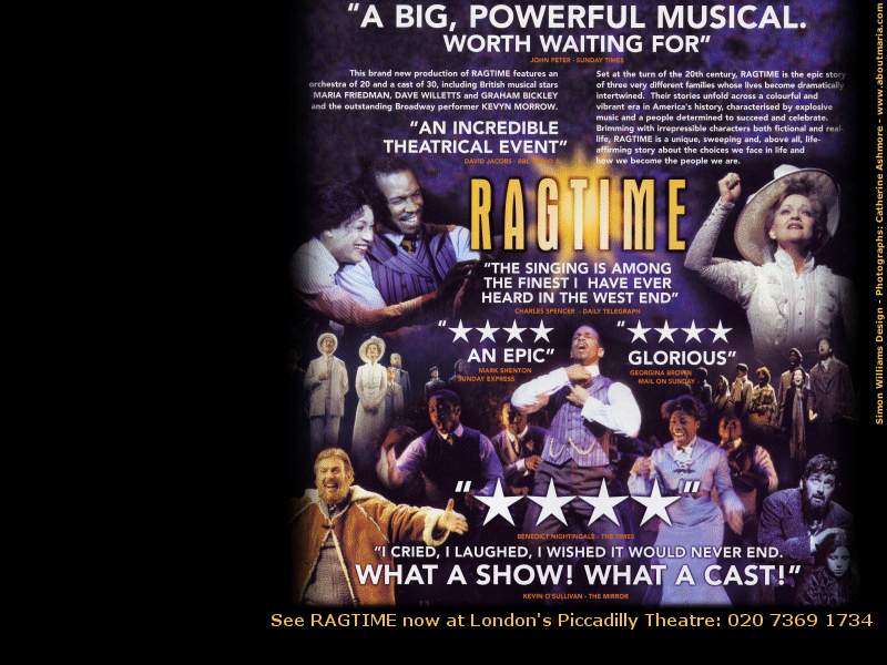
London's Ragtome artwork:

#77re: re: re: re: re: re: re: re: re: re: re: re: re: re: Favorite and Least
Posted: 1/2/10 at 1:47pm

I really love the artwork for Wonderland! The writing, the backdrop..everything!
#78re: re: re: re: re: re: re: re: re: re: re: re: re: re: Favorite and Least
Posted: 1/2/10 at 4:00pm
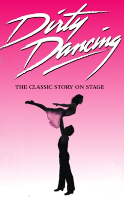
The artwork of London's Ragtime production reminds me of this...
#79re: re: re: re: re: re: re: re: re: re: re: re: re: re: Favorite and Least
Posted: 1/2/10 at 4:03pmgod... its similar....!! The Dirty Dancing artwork SUCKS!!!
#80re: re: re: re: re: re: re: re: re: re: re: re: re: re: Favorite and Least
Posted: 1/2/10 at 4:10pm
^ It does. So I guess it represents the show quite well... ![]()
#81re: re: re: re: re: re: re: re: re: re: re: re: re: re: Favorite and Least
Posted: 6/17/10 at 11:48pm

I always like this Spring Awakening artwork better than what was used on Broadway, and I second what was said about liking the old N2N artwork better as well
#82re: re: re: re: re: re: re: re: re: re: re: re: re: re: Favorite and Least
Posted: 6/18/10 at 12:24am
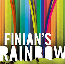
Favorite
#83re: re: re: re: re: re: re: re: re: re: re: re: re: re: Favorite and Least
Posted: 6/18/10 at 2:26amI nearly booked a flight to NYC just so I could put the Finian's Rainbow Playbill up on my wall. It's gorgeous.
#84re: re: re: re: re: re: re: re: re: re: re: re: re: re: Favorite and Least
Posted: 6/18/10 at 3:07amSomeone earlier posted the 'Hedda Gabler' poster. If the show lived up to the standards of the gorgeous artwork then that evening in the theatre might have been tolerable. Ashamedly, I actually bought the poster. I just think it's stunningly beautiful... as is Mary Louise-Parker. I never hung it up though because I hated the show so much.
#85re: re: re: re: re: re: re: re: re: re: re: re: re: re: Favorite and Least
Posted: 6/18/10 at 5:39am
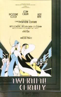
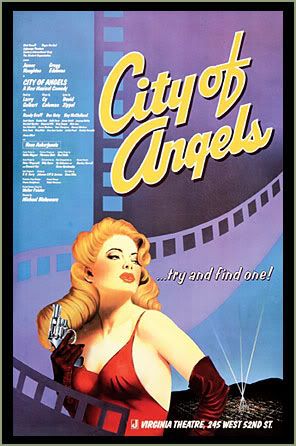
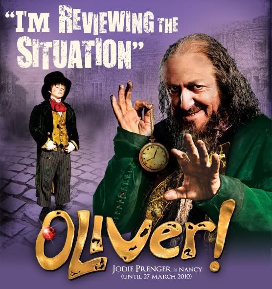
I did not know that Marti Pellow was ever in Witches Of Eastwick.
Would have loved to see him. And although I like Ian McShane, let's face it - it's hard to even tell what his songs are supposed to sound like with him growling through them.
#86re: re: re: re: re: re: re: re: re: re: re: re: re: re: Favorite and Least
Posted: 6/18/10 at 6:45am

#87re: re: re: re: re: re: re: re: re: re: re: re: re: re: Favorite and Least
Posted: 8/20/10 at 7:38pmDoes anyone have a picture of the possible artwork for 9 to 5 the musical? It was mentioned in another thread
#88re: re: re: re: re: re: re: re: re: re: re: re: re: re: Favorite and Least
Posted: 8/21/10 at 12:26am
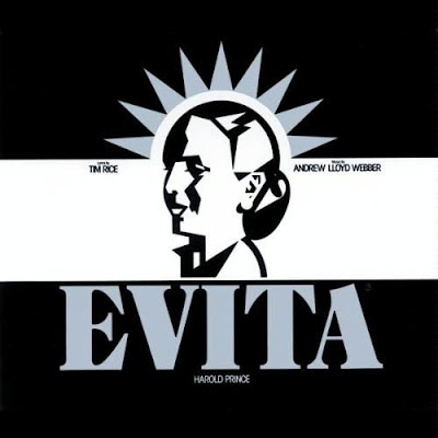
Best ever.
Worst ever is that terrible new Phantom face or How to Succeed In Business one from several years back. Ugly, ugly, ugly.
Rentaholic2
Broadway Legend Joined: 3/14/04
#89re: re: re: re: re: re: re: re: re: re: re: re: re: re: Favorite and Least
Posted: 8/21/10 at 11:19amI think the artwork for the A Little Night Music revival is absolutely disgusting. Can anyone look at that purple and orange mess and honestly think it's going to appeal to anyone who is not already planning on seeing the show? I'm not a designer, but there must be some rule about not putting purple and orange together, especially when they are blended. It didn't work for the original Ragtime artwork either.
#90re: re: re: re: re: re: re: re: re: re: re: re: re: re: Favorite and Least
Posted: 8/21/10 at 12:04pm

Follies artwork

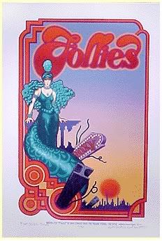
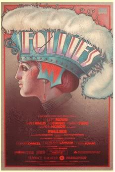
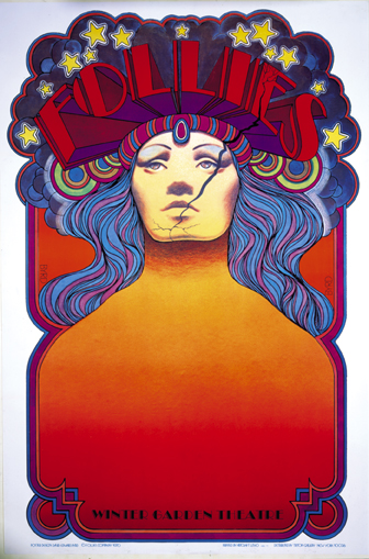
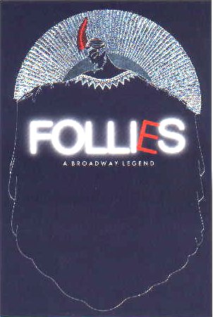


Updated On: 8/21/10 at 12:04 PM
#91re: re: re: re: re: re: re: re: re: re: re: re: re: re: Favorite and Least
Posted: 8/21/10 at 4:44pm
I love the Follies posters by David Edward Byrd. They are the ones that are at 2, 3, 4, and 7. He also designed the poster for SOON, a rock musical from the 1970s, which I have as my avatar. His posters for Soon, Godspell, Follies, Robber Bridegroom, and Frank Merriwell are all part of a series of posters he conceived as all being faces looking head on.


His The Grand Tour poster is among my all time favorites.

#92re: re: re: re: re: re: re: re: re: re: re: re: re: re: Favorite and Least
Posted: 8/21/10 at 5:31pm

Always liked this one:
#93re: re: re: re: re: re: re: re: re: re: re: re: re: re: Favorite and Least
Posted: 8/21/10 at 5:36pmI'll add to the chorus of voices who like the Follies artwork, particularly the original production's. Most of Hal Prince's shows have very strong poster art.
#94re: re: re: re: re: re: re: re: re: re: re: re: re: re: Favorite and Least
Posted: 8/21/10 at 5:40pm
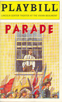
#95re: re: re: re: re: re: re: re: re: re: re: re: re: re: Favorite and Least
Posted: 8/21/10 at 7:56pm
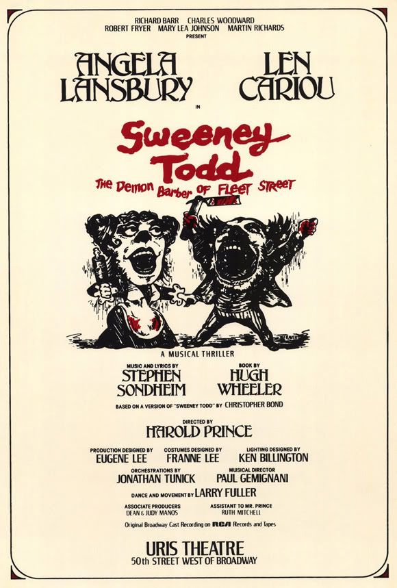
A favorite: 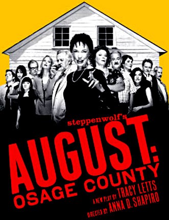
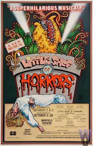
A least favorite: 
#96re: re: re: re: re: re: re: re: re: re: re: re: re: re: Favorite and Least
Posted: 8/25/10 at 10:18am


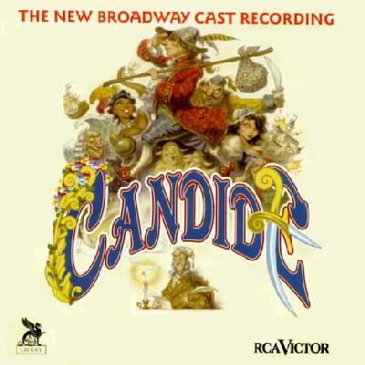
The artwork of Peter de Seve always seems to fit the show it represents
#97re: re: re: re: re: re: re: re: re: re: re: re: re: re: Favorite and Least
Posted: 8/25/10 at 11:01am

#98re: re: re: re: re: re: re: re: re: re: re: re: re: re: Favorite and Least
Posted: 8/25/10 at 11:16am
This is a fun thread.
I think my all time favorite poster is the original Follies by Byrd.
#99re: re: re: re: re: re: re: re: re: re: re: re: re: re: Favorite and Least
Posted: 8/25/10 at 5:46pm
I love Hilary Knight! Irene is a lovely image that is similar to No, No, Nanette. But, nothing beats his artwork for the Magdalena recording. Pitch perfect.
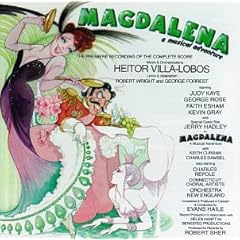
The artwork from the original production is wonderful as well.

Videos
