Favorite and Least Favorite Artwork
#26re: Favorite and Least Favorite Artwork
Posted: 8/22/09 at 6:23pm
I've got too many favorites to post here, but I really hate this new logo they keep trying to push for Phantom of the Opera.

Tonight belongs to... Mysterious masked floating Ken doll head!!
AndAllThatJazz22
Broadway Legend Joined: 11/8/08
#27re: Favorite and Least Favorite Artwork
Posted: 8/22/09 at 6:33pmThe new Phantom logo looks like the cover of a crappy romance novel.
-Danmeg's 10 year old son.
#28re: Favorite and Least Favorite Artwork
Posted: 8/22/09 at 6:36pm
Favorite:

#29re: Favorite and Least Favorite Artwork
Posted: 8/22/09 at 6:45pm
Good...

#30re: Favorite and Least Favorite Artwork
Posted: 8/22/09 at 6:46pm
"The new Phantom logo looks like the cover of a crappy romance novel. "
Have you seen some of the Vegas promo art?

Would someone kindly remind me when THAT scene happened in the show? I seem to have forgotten.
Updated On: 8/23/09 at 06:46 PM
#31re: Favorite and Least Favorite Artwork
Posted: 8/22/09 at 6:47pm
Bad...

#32re: Favorite and Least Favorite Artwork
Posted: 8/22/09 at 6:49pmThat Piazza artwork is pretty, but it kind of looks like he's throwing the hat to her.
AndAllThatJazz22
Broadway Legend Joined: 11/8/08
#33re: Favorite and Least Favorite Artwork
Posted: 8/22/09 at 6:52pmThey look like they're in Mexico in that LITP poster.
-Danmeg's 10 year old son.
IfYouCan
Stand-by Joined: 7/1/09
#34re: Favorite and Least Favorite Artwork
Posted: 8/22/09 at 6:57pm
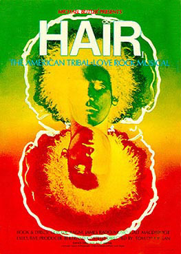
I like the original Hair artwork.
I like the revival's, too, but the original fits with the show really well.
#35re: Favorite and Least Favorite Artwork
Posted: 8/22/09 at 7:10pm
There is some really good work in those posters, thanks so much for reminding us of them!
Please keep in mind that the object of the artwork is to present the essence of the show or play, and not to present a picture of a cast member, a scene, or anything else that occurs on the stage.
#36re: Favorite and Least Favorite Artwork
Posted: 8/22/09 at 7:55pm

I like this Light In The Piazza artwork better.
#37re: Favorite and Least Favorite Artwork
Posted: 8/22/09 at 7:55pm

I like this Light In The Piazza artwork better.
#38re: Favorite and Least Favorite Artwork
Posted: 8/23/09 at 1:06am
Favorites 


 Updated On: 8/23/09 at 01:06 AM
#39re: Favorite and Least Favorite Artwork
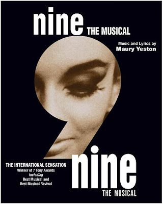
Posted: 8/23/09 at 1:29amI have too many favorites, but my least favorite is definitely the new Phantom artwork. And I don't get the Vegas art either. How is the mask an "O"? If anything it's an "M" because of the way the bottom is shaped. I also hate that it's just "Phantom" now as that creates further confusion with the Maury Yeston version.
#40re: Favorite and Least Favorite Artwork
Posted: 8/23/09 at 1:32amALW trying to get rid of the competition, methinks.
#41re: Favorite and Least Favorite Artwork
Posted: 8/23/09 at 1:46am^ Lol, I doubt that Yeston's Phantom was ever ANY competition to Webber's , love.
#42re: Favorite and Least Favorite Artwork
Posted: 8/23/09 at 1:53am
BUT Yeston is going to make it big with the NINE movie, then a full-scale Broadway production of PHANTOM will be produced to upstage POTO..
Well, no, and I know he doesn't really have competition, but STILLLL..I was kidding, I think.
beewai
Chorus Member Joined: 7/30/09
#43re: Favorite and Least Favorite Artwork
Posted: 8/23/09 at 1:57am
Grey Gardens had a wonderfully expressive marquee, but the subsequent "Scandal" Ad Campaign later in the run drove that show into the ground in my opinion.
Grey Gardens (the good)
[IMG]
(and the bad)
[IMG]
#45re: Favorite and Least Favorite Artwork
Posted: 8/23/09 at 2:33amI actually like James McMullan's artwork for The Light in the Piazza better than "ballet Clara", but I tend to like all the work he does for the Lincoln Center shows. South Pacific, Carousel and Parade were all great.
#46re: Favorite and Least Favorite Artwork
Posted: 8/23/09 at 2:42am

I really like the Legally Blonde artwork... It's super fun.
But really the first thing I thought of when I read the title of this thread was BOTH of The Light in the Piazza artworks. They're both pretty stunning.
However my favorite is Marie Christine...SO good.
#47re: Favorite and Least Favorite Artwork
Posted: 8/23/09 at 2:50am
How did I forget Urban Cowboy? Brilliant example of putting the show's best asset right on the poster.

heo1128
Broadway Star Joined: 7/9/08
#48re: Favorite and Least Favorite Artwork
Posted: 8/23/09 at 3:14am

I can't believe no one's said the new HAIR artwork. I LOVE it.
Updated On: 8/23/09 at 03:14 AM
#49re: Favorite and Least Favorite Artwork
Posted: 8/23/09 at 3:28amI love the new Hair artwork as well. I wish they would have printed a poster with the blue background and the blue sun.
Videos
