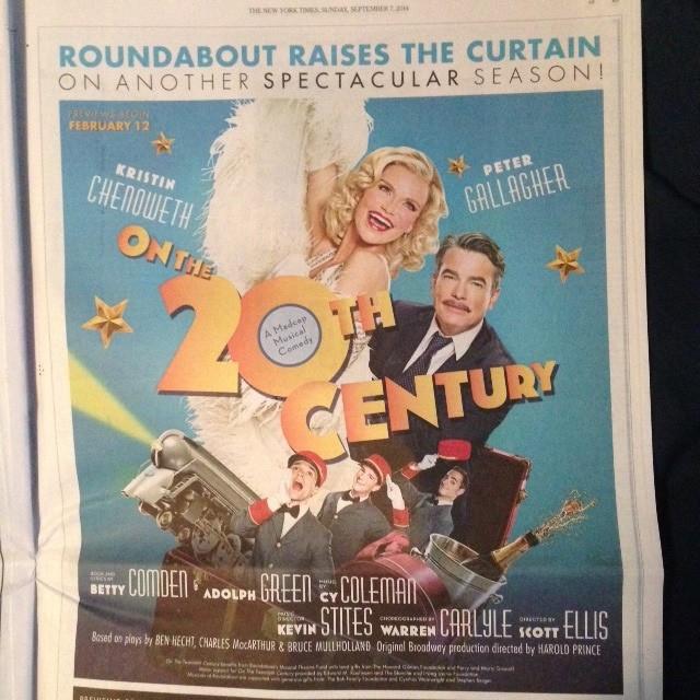
As anybody seen this yet? Looks much much better than before
No train? If the show is about drag queens and bellhops then this artwork is perfect.
they had a ad int NY Times this past weekend with the train.
Certainly an improvement over the first. I think?
I actually prefer the Cameron Diaz version.
It's a hit, it's a hit, it's a palpable hit...
Chorus Member Joined: 5/31/10
So much better, it's oh-oh-oh-oh-oh much better.
Well I’m just glad Roundabout is doing real artwork again instead of the silhouette/Saul Bass thing they did for Talley’s Folly, The Big Knife, Dinner With Friends, Machinal,The Winslow Boy, Machinal and Violet. We get it, Roundabout. It’s About You.
I think they just sort of came to the conclusion that they have to actually USE their stars to sell the show.
^^^^^^
They didn't think Cameron Diaz would rake them in?
I did hate the first one (although just I thought it was a good concept poorly executed) but I'm not sure I like this one much better.
Don't you think the man[should look up his name] looks a little strange-the hair/the mo.?
Actually think it's his eyes.
Updated On: 9/10/14 at 11:24 PM
I don't think it's an improvement either Mr. Nowack.
Well, agreed. I think the art deco of the first isn't terrible, just the execution. The new one looks more like Anything Goes 2.
Christie Brinkley looks enchanting in this new ad...
No choo choo? That's poo poo.
It looks cheap. Definitely a sideways move.
The new ones not bad lol it looks like a poster that papermill would make. I actually still like the first one better though
Will the porters be cast with white performers in this production?
Swing Joined: 9/11/14
This is what it looked like in the New York Times. There's a train.
I like it... I could see the marquee and its stars draw in an audience with this artwork rather than the other one. It's more fun, brighter, and looks more like a musical comedy. The other image kept reminding me of a Jean Brodie poster I once saw, with a different face.
It looks like a 5th grade photoshop job.
Well Roundabout has never been known for their graphic design capabilities, and this one fits the madcap of the show even if it lacks great execution. It still is better than that terrifying artwork they had originally.
Stand-by Joined: 6/13/14
would be nice if the Playbill will be in color but we all know it won't be
Videos