PLAYBILL Covers of the 2015-2016 Season
#150PLAYBILL Covers of the 2015-2016 Season
Posted: 2/13/16 at 9:51pm
GreasedLightning said: "
Would it kill Roundabout to throw some color into their Playbills?
I know, I know... they're a non-profit, they've never had color Playbills, why change it now, it's not necessary, blah, blah, blah. I get it. I just wonder why they wouldn't at least throw a colorful background behind the text, make it a consistent thing and get some flare on their Playbills. Even the Public started doing color Playbills downtown and those look great. Doesn't necessarily have to be the show logo, but at least the Roundabout logo, the show title and some color. Just rambling.
"
^^^ Thank you! I hear ya! Noises Off was a missed opportunity. It would have been gorgeous in color. Same with Old Times. She loves me is just wrong and ugly.
@z5
Broadway Legend Joined: 11/30/15
#151PLAYBILL Covers of the 2015-2016 Season
Posted: 2/13/16 at 9:57pm
I honestly didn't mind Old Times at all. Definitely the best of all them.
#152PLAYBILL Covers of the 2015-2016 Season
Posted: 2/13/16 at 11:34pm
I am a massive fan of the vintage Playbill look. I love SHUFFLE ALONG & THE CRUCIBLE. I appreciate the nod to the novel, re: AMERICAN PSYCHO. One has to wonder how just a touch of color could have elevated it. Maybe if the letters were red but Mr. Bateman was still in black & white?
@z5
Broadway Legend Joined: 11/30/15
#153PLAYBILL Covers of the 2015-2016 Season
Posted: 2/13/16 at 11:39pm
I agree that that could have given it a little more maybe, but it has started to grow on me a little already.
VintageSnarker
Broadway Legend Joined: 1/30/15
#154PLAYBILL Covers of the 2015-2016 Season
Posted: 2/14/16 at 1:59am
"I didn't like American psycho but when someone explained about how they tried to recreate the novel's book cover then it made sense and I guess it's ok. At least it wasn't for the lack of imagination."
Looking at the cover of the novel they chose a better font and the photo was much better. It has that oddly flat male model look where the person is looking at you but looking through you. On the Playbill Walker is just looking off into distance blandly.
@z5
Broadway Legend Joined: 11/30/15
#155PLAYBILL Covers of the 2015-2016 Season
Posted: 2/25/16 at 3:43pm
"The Father" with Frank Langella has got a cover now...and pleasantly surprised with it!
#157PLAYBILL Covers of the 2015-2016 Season
Posted: 2/25/16 at 3:49pm
Also, deeply sorry for the horribly pixelated attachment of that playbill. The new Vault design is ruining my life.
#158PLAYBILL Covers of the 2015-2016 Season
Posted: 2/25/16 at 4:13pm
And most of the old links are also gone. ![]()
#159PLAYBILL Covers of the 2015-2016 Season
Posted: 2/25/16 at 5:43pm
WayTooBroadway said: "And most of the old links are also gone. ![]()
"
This is infuriating.
#160PLAYBILL Covers of the 2015-2016 Season
Posted: 2/25/16 at 6:15pm
The ripples of the terrible revamp are terrible ![]()
#162PLAYBILL Covers of the 2015-2016 Season
Posted: 2/26/16 at 5:40pm
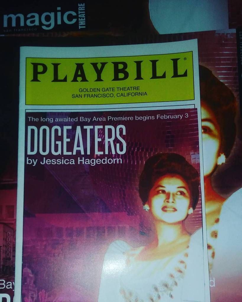
Antonjian... is that just a picture glued onto a playbill? Cause it looks like it
#163PLAYBILL Covers of the 2015-2016 Season
Posted: 2/26/16 at 5:53pm
Wow, I haven't heard that name in an eon and a half.
@z5
Broadway Legend Joined: 11/30/15
#164PLAYBILL Covers of the 2015-2016 Season
Posted: 2/26/16 at 6:35pm
lol...way to ruin the trend of real playbills
#165PLAYBILL Covers of the 2015-2016 Season
Posted: 2/27/16 at 3:20am
Just taped...but it is my fan art of the play Dogeaters that played off broadway in 2000ish
#166PLAYBILL Covers of the 2015-2016 Season
Posted: 2/27/16 at 8:12am
I'm sorry... even if they are inspired by the novel for American Psycho, the entire marketing campaign so far is built on the pink/blue colors and is beautiful! I mean thanks for teasing us with those colors and making me hope for a bright and fun playbill and then give us this. The book was at least in color. If you're going to reference the book, give us some color!
Just showing my terrible disappointment for this cover. SMH
#167PLAYBILL Covers of the 2015-2016 Season
Posted: 2/27/16 at 2:58pm
I don't think everyone should give the AP playbill a pass just because it's a reference to the book. I don't think it's a particularly well done homage.
#168PLAYBILL Covers of the 2015-2016 Season
Posted: 2/27/16 at 3:03pm
I disagree. I don't think that it has to be an exact replica to be a good homage. I think their design is cool and fitting - but to each his own. I respect your dislike for it.
Will Paramour have a Playbill?
#169PLAYBILL Covers of the 2015-2016 Season
Posted: 2/27/16 at 3:04pm
antonijan said: "Just taped...but it is my fan art of the play Dogeaters that played off broadway in 2000ish
What does that have anything to do with the BROADWAY Playbill covers of the 2015-2016 season?????
"
Updated On: 2/27/16 at 03:04 PM
@z5
Broadway Legend Joined: 11/30/15
@z5
Broadway Legend Joined: 11/30/15
#171PLAYBILL Covers of the 2015-2016 Season
Posted: 3/3/16 at 4:33pm
"Tuck Everlasting" and "Long Day's Journey Into Night" both officially both have covers.
#173PLAYBILL Covers of the 2015-2016 Season
Posted: 3/3/16 at 4:56pm
I feel like I know exactly what kind of show Tuck Everlasting will be just by looking at the playbill.
woeisme3
Featured Actor Joined: 9/14/15
#174PLAYBILL Covers of the 2015-2016 Season
Posted: 3/3/16 at 5:20pm
Long Day's Journey is beautiful. Roundabout's black and white playbills can work if they just put a little effort in.
Videos


.jpg?format=auto&width=200)


