PLAYBILL Covers of the 2016-2017 Season
@z5
Broadway Legend Joined: 11/30/15
#100PLAYBILL Covers of the 2016-2017 Season
Posted: 1/9/17 at 9:11pm
Isn't Sunset Blvd already black and white...?
@z5
Broadway Legend Joined: 11/30/15
#101PLAYBILL Covers of the 2016-2017 Season
Posted: 1/9/17 at 9:12pm
In transit also has an altered/black and white cover starting next month.
Rainah
Broadway Star Joined: 11/24/16
#102PLAYBILL Covers of the 2016-2017 Season
Posted: 1/9/17 at 9:58pm
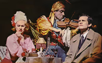
Man I am loving The Price. What an arresting image. I don't know the show but I'm keen to google it now (Which means the playbill is doing it's job imo)
#103PLAYBILL Covers of the 2016-2017 Season
Posted: 1/9/17 at 11:26pm
Rainah said: "Man I am loving The Price. What an arresting image. I don't know the show but I'm keen to google it now (Which means the playbill is doing it's job imo)
"
I had the exact same thought/feeling! I am curious about the show. Anyone care to weigh in?
#104PLAYBILL Covers of the 2016-2017 Season
Posted: 1/10/17 at 12:37am
@z5 said: "In transit also has an altered/black and white cover starting next month.
"
Are they going to even make it to next month,
#105PLAYBILL Covers of the 2016-2017 Season
Posted: 1/10/17 at 9:01pm
wow, Sunset Boulevard's Playbill is beautiful. Very elegant artwork. I also really like 'The Price' - it's better than so much of Roundabout's previous artwork!
Love the color in Come From Away as well. Nice texture on the 'O'
#107PLAYBILL Covers of the 2016-2017 Season
Posted: 1/10/17 at 9:04pm

I'll admit I'm not a big fan of the art for Significant Other. It feels mismatched to the tone of the show - more like a sitcom of some sort.
#108PLAYBILL Covers of the 2016-2017 Season
Posted: 1/10/17 at 9:21pm
I don't hate it, but I also don't know the show. I would be expecting a show with a vibe like the TV show New Girl. Is that totally off the mark?
#109PLAYBILL Covers of the 2016-2017 Season
Posted: 1/10/17 at 9:40pm
Mr. Nowack said: "I don't hate it, but I also don't know the show. I would be expecting a show with a vibe like the TV show New Girl. Is that totally off the mark?
"
Not totally off. The show is sort of sit-com-y.
#110PLAYBILL Covers of the 2016-2017 Season
Posted: 1/10/17 at 9:43pm
I love the Significant Other playbill, specifically the idea of how in every photo there's one less friend and he's less happy, until the final pane where it's just him and you see the reality of the show. I think it's a smart design!
VintageSnarker
Broadway Legend Joined: 1/30/15
#111PLAYBILL Covers of the 2016-2017 Season
Posted: 1/10/17 at 10:34pm
Without altering the design of In Transit, I don't know what else you could do to make it pop more... maybe use darker tones instead of those light grays? It just looks sad.
While I'm not a fan of the play itself, I think the Significant Other cover definitely makes sense once you know what the play's about and if you're going to do something with photos of the actors, it's a pretty good way to go. I do think it fails to communicate the tone of most of the play (outside of the weddings). Maybe the last photo could be more telling. But I assume people going to see would be relying on more than the Playbill cover.
Unknown User
Joined: 12/31/69
#112PLAYBILL Covers of the 2016-2017 Season
Posted: 1/11/17 at 9:16am
I think I have to agree with the VotePeron opinion. The Significant Other playbill does a great job of telling the story of the show. I will admit the blue coloring isn't the best, but the 4 pics like it's a wedding photo booth is kind of perfect, no?
The playbill is doing its job of getting me excited to see it again.
#113PLAYBILL Covers of the 2016-2017 Season
Posted: 1/13/17 at 10:45pm

Sunday in the Park playbill is here! I'm so glad it is in color. I don't know why, but I really like it. Getting me even more excited for this production, if that is even possible.
#114PLAYBILL Covers of the 2016-2017 Season
Posted: 1/13/17 at 11:50pm
That SITPWG artwork is amazing. It looks classy, gets the message across and juts screams elegance.
@z5
Broadway Legend Joined: 11/30/15
#115PLAYBILL Covers of the 2016-2017 Season
Posted: 1/14/17 at 12:55am
The cover for Significant Other has changed according the the vault to a totally different design.
yknot
Understudy Joined: 5/21/12
#117PLAYBILL Covers of the 2016-2017 Season
Posted: 1/14/17 at 1:28am
Boo. I loved the first design ![]() Much more interesting, and loved how each bar was the same size as the yellow header.
Much more interesting, and loved how each bar was the same size as the yellow header.
VintageSnarker
Broadway Legend Joined: 1/30/15
#118PLAYBILL Covers of the 2016-2017 Season
Posted: 1/14/17 at 2:23pm
I don't hate the new design for Significant Other but I agree it's less interesting. Did they really need to get the whole cast on the Playbill?
I like the Sunday cover though I wish it were somehow more indicative of Seurat's actual style of painting.
#119PLAYBILL Covers of the 2016-2017 Season
Posted: 1/14/17 at 2:30pm
VintageSnarker said: "I don't hate the new design for Significant Other but I agree it's less interesting. Did they really need to get the whole cast on the Playbill?
I like the Sunday cover though I wish it were somehow more indicative of Seurat's actual style of painting.
"
That is true, it seems like it would've been obvious to use pointillism.
#120PLAYBILL Covers of the 2016-2017 Season
Posted: 1/14/17 at 3:32pm
I'm honestly not really a fan of the Sunday art. Like others have said, it doesn't speak to Seurat's pointillism, and I think having the actual letters of the title blurred/streaky is a misfire.
#121PLAYBILL Covers of the 2016-2017 Season
Posted: 1/14/17 at 4:04pm
I feel like this would read better on a marquee than pointillism unless it were a large sample/example. I think it looks great though.
#122PLAYBILL Covers of the 2016-2017 Season
Posted: 1/14/17 at 11:14pm
I don't care for the Sunday... playbill.
The marketing for Significant Other is making it seem so sitcomy.
#123Covers of the 2016-2017 Season
Posted: 1/15/17 at 4:48am
I think the Sunday artowrk is gorgeous. It's clear that it's not supposed to be part of an actual painting but rather just some random strokes.
10086sunset
Broadway Legend Joined: 2/8/16
#124Covers of the 2016-2017 Season
Posted: 1/15/17 at 8:11am
Happen to like the Sunday cover...
Preferred the first Significant Other Playbill...Wonder why it was changed...
Videos


