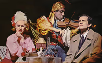
PLAYBILL Covers of the 2016-2017 Season
10086sunset
Broadway Legend Joined: 2/8/16
#77PLAYBILL Covers of the 2016-2017 Season
Posted: 10/14/16 at 5:35pm
God that In Transit art is ugly.
broadwayguy91
Broadway Star Joined: 12/23/15
#78PLAYBILL Covers of the 2016-2017 Season
Posted: 10/14/16 at 9:01pm
BroadwayConcierge said: "It looks like people are frantically running away from the show.
"
I LOLed
In Transit.. so blah. why not use some scenery of the subway?
#79PLAYBILL Covers of the 2016-2017 Season
Posted: 10/15/16 at 1:39am
IN TRANSIT looks like regional artwork to me, not Broadway quality. On the other hand though, A BRONX TALE's paper mill artwork was much better looking than the Broadway version...
@z5
Broadway Legend Joined: 11/30/15
#80PLAYBILL Covers of the 2016-2017 Season
Posted: 10/15/16 at 1:41am
In transit, and Bronx Tale especially doesn't bother me as much... Kinda digging it.
@z5
Broadway Legend Joined: 11/30/15
#82PLAYBILL Covers of the 2016-2017 Season
Posted: 10/18/16 at 11:23pm
I think I liked the first Front Page one better...
10086sunset
Broadway Legend Joined: 2/8/16
#83PLAYBILL Covers of the 2016-2017 Season
Posted: 10/19/16 at 10:04pm
Also preferred the first Front Page...
It had some character, this current one feels like something we've seen countless times before...
10086sunset
Broadway Legend Joined: 2/8/16
#84PLAYBILL Covers of the 2016-2017 Season
Posted: 10/19/16 at 10:09pm
The Encounter goes B/W starting in November...
10086sunset
Broadway Legend Joined: 2/8/16
#86PLAYBILL Covers of the 2016-2017 Season
Posted: 11/3/16 at 2:36pm
Torn on The Present...Sorta wish it was in color...
VintageSnarker
Broadway Legend Joined: 1/30/15
#87PLAYBILL Covers of the 2016-2017 Season
Posted: 11/3/16 at 6:20pm
The Present isn't terrible but it's not great either. I think it's the way Cate Blanchett's body is positioned + the dress but it looks photoshopped to make her arms and body smaller and slimmer. When did people used to take Playbill photos for older plays? I like those older Playbills that look like a scene from the play. Or, barring that, just a good photo like The Apple Tree. I often find myself thinking "this can't be the best photo you took."
@z5
Broadway Legend Joined: 11/30/15
#89PLAYBILL Covers of the 2016-2017 Season
Posted: 12/8/16 at 4:41pm

10086sunset
Broadway Legend Joined: 2/8/16
#90PLAYBILL Covers of the 2016-2017 Season
Posted: 12/10/16 at 12:54am
Jitney could be worse...It could also be better...
Don't love it, don't hate it...
¿Macavity?
Broadway Star Joined: 1/29/16
#91PLAYBILL Covers of the 2016-2017 Season
Posted: 12/10/16 at 2:46am
It would look better in color, I know, it's a common complaint.
10086sunset
Broadway Legend Joined: 2/8/16
#97PLAYBILL Covers of the 2016-2017 Season
Posted: 1/9/17 at 1:27pm
Really like sunset and come from away but I wonder how long till they go b/w
#98PLAYBILL Covers of the 2016-2017 Season
Posted: 1/9/17 at 3:17pm
COME FROM AWAY is giving me AIDA vibes I think it's not only the same color scheme but also the same font.
VintageSnarker
Broadway Legend Joined: 1/30/15
#99PLAYBILL Covers of the 2016-2017 Season
Posted: 1/9/17 at 3:46pm
The background looks like wood but something about the font and color scheme of Come From Away keeps making me think the show has something to do with the beach or being underwater.
The Price is a solid design. At least there's an idea there.
Videos


