That BRIEF ENCOUNTER artwork is gorgeous.
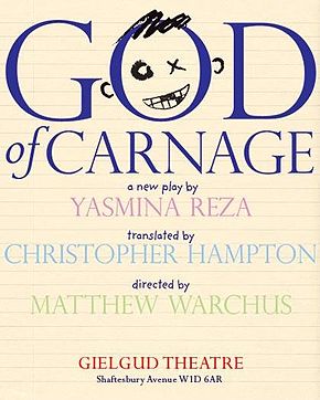
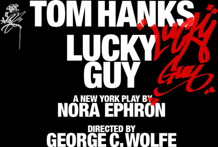
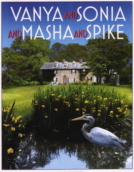
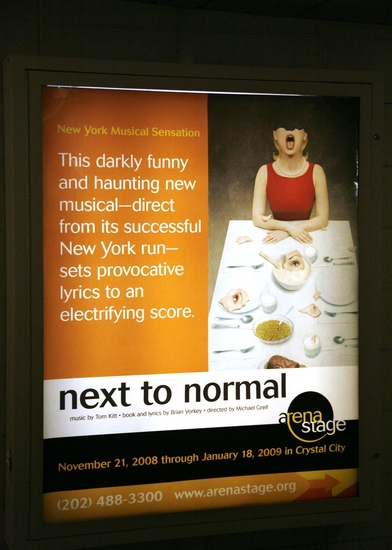
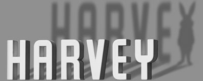
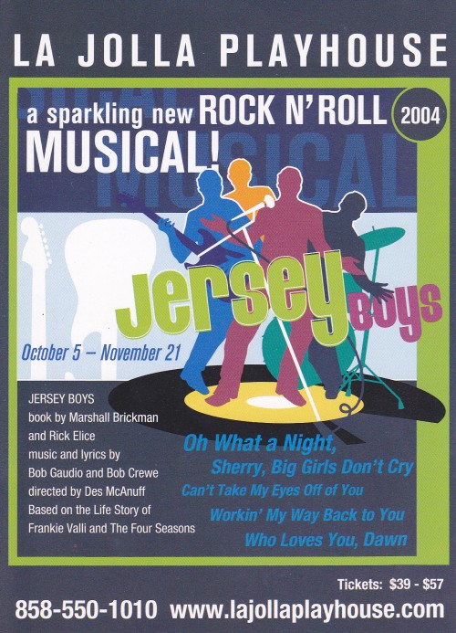
Some other London transfers I've found:
From the Menier Chocolate Factory


I'm not sure if JERUSALEM played the Royal Court with this artwork but this is the cover of their published version of the script:

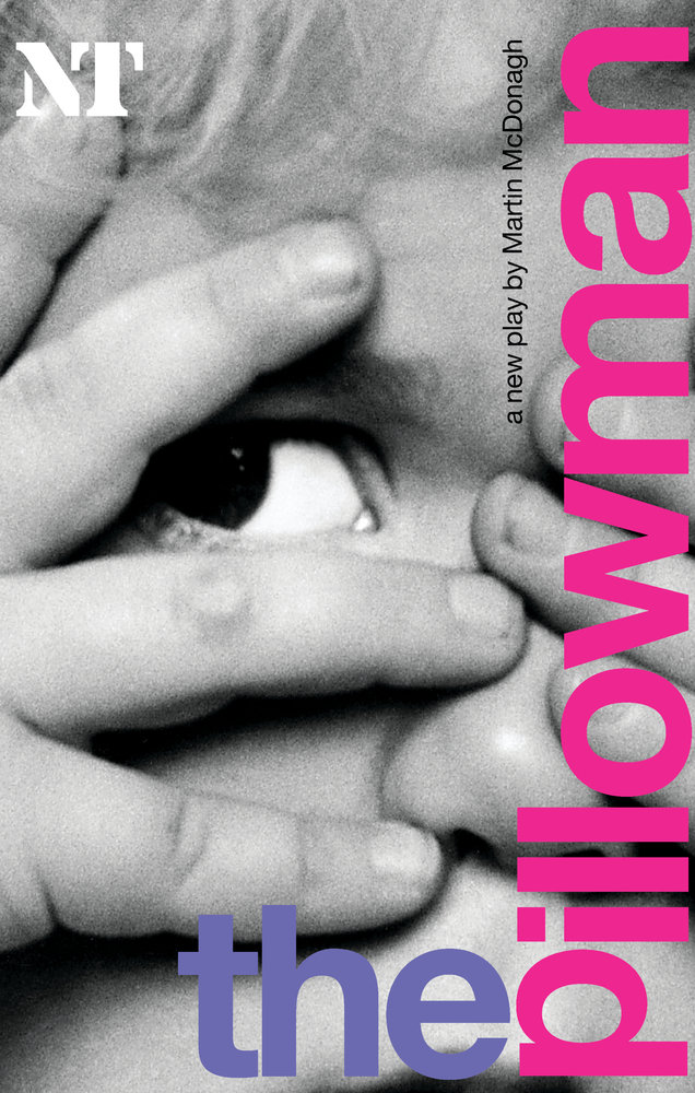
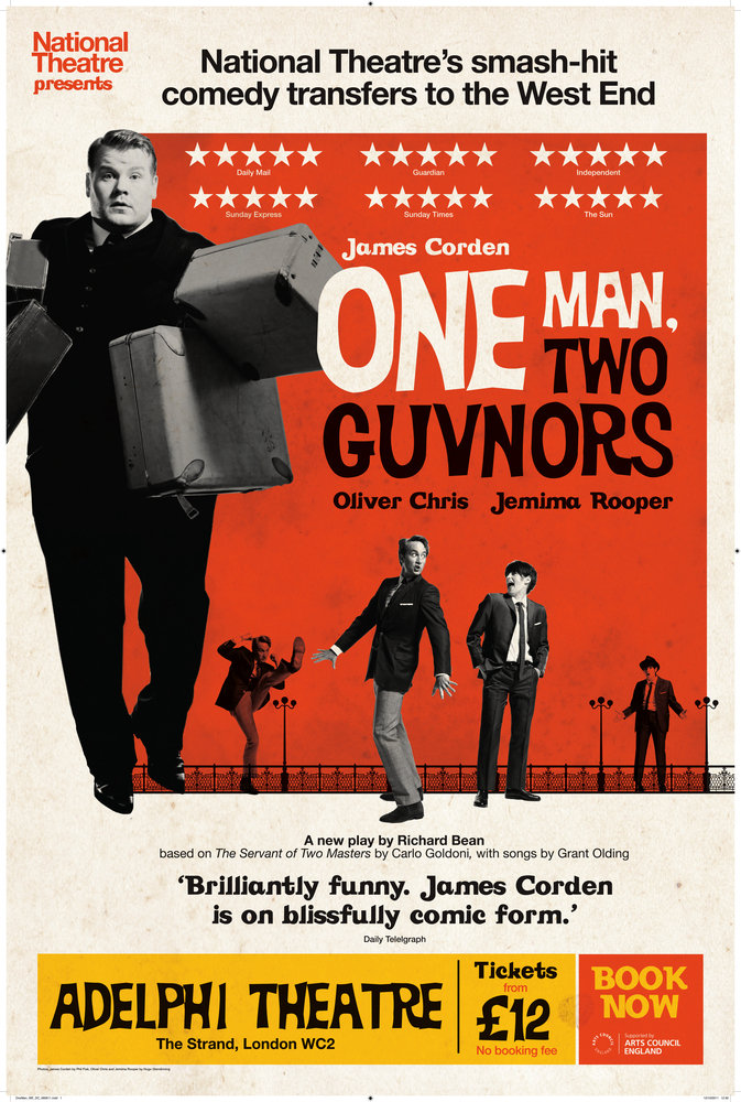
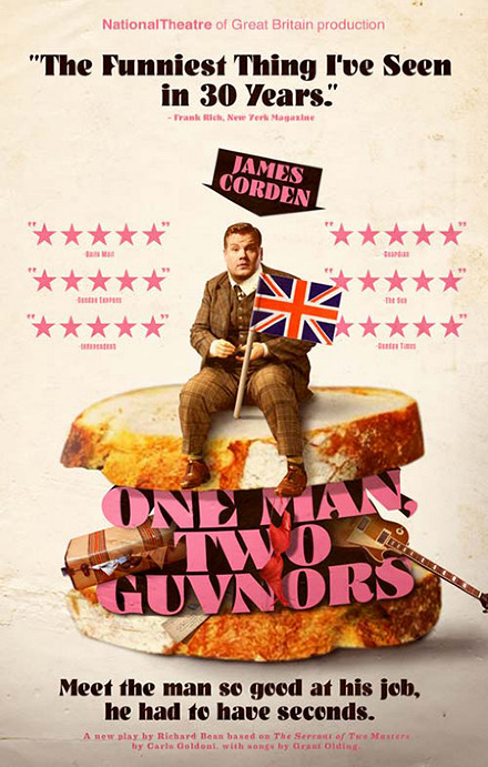
And lastly, in the National's inimitable style
Words don't deserve that kind of malarkey. They're innocent, neutral, precise, standing for this, describing that, meaning the other, so if you look after them you can build bridges across incomprehension and chaos. But when they get their corners knocked off, they're no good anymore…I don't think writers are sacred, but words are. They deserve respect. If you get the right ones in the right order, you can nudge the world a little.


















.jpg?format=auto&width=300)





