Roundabout's ANYTHING GOES Artwork
#25Roundabout's ANYTHING GOES Artwork
Posted: 7/8/10 at 11:18am
I liked the London artwork from 2003!

thats the CD case, but struggling to find a full poster for it.
THAT was a great production!
AnythingGoes2
Broadway Legend Joined: 12/30/08
#26Roundabout's ANYTHING GOES Artwork
Posted: 7/8/10 at 12:07pm
Shame the 2003 london show never transfered to Broadway.
Hate the logo, but as someone else said, its probably a working one and not the finished *hopes*
#27Roundabout's ANYTHING GOES Artwork
Posted: 7/8/10 at 12:38pmI really like the concept, I'm just not super crazy about the execution.
#28Roundabout's ANYTHING GOES Artwork
Posted: 7/8/10 at 1:16pm
chrissydee, I agree with you on the 2003 London production. Excellent cast, set,...
Before their West End transfer, when it was playing at the National Theatre, this was their artwork... Loved it: 
#29Roundabout's ANYTHING GOES Artwork
Posted: 7/8/10 at 5:16pmMisterMatt: I do believe they are going for overlapping luggage labels; the execution is a failure. Dead boring.
#30Roundabout's ANYTHING GOES Artwork
Posted: 10/5/10 at 8:41pm

New artwork from Roundabout's website. Also, the show's website (AnythingGoesOnBroadway.com) is not working for me so I can try to find a bigger version. Love the ways you can interpret that URL... lol.
What do you think? Any better than Roundabout's original? Probably. Wanna see a bigger version...
#31Roundabout's ANYTHING GOES Artwork
Posted: 10/5/10 at 8:52pm

wexy
Broadway Legend Joined: 9/19/05
#32Roundabout's ANYTHING GOES Artwork
Posted: 10/5/10 at 9:13pmOnce it opens, it will be in black and white anyways
#34Roundabout's ANYTHING GOES Artwork
Posted: 10/5/10 at 9:42pm
the pale blue "clipart" is the artwork that is currently on Broadway.com
Updated On: 10/5/10 at 09:42 PM
#36Roundabout's ANYTHING GOES Artwork
Posted: 10/5/10 at 10:58pm
That's worse than the first one, but at least they're trying.
Updated On: 10/7/10 at 10:58 PM
#36Roundabout's ANYTHING GOES Artwork
Posted: 10/7/10 at 11:49am
FYI, Roundabout has just launched a new Twitter feed @
http://twitter.com/#!/AnythingGoesRTC
which has confirmed that this is indeed temporary artwork.
#37Roundabout's ANYTHING GOES Artwork
Posted: 12/7/10 at 10:37pm
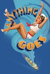
Well, I think they absolutely nailed it with this new artwork. Stunning, bright, apropos. I had no interest in this before, and suddenly I'm a little bit interested. Not a lot interested, mind you, but it's something.
#38Roundabout's ANYTHING GOES Artwork
Posted: 12/7/10 at 11:22pmI'm in LOVE with this poster. My interest in seeing this has blown through the roof! :)
#39Roundabout's ANYTHING GOES Artwork
Posted: 12/8/10 at 12:56amI think it's great too. Of course there are few Roundabout posters I don't like.
wexy
Broadway Legend Joined: 9/19/05
#41Roundabout's ANYTHING GOES Artwork
Posted: 12/8/10 at 10:51amThe Playbill will be black and white.
#42Roundabout's ANYTHING GOES Artwork
Posted: 12/8/10 at 1:54pmActually, wexy, that's solely an assumption. The Roundabout revival of BYE BYE BIRDIE - which played the Sondheim (then, the Henry Miller) - touted color playbills. Not every Roundabout entity is due in black-and-white.
#43Roundabout's ANYTHING GOES Artwork
Posted: 12/8/10 at 7:52pmFrom bad to worse. The title is an eyesore. And, ironically, Sutton looks utterly out of place and ill-lit.
#44Roundabout's ANYTHING GOES Artwork
Posted: 12/8/10 at 9:39pmI think it looks cutesy but i think they tried to overshoot it and make it look very 2010's instead of legit broadway artwork...and the golden title looks like its from the 70's.
#46Roundabout's ANYTHING GOES Artwork
Posted: 12/8/10 at 10:56pmI thought that was Katherine Heigl on the artwork
Videos
