Anyone who writes this off as just a wife cheating on her husband with a sexy man is really oversimplifying it.
"What in your opinion were the flaws in the campaign and how could they have improved?"
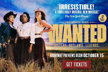
Whenever I would see the ad, I would get excited due to the people involved. However, whenever other people were in the room they would say things like "Um...so what is that about?" or "Why would they make a musical out of THAT movie?" or "That doesn't look particularly interesting". The colors were off, and people had no idea what the hell it was. People on these boards hated, I mean HATED the red color scheme initially used. The colors actually PISSED them off.
I hate the ads for Aladdin because it doesn't show anything. It just says what it is, and where it is, with some of the average score in the background. They don't show any actors, any sets, nothing. Of course I know the story, but the ads make me not want to see it. It's like, please show me something.
Some of the best ads I have ever seen in the past year were for Newsies and Kinky Boots. Fun, bright, full of dancing, shiny, fast paced. They showed the best parts of both shows, in a 30 second spot. Those ads made me excited to see those shows. Bridges has some humor, it has some dancing, and the lighting design is really beautiful. If they had shown any of that, perhaps the ad campaign would not have been such a terrible disaster.
wck.org