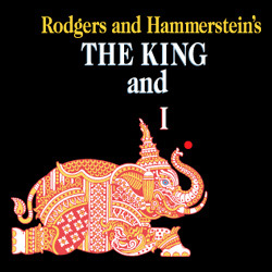
Of course it's beautiful! I will post a larger version if I find it
That's gorgeous! I generally love LCT's artwork though.
I too think it's very nice!
That poster is so beautiful that it could rank in the top 5 of the best THE KING AND I posters ever.
I hate their artwork for shows, ha. I'm sure it will be a gorgeous production though.
It's better than the artwork for Roundabout shows.
I love McMullan's artwork and this does not disappoint.
The style reminds me of the poster for Bernarda Alba - naturally, I love it.
Sally that is because it is by the same artist, like all (most) posters for Lincoln center
Classic and traditional. Very nice.
He also has his own website and a collection on Triton Gallery
http://jamesmcmullan.com/index.htm
I must be missing something...apparently I'm the only one though.
I think its nice, not amazing, but really nice. I however am SOOOO excited for this show!!! Kelli O'hara - Best Actress in a Leading Role in a Musical 2015 anybody?!
Broadway Legend Joined: 4/10/12
I think it's lovely and represents the previous artwork at LCT nicely. It has a grand american theater look to it.
Broadway Legend Joined: 7/18/11
Sorry but I don't get it. Stodgy and dreary and lifeless. I'm a fan of McMullan in general but can't get on board with this one.
Looks like it says The Kiny and I.
I prefer the last one.
Yikes! I've never actually seen the entire body of the elephant. It was usually cut off. It looks kind of weird like that.
Are the statues about the fall and topple over her?
The elephant poster for the 1990's productions have always bored me. I prefer the new artwork, the drop dead beautiful 1956 film poster, and the original Broadway production poster as well.
Broadway Legend Joined: 6/21/06
It looks like a horror movie... Clueless young woman walking into the dark while evil creatures await her
MM, is this the poster to which you are referring?
Yep, that's the one; my personal favorite poster of THE KING AND I. :)
Updated On: 9/26/14 at 02:27 AM
Yes, that one is lovely though I am still partial to the Original Broadway one and now this one.
After looking at it for a few minutes, I like it more. But I think a different typeface for the title would be an improvement for my taste. The image is stunning, but the title's styling bothers me too much.
Videos