 
 
 
There'll probably be a version with Matthew Broderick or Kelli O'Hara for bigger billboards and publicity... what do you think?
		     				
		     					
Broadway Legend Joined: 11/8/11
looks like a looney tunes title card, love it
Wait a minim' - shouldn't this be called THE GERSHWIN's NICE WORK IF YOU CAN GET IT?
		     			Holy cow, how many different fonts did they use? 
 
Too bad they don't have anything that represents the characters or story.  Perhaps that will come later?
		     						     						
Wow, too many different fonts.
I actually like it but I agree all the different fonts make it look busy.
		     			Oh...that's artwork...*avoids eye contact* 
		     				Updated On: 11/28/11 at 06:46 PM
		     					
Broadway Legend Joined: 11/23/05
Hooray! The Drowsy Chaperone is coming back....oh wait.
		     			
		     			It really does resemble the Looney Tunes logo. 
 
		     						     						
It's a bit much, but I'm sure it will calm down before it gets to the marquee.
		     			I agree that it needs a visual component of some kind that offers a better sense of the story, but otherwise I like it for the same Looney Tunes-esque reason offered above.  Given that they're basically telling us nothing of substance, it still gives some feeling of being a fun show. 
 
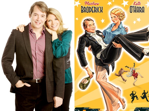
As near as I can tell, it's two fonts + the title treatment.  Looking at "Anything Goes" and "Porgy & Bess" -- period musicals with star billing (and shorter titles!) -- they seem to do the same, though the fonts are absolutely less florid so maybe less distracting.  If they can come up with some sort of iconic image/graphic -- and they really should -- then I think it will matter less.
		     						     						
		     			Duplicate post.  Very sorry. 
		     						     						
Meh.
I'd buy this cereal box.
Oh right, this is a thing.
lame. How is that poster supposed to help sell tickets? lame.
		     			What do you think?     


...I appreciate what they're going for, but it's ugly.


What do you think of the addition of the two stars in the poster?
		     				
		     					
		     			Here's the rest of it, which I think is fun.  Sort of looks like an MGM musical poster. 
  
		     						     						
I like the MGM musical version, maybe because it's more artwork and less crazy fonts overload. Then again, I like Kelli's face so yeah.
Videos