
New SPRING AWAKENING logo
bwayondabrain
Broadway Legend Joined: 5/20/05
#0New SPRING AWAKENING logo
Posted: 9/11/06 at 7:32pm
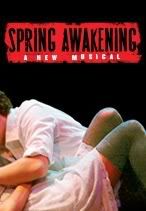
I dont know if this has been discussed, but I just saw this logo for SPRING AWAKENING on broadway.yahoo.com
So yeah...thoughts?
I personally like it- I think I liked the original better, though...

#1re: New SPRING AWAKENING logo
Posted: 9/11/06 at 7:44pmI'm very excited about this.
"Picture "The View," with the wisecracking, sympathetic sweethearts of that ABC television show replaced by a panel of embittered, suffering or enraged Arab women" -the Times review of Black Eyed
Julian2
Broadway Legend Joined: 8/10/06
#2re: New SPRING AWAKENING logo
Posted: 9/11/06 at 7:51pmI prefer the original.
I have several names, one is Julian2. I am also The Opps Girl. But cross me, and I become Bitch Dooku!

#3re: New SPRING AWAKENING logo
Posted: 9/11/06 at 7:55pmi wonder if this is a sign they are going to get rid of those awful chorded microphones?
Yankeefan007
Broadway Legend Joined: 3/20/04
i*heart*fame
Broadway Star Joined: 9/15/04
#5re: New SPRING AWAKENING logo
Posted: 9/11/06 at 8:06pmI actually like this logo better. It has sexual tension implicit in the logo and hints at the show; I hated the old logo.
"Don't thank your parents, if you were raised in a nurturing environment you wouldnt be in show business"--Conan O'Brien at the 2006 Emmy Awards

#6re: New SPRING AWAKENING logo
Posted: 9/11/06 at 8:07pmThis sounds kind of pervy but, this is really gunna go make some people go see it.

#7re: New SPRING AWAKENING logo
Posted: 9/11/06 at 8:13pmI'm excited about this show, but haven't heard any of the music from it. Does the show even have a proper website?

#8re: New SPRING AWAKENING logo
Posted: 9/11/06 at 8:23pmI like the concept, but that looks kind of photoshopped...

#9re: New SPRING AWAKENING logo
Posted: 9/11/06 at 8:24pmCan someone post the original?
i*heart*fame
Broadway Star Joined: 9/15/04
#10re: New SPRING AWAKENING logo
Posted: 9/11/06 at 8:28pm

here it is...
"Don't thank your parents, if you were raised in a nurturing environment you wouldnt be in show business"--Conan O'Brien at the 2006 Emmy Awards
#11re: New SPRING AWAKENING logo
Posted: 9/11/06 at 8:35pmI like the original colors better, but the graphic is creepy.

#12re: New SPRING AWAKENING logo
Posted: 9/11/06 at 8:36pmThose look like two very different shows.
#13re: New SPRING AWAKENING logo
Posted: 9/11/06 at 8:47pmThe original logo almost makes the play seem innocent, since the logo is of a creepy little girl. The new one definitely shows that it is a more "mature" show..and hey, sex sells!
Rotel1026
Broadway Star Joined: 8/12/06
#14re: New SPRING AWAKENING logo
Posted: 9/11/06 at 10:37pmI never really liked the original but can't say I like this new one much either. It does give a better idea about the sexual content of the show, but you'd figure they'd at least show faces.
#15re: New SPRING AWAKENING logo
Posted: 9/11/06 at 10:42pmYeah, when I saw the logo and then read what the show really was about, it was surprising, to say the least.
SDav 10495
Broadway Star Joined: 7/21/06
#16re: New SPRING AWAKENING logo
Posted: 9/11/06 at 10:50pm
I like the Victorian quality of the old one--the original logo is actually what made me interested in finding out what the show was about, and when I found out I was really excited--but I see why the sexuality of the new one better serves the show.
I'm gonna go out on a pervert limb here and say that I think the perfect balance between the two would be showing more of the Victorian girl in the old logo (she's clearly naked), kind of like it's creepy Victorian porn. That would at least allow the logo to keep some of the character that I think the new one lacks.
"If there is going to be a restoration fee, there should also be a Renaissance fee, a Middle Ages fee and a Dark Ages fee. Someone must have men in the back room making up names, euphemisms for profit."
(Emanuel Azenberg)
#17re: New SPRING AWAKENING logo
Posted: 9/11/06 at 10:53pmDuncan played a song he wrote for the show called "White Champagne" on the radio the other day and talked about how they are re-working the story for Broadway including adding music & whatnot. i'm not sure how i feel about that because i loved the songs from the Atlantic Theatre Company

Amneris
Broadway Legend Joined: 5/16/03
#18re: New SPRING AWAKENING logo
Posted: 9/11/06 at 10:58pmwell..let's figure it out this way, which would you rather like on your t-shirt?
Rotel1026
Broadway Star Joined: 8/12/06
#19re: New SPRING AWAKENING logo
Posted: 9/11/06 at 11:00pmBit off topic, but has there been any mention of when the cast recording is expected for this show?
#20re: New SPRING AWAKENING logo
Posted: 9/11/06 at 11:01pmthey said possibly a few weeks before it hits broadway if not the same week
i*heart*fame
Broadway Star Joined: 9/15/04
#21re: New SPRING AWAKENING logo
Posted: 9/11/06 at 11:02pmfolkyboy--I'm glad that they are tweaking it a bit. The ending at ATC was very unclear and should have been fleshed out. I enjoyed most of the songs, but felt as though the transitions needed work, as a whole, the musicalization of the show had faults, if that makes sense, even though I really liked the music. They will probably keep most of the songs but fix some plot/transition stuff.
"Don't thank your parents, if you were raised in a nurturing environment you wouldnt be in show business"--Conan O'Brien at the 2006 Emmy Awards
RentBoy86
Broadway Legend Joined: 2/15/05
#22re: New SPRING AWAKENING logo
Posted: 9/11/06 at 11:33pmI much prefer the older one. I like the new one, but I wish they'd use the same off-blue as the original. I feel like it just grasps your eye more. And the new one lacks something. Like, it just feels like there's something missing from it (and no, I don't mean their faces).

Someday
Featured Actor Joined: 4/4/06
#23re: New SPRING AWAKENING logo
Posted: 9/11/06 at 11:49pmThe lack of faces (Jersey Boys) or the use of cartoony faces (Altar Boyz) is the trend in theatrical logos. These types of logos use the human form (to which one's eyes are naturally drawn), while still allowing for endless cast changes, tours, and sit-downs.
bwayondabrain
Broadway Legend Joined: 5/20/05
#24re: New SPRING AWAKENING logo
Posted: 9/12/06 at 6:10am
yeah, i actually prefer the older logo as i said before- i think the girl seems kind of creepy in a weird sexual way...in a way that would make me interested in the show, though!
oh well
good luck to the show
Videos