PLAYBILL Covers of the 2018-2019 Season
hamiltonboys
Understudy Joined: 1/18/16
#50PLAYBILL Covers of the 2018-2019 Season
Posted: 9/23/18 at 10:51pm
I love The Prom's artwork too. Nice mix of modern/classic art styles.
#51PLAYBILL Covers of the 2018-2019 Season
Posted: 9/23/18 at 11:43pmI LOVE the Torch Song playbill
JON111699
Chorus Member Joined: 5/12/17
#53PLAYBILL Covers of the 2018-2019 Season
Posted: 10/3/18 at 11:55pm
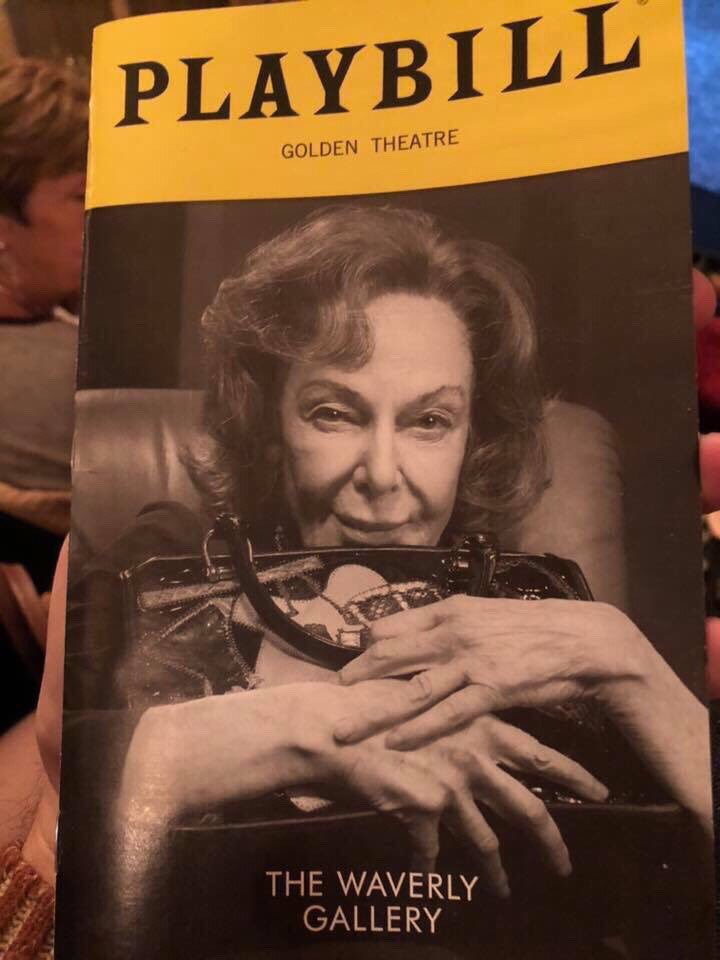
Here's The Waverly Gallery's new playbill:
natashalost
Broadway Star Joined: 1/15/18
VintageSnarker
Broadway Legend Joined: 1/30/15
#55PLAYBILL Covers of the 2018-2019 Season
Posted: 10/13/18 at 10:59pm
I love the one for The Cher Show. Now there's a cover with some personality. My only complaint is I wish it were a bit more fun but it's way ahead of the rest of the pack.
Ryantheatrekid
Chorus Member Joined: 11/10/17
#56PLAYBILL Covers of the 2018-2019 Season
Posted: 10/16/18 at 8:10pm
Head Over Heels has a new playbill cover
http://www.playbill.com/playbillpagegallery/playbill-cover-gallery?asset=00000161-47f6-d15f-aded-c7fee5430000&type=PlaybillCover
ilysespieces
Featured Actor Joined: 11/13/13
#57PLAYBILL Covers of the 2018-2019 Season
Posted: 10/16/18 at 8:13pm
Ryantheatrekid said: "
Head Over Heels has a new playbill cover
http://www.playbill.com/playbillpagegallery/playbill-cover-gallery?asset=00000161-47f6-d15f-aded-c7fee5430000&type=PlaybillCover
"
I really like the new one, personally I feel like it fits the show a little bit better.
#58PLAYBILL Covers of the 2018-2019 Season
Posted: 10/16/18 at 8:49pm

I understand the marketing team is trying to dull down the branding to make it more main stream, but they are stripping it of everything that makes it stand out. Toning down the Go-Go's, the queerness, hell, even tossing Peppermint off of the poster, is ludicrous for a show that is anything but a typical Broadway show. Trying to fake it will not help. This is infuriating to me as they're clearly trying to make something work, but this is the wrong direction. It's also just...ugly.
#59PLAYBILL Covers of the 2018-2019 Season
Posted: 10/16/18 at 8:57pm
It looks like they slapped a heart on top of that old Windows computer desktop picture. Cazwell, a famous gay rapper and close friend of Peppermint, Posted on his Instagram about the changes in marketing and now a bunch of people are buzzing about it. I had no idea that they were removing her.
LightsOut90
Broadway Legend Joined: 5/2/14
#60PLAYBILL Covers of the 2018-2019 Season
Posted: 10/17/18 at 1:12am
What I believe is now the THIRD version of the Playbill for The Waverly Gallery, yikes
Fanboy99
Understudy Joined: 2/23/18
#61PLAYBILL Covers of the 2018-2019 Season
Posted: 10/17/18 at 1:21am
The first Playbill for The Waverly Gallery was so beautiful!!! Why did they have to change it?!
saxpower
Featured Actor Joined: 9/14/16
#62PLAYBILL Covers of the 2018-2019 Season
Posted: 10/17/18 at 12:51pm
The newest Waverly is almost scary. I can't decide if the picture looks more like a wicked stepmother or one of the ladies from Arsenic and Old Lace. (Just so no one misinterprets- I am not bashing the actress' looks, just commenting about the picture (and the way they have her posed)).
Maybe they ditched the first one because it was "too pretty" given the plot of the play (a woman beginning to show signs of Alzheimer's and the effect on her family.)?
Unknown User
Joined: 12/31/69
#63PLAYBILL Covers of the 2018-2019 Season
Posted: 10/17/18 at 1:03pm
The Head Over Heels Playbill is weird. If they really wanted to use the new advertising why not use the artwork with the cast? This just looks photoshopped.
#64PLAYBILL Covers of the 2018-2019 Season
Posted: 10/17/18 at 1:40pm

#65PLAYBILL Covers of the 2018-2019 Season
Posted: 10/17/18 at 10:53pm
All I can say is: I sure am glad I saw THE WAVERLY GALLERY during its first week, when the Playbill still featured the show's artwork.
#66PLAYBILL Covers of the 2018-2019 Season
Posted: 10/17/18 at 11:11pmAnyone know if Wicked will be getting a special playbill for the 15th anniversary?
#67PLAYBILL Covers of the 2018-2019 Season
Posted: 10/24/18 at 12:43am
The Waverly Gallery has a new (and final) PLAYBILL design for this week and going into opening night. Looks fab.
Updated On: 10/24/18 at 12:43 AM#68PLAYBILL Covers of the 2018-2019 Season
Posted: 10/24/18 at 8:45am^^ anyone have a picture of it?? Can't wait to see the show next week. Crazy when it was Elaine May and the purse lol totally set the wrong vibe for the show I feel
#69PLAYBILL Covers of the 2018-2019 Season
Posted: 10/24/18 at 8:50am
I still prefer the playbill from the first week of previews, but this is definitely the best of all the production photo options.
Rainah
Broadway Star Joined: 11/24/16
#70PLAYBILL Covers of the 2018-2019 Season
Posted: 10/24/18 at 11:38am
Man have Waverly Gallery heard of mock ups or? Some way of deciding whether they like a photo before it goes to the printers?
Seeing The Prom playbills in person/as actual physical playbills is giving me mixed feelings about it. It's a LOT of whitespace. But as playbills usually have zero whitespace (or at least, it's never white), it does make them stand out.
VintageSnarker
Broadway Legend Joined: 1/30/15
#71PLAYBILL Covers of the 2018-2019 Season
Posted: 10/24/18 at 2:54pm
amazingamandakate said: "The Head Over Heels Playbill is weird. If they really wanted to use the new advertising why not use the artwork with the cast? This just looks photoshopped."
I agree. I can see an argument for the concept. The background is representative of the source material and the text is writing over that. So you've got this pastoral scene stamped over with slashing bold text and a bit more color. But it ends up just looking like cheap Photoshop. It's not specific enough.
If they wanted to reflect the setting, the easiest thing would be to show the cast so you could see their costumes. Also, they took away all the color and vibrancy and if there's anything the artwork should communicate, it's that this show is a fun time. This new art doesn't look fun.
carnzee
Broadway Star Joined: 9/2/11
#74PLAYBILL Covers of the 2018-2019 Season
Posted: 11/1/18 at 11:43am
GeorgeandDot said: "Wow that's awful."
I liked it, but I know these rehearsal picture playbills aren't everyone's cup of tea.
However, if Waverly Gallery is any guideline, it will change five more times and get progressively worse until opening.
Videos
