My Shows
News on your favorite shows, specials & more!
pixeltracker

PLAYBILL Covers of the 2018-2019 Season- Page 2

PLAYBILL Covers of the 2018-2019 Season

reginula Profile Photo

PLAYBILL Covers of the 2018-2019 Season#25

Posted: 8/31/18 at 4:28pm

I wish Nicolette Robinson's Waitress Playbill was full color. Still, I love the photo they picked.

 PLAYBILL Covers of the 2018-2019 Season


VotePeron Profile Photo

PLAYBILL Covers of the 2018-2019 Season#26

Posted: 8/31/18 at 5:46pm

The Nap's playbill/artwork baffles me, it's so bad. It's called "The Nap" but is written on giant flashy marquee letters, and sitting on top of a pool table? What?

(Also, not really feeling the new Waitress cover. I wish they had chosen a different picture, it looks a bit forced/awkward to me)

PLAYBILL Covers of the 2018-2019 Season#27

Posted: 8/31/18 at 6:01pm

VotePeron said: "The Nap's playbill/artwork baffles me, it's so bad. It's called "The Nap" but is written on giant flashy marquee letters, and sitting on top of a pool table? What?

(Also, not really feeling the new Waitress cover. I wish they had chosen a different picture, it looks a bit forced/awkward to me)
"

The Nap is a term in the game of Snooker which is what the play is based around. 

quizking101 Profile Photo

PLAYBILL Covers of the 2018-2019 Season#28

Posted: 8/31/18 at 7:43pm

I honestly love the Waitress changes it’s cover to reflect every actress in the role, even the non-major celebrities


Check out my eBay page for sales on Playbills!! www.ebay.com/usr/missvirginiahamm

VotePeron Profile Photo

PLAYBILL Covers of the 2018-2019 Season#29

Posted: 8/31/18 at 8:28pm

LightsOut90 said: "VotePeron said: "The Nap's playbill/artwork baffles me, it's so bad. It's called "The Nap" but is written on giant flashy marquee letters, and sitting on top of a pool table? What?

(Also, not really feeling the new Waitress cover. I wish they had chosen a different picture, it looks a bit forced/awkward to me)
"

The Nap is a term in the game of Snooker which is what the play is based around.
"

Oh WHOA. Genuinely didn’t know that. And genuinely not anymore interested to see it knowing this vs. when I thought the play was literally about taking a nap. 

Elegance101 Profile Photo

PLAYBILL Covers of the 2018-2019 Season#30

Posted: 8/31/18 at 8:44pm

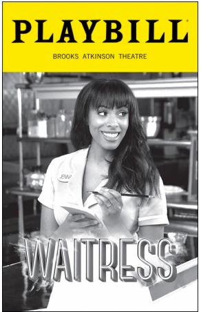
Agreed that Nicolette's photo looks a little posed. I also love how each Playbill is personalized, but I wish hers looked more chill, like previous Jennas.

The Lifespan of a Fact looks so bad. I hate how they just took photos of the actors on red carpets or any random photo they found on Google Images and just pasted it onto the cover, it doesn't look great.

I think if you want to cut costs and print in black and white, you should design a Playbill cover that looks good in black and white. Even though not everyone likes Scott Rudin's Playbill covers, he always seems to have them designed in black and white so they don't look cheap. The Waitress ones can run into this problem, they look cheap in black and white. Same goes with The Nap.

PLAYBILL Covers of the 2018-2019 Season#31

Posted: 9/5/18 at 1:51pm

Anybody know of a 'King King' or 'The Prom' playbills yet?

WayTooBroadway Profile Photo

PLAYBILL Covers of the 2018-2019 Season#32

Posted: 9/12/18 at 3:56pm

PLAYBILL Covers of the 2018-2019 Season

PLAYBILL Covers of the 2018-2019 Season

PLAYBILL Covers of the 2018-2019 Season


"When the audience comes in, it changes the temperature of what you've written." -Stephen Sondheim

YvanEhtNioj Profile Photo

PLAYBILL Covers of the 2018-2019 Season#33

Posted: 9/12/18 at 4:00pm

Not feeling the King Kong design or The Prom. 

The Prom should've just have the Sign with the hand holding it. 


I should’ve been Blac Chyna.

Call_me_jorge Profile Photo

PLAYBILL Covers of the 2018-2019 Season#34

Posted: 9/12/18 at 4:07pm

King Kong starting off with the black and white, i see. Haha.


My father (AIDS) My sister (AIDS) My uncle and my cousin and her best friend (AIDS, AIDS, AIDS) The gays and the straights And the white and the spades

IdinaBellFoster Profile Photo

PLAYBILL Covers of the 2018-2019 Season#35

Posted: 9/12/18 at 4:12pm

I LOVE the AMERICAN SON playbill. 


"Oh look at the time, three more intelligent plays just closed and THE ADDAMS FAMILY made another million dollars" -Jackie Hoffman, Broadway.com Audience Awards

PLAYBILL Covers of the 2018-2019 Season#36

Posted: 9/12/18 at 4:20pm

Call_me_jorge said: "King Kong starting off with the black and white, i see. Haha."

I think you intended for this comment to be a joke, but come on now. The show hasn't started performances yet, so no one really knows if it's going to be a good show or a bad show!

Honestly, I really like these new covers. The Prom is cute and fun, and American Son also has a pretty amazing design! I'm actually excited for what this season has in store...

YvanEhtNioj Profile Photo

PLAYBILL Covers of the 2018-2019 Season#37

Posted: 9/12/18 at 4:21pm

Call_me_jorge said: "King Kong starting off with the black and white, i see. Haha."

The shade.. lol


I should’ve been Blac Chyna.

CATSNYrevival Profile Photo

PLAYBILL Covers of the 2018-2019 Season#38

Posted: 9/12/18 at 4:26pm

I like the King Kong artwork except for the hidden girl. I get what they were going for and it harkens back to the simple, clever 80s mega musical designs from Dewynters but the shape of the girl is too cartoonish.

VotePeron Profile Photo

PLAYBILL Covers of the 2018-2019 Season#39

Posted: 9/12/18 at 4:27pm

I like the pictures on the American Son playbill, but the middle banner doesn't fit with the other pieces. It feels like someone made it in a collage app. It'll be beautiful I'm sure, but I wish it was maybe angled or something more interesting.

YvanEhtNioj Profile Photo

PLAYBILL Covers of the 2018-2019 Season#40

Posted: 9/12/18 at 4:37pm

I feel like either of these would have looked so much better. 

Artwork 1

Artwork 2


I should’ve been Blac Chyna.

BroadwayRox3588 Profile Photo

PLAYBILL Covers of the 2018-2019 Season#41

Posted: 9/12/18 at 8:34pm

I really love the American Son cover! The colors really pop!

PLAYBILL Covers of the 2018-2019 Season#42

Posted: 9/13/18 at 4:03pm

Bernhardt/Hamlet is a little stylish. The others in that post are not worth commenting on.

I wish Waitress was full color but I agree that it's nice that each Jenna gets to do her own thing rather than copying the last cover.

I don't get American Son. Why is Pasquale's face slightly distorted? Nothing against the colors/lighting. I just don't get how these could be the best photos they have to choose from. 

The Prom is... a choice. I don't love it but at least they made a choice.

King Kong is so bland. Especially since they showed off some of their artwork choices.

PLAYBILL Covers of the 2018-2019 Season#43

Posted: 9/13/18 at 4:15pm

I wouldn't mind The Prom if it wasn't aligned so oddly. The art reminds me of classic animation storyboards - whether that does anything for the show's actual live aesthetic, I couldn't say.

LOVE the American Son colors for the promotional shots, etc., but I agree with VotePeron that it looks like it was stitched together in a collage app. The center strip doesn't make sense visually. I wish they would've used this promo shot from the chest up then put the title in the blank space.

I kind of like the King Kong one because it reminds me of some old-fashioned, decades-old playbill you'd find in a bin at a thrift store, but it doesn't make me want to rush to the theater. They had way better options, ones that wouldn't have been so bland.

PLAYBILL Covers of the 2018-2019 Season#44

Posted: 9/13/18 at 4:30pm

YvanEhtNioj said: "I feel like either of these would have looked so much better.

Artwork 1

Artwork 2
"

I don't mind the one they went with - it's fine. but Artwork 1 there is so much more grand and impactful. What a pity.

Also - their instagram is very.... grey, isn't it?

Updated On: 9/13/18 at 04:30 PM

PLAYBILL Covers of the 2018-2019 Season#45

Posted: 9/13/18 at 6:38pm

Taking a look at King Kong again, another thing that bothers me is that the eye doesn't focus easily. It's not just the female figure but the moon/spotlight and how the gorilla blends into the background in a few spots. It's like an optical illusion where the eye can't settle. 

I don't mind a graphic, more iconic design. Lion King is brilliant. Phantom works. This doesn't. It takes me a second to see the gorilla, then my eye focuses on the woman, then I sort of lose the shape of the gorilla and focus on the moon/spotlight space. And it all repeats.

GeorgeandDot Profile Photo

PLAYBILL Covers of the 2018-2019 Season#46

Posted: 9/13/18 at 8:07pm

The artwork on The Prom reminds me of the original The Music Man artwork for some reason. I kind of love it.

PLAYBILL Covers of the 2018-2019 Season#47

Posted: 9/23/18 at 1:43pm

Wow. LOVE this.

PLAYBILL Covers of the 2018-2019 Season

asoftplacetoland Profile Photo

PLAYBILL Covers of the 2018-2019 Season#48

Posted: 9/23/18 at 4:49pm

Call me crazy but I’m really digging THE PROM playbill.

I agree with a previous poster that King Kong is a little confusing to look at. I get what they were going for but it just doesn’t deliver. Very underwhelming.

PLAYBILL Covers of the 2018-2019 Season#49

Posted: 9/23/18 at 6:35pm

They nailed that Torch Song cover.


Videos


TICKET CENTRAL
Hot Show
Tickets From $59
Hot Show
Tickets From $77
Hot Show
Tickets From $70
Hot Show
Tickets From $59