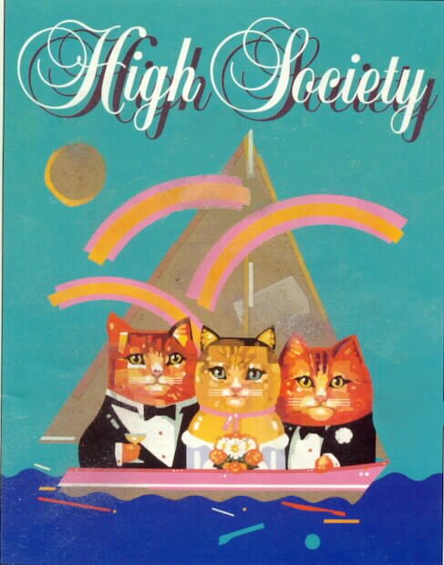
Posted: 11/11/09 at 4:47pm
Posted: 11/11/09 at 4:48pm
Posted: 11/11/09 at 4:51pm
Updated On: 11/11/09 at 04:51 PM
Posted: 11/11/09 at 4:54pm
Posted: 11/11/09 at 4:56pm
Posted: 11/11/09 at 4:58pm
KidPix?
Posted: 11/11/09 at 5:13pm
Posted: 11/11/09 at 5:43pm
Posted: 11/11/09 at 6:39pm
Posted: 11/11/09 at 7:06pm
Also, there's not much I find creepier than animals dressed like humans. D:
Posted: 11/11/09 at 8:02pm
Posted: 11/11/09 at 8:20pm
I like a lot of the graphics that most of you on here don't like, I think you guys are a little more traditional for the most part and I like the tradition and modern type stuff.
Posted: 11/11/09 at 8:22pm
Posted: 11/11/09 at 8:23pm
The Times New Roman lettering?
Or the photo of Bostwick, Gleason and the dog?
Or the tiny font of credits?
P
Posted: 11/11/09 at 8:24pm
Unless it was supposed to be about mentally challenged teenagers who got crayon therapy.
Posted: 11/11/09 at 8:27pm
That was uncalled for and inappropriate.
Posted: 11/11/09 at 8:30pm
Posted: 11/11/09 at 11:37pm
One of my theater professors in college did the lighting design for HIGH SOCIETY and he showed us the poster of the cats as an example of horrible design!
I didn't even remember that until I saw this thread!
Everything in life is only for now. ~ Avenue Q
There is no future, there is no past. I live this moment as my last. ~ Rent
Posted: 11/11/09 at 11:52pm
The Times New Roman lettering?
It's not Times New Roman. It looks more like Bordeaux Roman, though not exactly because the "R" is different.
Posted: 11/12/09 at 10:32am

I never really understood the High Society artwork, but I didn't necessarily hate it. But as far as Broadway poster designs go, I don't think I can recall anything worse than Waiting in the Wings, which makes Nick and Nora look like creative genius.
BroadwayWorld TV
