Side Show Artwork
jacobsnchz14
Broadway Legend Joined: 12/13/06

#52Side Show Artwork
Posted: 8/25/14 at 11:55pm
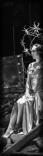
Wow, thanks guys! Also, CATSNYrevival here's my version of a cast recording cover, even though jacobsnchz14 posted a really nice one, that sorta looks like it. Enjoy.
#53Side Show Artwork
Posted: 8/25/14 at 11:57pmThat's amazing work. You should work in the poster/logo department.
#54Side Show Artwork
Posted: 8/26/14 at 1:10am
It always amazes me when the fine people of BroadwayWorld are able to create poster art so vastly superior to the professional versions. They look great, and so much better!
Keeping BroadwayWorld Illustrated
Updated On: 8/26/14 at 01:10 AM
mjohnson2
Broadway Star Joined: 11/2/13
#55Side Show Artwork
Posted: 8/26/14 at 3:13amthemonkeybananaking, wow that is very impressive work. The "O" still drives me crazy, though.
Anything regarding shows stated by this account is an attempt to convey opinion and not fact.
#56Side Show Artwork
Posted: 8/26/14 at 2:05pmThe majority of the letters are heavier on the left side than they are on the right side. It's just the type set they chose. The shape of the "O" probably wasn't even altered. It's just the style.
#57Side Show Artwork
Posted: 8/26/14 at 3:23pm
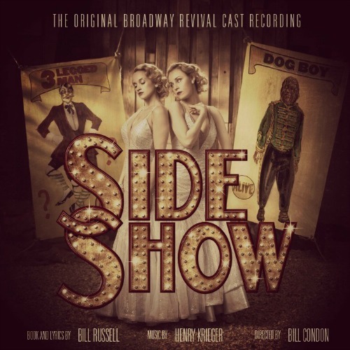
The producers are doing exactly what they should be with this show. The artwork is mainstream, bright, but with a hint of seriousness in the expressions of the sisters.
To be honest, I think the whole look is very confident and iconic. It projects being a hit.
that image is going to be on bus shelters and billboards. As much as I like what themonkeybananaking came up with, sepia toned artwork with multiple images to absorb wouldn't make anywhere near the impression that the official art does.
#58Side Show Artwork
Posted: 8/26/14 at 4:14pmI'm not arguing that their artwork isn't in their best interest. It's certainly Broadway and it may attract the eye, but it doesn't represent what the show actually is and their effort to hide the circus element is obvious and absurd given the popularity of Pippin.
Up In One
Broadway Star Joined: 5/27/04
#59Side Show Artwork
Posted: 8/26/14 at 4:28pm^ Circus elements? SideShow is character driven, folks who gravitated to Pippin because of the circus acts would be sorely disappointed if they went to SideShow for side show acts.
Up In One
#60Side Show Artwork
Posted: 8/26/14 at 4:39pm
They're distilling it down to the two sisters. Period. And I'm glad you agree that the artwork is in the shows best interest.
Has Les Mis been misleading the public for 25 years using Cosette as its trademark? Do people think they're going to see the French Annie?
Liza's Headband
Broadway Legend Joined: 5/28/13
#61Side Show Artwork
Posted: 8/26/14 at 4:43pm
...but with a hint of seriousness in the expressions of the sisters.
Really? You can pick that up with only less-than-half of their faces appearing in the artwork?
#62Side Show Artwork
Posted: 8/26/14 at 5:10pm
Definitely. Put the two symmetrical sides together and you have single face ![]() But yes, though it is subtle, they're expressions are at best pensive. They're clearly not glorying from the footlights.
But yes, though it is subtle, they're expressions are at best pensive. They're clearly not glorying from the footlights.
mjohnson2
Broadway Star Joined: 11/2/13
#63Side Show Artwork
Posted: 8/26/14 at 9:25pm

higher quality image of the artwork
Anything regarding shows stated by this account is an attempt to convey opinion and not fact.
Updated On: 8/26/14 at 09:25 PM
#65Side Show Artwork
Posted: 8/26/14 at 10:27pm
At the higher resolution I must say I like it a bit better. There were parts I missed at first glance, like their melancholy faces and the way they're holding hands.
It's still a bit flashy and bright for my taste, but perhaps I should not have judged it so harshly at first glance.
But that tagline has GOT to go. Anything else but that.
Keeping BroadwayWorld Illustrated
Updated On: 8/26/14 at 10:27 PM

ggersten
Broadway Legend Joined: 5/11/06
#66Side Show Artwork
Posted: 9/26/14 at 5:14pm
I'm not certain this TV spot sells the show very well. It is designed to draw in people who loved the films of Chicago and Dreamgirls and are not familiar with the show - but doesn't explain what makes the sisters special. I found the jump in the music also odd and ineffective.
TV Spot
Updated On: 9/26/14 at 05:14 PM
#67Side Show Artwork
Posted: 9/26/14 at 6:06pm
I think neglecting to acknowledge their condition is a bit odd. Although, how can you do it delicately? They hint but don't really say anything about the show except what other shows it has connections to.
It makes it look more like just another story about two random sisters who are very close trying to get their big break.
Keeping BroadwayWorld Illustrated
RippedMan
Broadway Legend Joined: 8/14/05
#68Side Show Artwork
Posted: 9/27/14 at 1:43amEven just explaining the show to friends, they find it interesting to have a theater piece with conjoined twins. I think it would be smart to play that up. It's kind of a spectacle in itself.
Videos