

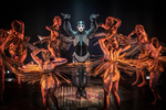
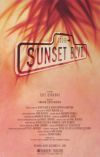
Side Show Artwork

Tag
Broadway Legend Joined: 11/19/05
#1Side Show Artwork
Posted: 8/25/14 at 1:30am

With possibly the worst tagline "It will never leave you".
Via Deadline
jacobsnchz14
Broadway Legend Joined: 12/13/06

#2Side Show Artwork
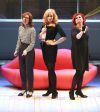
Posted: 8/25/14 at 3:03amThis is the first I've seen it with the twins included. It's so flashy and so vastly different from the look of this production. It's like the show is one thing and the artwork suggests it to be something completely different which could work to get butts in the seats initially but I just don't know if it will work in the long run. Maybe they didn't want it to look too circus like and have people confuse it with The Elephant Man which has very beautiful side show like artwork.
mjohnson2
Broadway Star Joined: 11/2/13
#3Side Show Artwork
Posted: 8/25/14 at 3:11amIt certainly looks nicer with the artwork, but that "O" still drives me crazy every time I look at it. So pointless and ugly.
Anything regarding shows stated by this account is an attempt to convey opinion and not fact.
#4Side Show Artwork
Posted: 8/25/14 at 6:52am"It will never leave you" sounds like the tagline for a horror movie to me. They should use, "I will never leave you" instead.
"What was the name of that cheese that I like?"
"you can't run away forever...but there's nothing wrong with getting a good head start"
"well I hope and I pray, that maybe someday, you'll walk in the room with my heart"
#5Side Show Artwork
Posted: 8/25/14 at 7:30amI have mixed feelings about this artwork. The lettering doesn't really bother me but when you put it with the silhouetted twins it kind of looks a bit cheap to me. And I agree that tagline has got to go. Using the word "It" implies that they are less than human, they are freaks which in my opinion is completely opposite what the show stands for. Also this is not the only artwork to feature the twins, both the La Jolla and Kennedy Center artwork did as well. I understand with this artwork they were trying to go for the "glitz and glamour" but I think in this case it was a misfire.
#6Side Show Artwork
Posted: 8/25/14 at 7:37amBy "it" I don't think they are referring to any particular person, they are referring to the show. i.e., The show will never leave you.
"You can't overrate Bernadette Peters. She is such a genius. There's a moment in "Too Many Mornings" and Bernadette doing 'I wore green the last time' - It's a voice that is just already given up - it is so sorrowful. Tragic. You can see from that moment the show is going to be headed into such dark territory and it hinges on this tiny throwaway moment of the voice." - Ben Brantley (2022)
"Bernadette's whole, stunning performance [as Rose in Gypsy] galvanized the actors capable of letting loose with her. Bernadette's Rose did take its rightful place, but too late, and unseen by too many who should have seen it" Arthur Laurents (2009)
"Sondheim's own favorite star performances? [Bernadette] Peters in ''Sunday in the Park,'' Lansbury in ''Sweeney Todd'' and ''obviously, Ethel was thrilling in 'Gypsy.'' Nytimes, 2000
#7Side Show Artwork
Posted: 8/25/14 at 7:40amI think it's a bit too "Frank Marino's Divas", especially for a musical that's pretty hard going but I guess that could be why they're going for a lighter approach for the poster?
#8Side Show Artwork
Posted: 8/25/14 at 7:44am
If their arms were up it'd be DREAMGIRLS.
That tag line implies that something will never leave you, i.e. haunt you. Like herpes. It's horrible. It doesn't spark interest or make you curious. It says "RUN AWAY AND DON'T LOOK BACK!"
"The Spectacle has, indeed, an emotional attraction of its own, but, of all the parts, it is the least artistic, and connected least with the art of poetry. For the power of Tragedy, we may be sure, is felt even apart from representation and actors. Besides, the production of spectacular effects depends more on the art of the stage machinist than on that of the poet."
--Aristotle
--Aristotle
#9Side Show Artwork
Posted: 8/25/14 at 7:49am"Come look at the freaks" would be a better tag line if they paired it with artwork that shows the misshapen circus performers, but in elegant poses so you glimpse into these "freaks'" inner beauty.
"The Spectacle has, indeed, an emotional attraction of its own, but, of all the parts, it is the least artistic, and connected least with the art of poetry. For the power of Tragedy, we may be sure, is felt even apart from representation and actors. Besides, the production of spectacular effects depends more on the art of the stage machinist than on that of the poet."
--Aristotle
--Aristotle
#11Side Show Artwork
Posted: 8/25/14 at 8:31am
Hate the tag line (it sounds like a threat).
Love the poster/artwork.
....but the world goes 'round
Tag
Broadway Legend Joined: 11/19/05
#12Side Show Artwork
Posted: 8/25/14 at 10:40amYes I think the "it" is referencing the show itself and not the twins. But if someone took it that way, then yes it fails as a tagline.
#13Side Show Artwork
Posted: 8/25/14 at 10:44amI love it.
"There’s nothing quite like the power and the passion of Broadway music. "
#14Side Show Artwork
Posted: 8/25/14 at 10:53amIt's not so much the actual image I have a problem with. It just doesn't really seem to fit the dark tone of the show. It would be more fitting to use the Kennedy Center artwork or something darker.
Up In One
Broadway Star Joined: 5/27/04
#15Side Show Artwork
Posted: 8/25/14 at 11:15amThe dark and ominous marketing of the original is probably what kept it from gaining a wider audience the first time around. This plays up on an aspect of the show when they were headliners. Dreamgirls didn't play up on its darker side in its advertising and Dreamgirls was no Motown walk in the park. It's best side was dark and about Effie's self destruction and abandonment.
Up In One
Liza's Headband
Broadway Legend Joined: 5/28/13
#17Side Show Artwork
Posted: 8/25/14 at 11:41amIt looks like Beautiful.
"This thread reads like a series of White House memos." — Mister Matt
#18Side Show Artwork
Posted: 8/25/14 at 11:56am
I don't get how it looks like BEAUTIFUL except they are both in the yellow/gold colors for background.
Updated On: 8/25/14 at 11:56 AM
RippedMan
Broadway Legend Joined: 8/14/05
#19Side Show Artwork
Posted: 8/25/14 at 12:37pmWell, the Elephant Man beat them to it with a better design theme. So now we get a rehash of Dreamgirls. Which makes 0 sense.

Smaxie
Broadway Legend Joined: 9/26/05
#20Side Show Artwork
Posted: 8/25/14 at 12:40pmSeamgirls?
Begin at the beginning and go on till you come to the end: then stop.
#21Side Show Artwork
Posted: 8/25/14 at 12:42pmThread over.
"This thread reads like a series of White House memos." — Mister Matt
greensgreens
Broadway Star Joined: 10/14/09
#22Side Show Artwork
Posted: 8/25/14 at 1:56pm
It looks like the designs for the Dreamgirls movie, which were cool, but totally appropriate for that show specifically. Using the same concept (even adopting a lyric line for the tag) is not going to work. These sisters never worked the club circuit, did they? Or maybe they're trying to downplay the rather dark elements, but that seems silly...
I am utterly confused as to why they didn't take some tips from American Horror Story and jump on that Freak Show bandwagon a bit with the design. Even if it looked slightly like The Elephant Man (which I highly doubt people are going to confuse this with), that would sell tickets. Sometimes, moreso lately than in the past, I just don't understand show marketing anymore. It used to be about creating lasting images evocative of the production (i.e. the Phantom's mask and rose) - but not such a direct translation. I can't even remember when the last time I saw a good succinct logo that was up there with the Dewynters work of the 80s and 90s.

#23Side Show Artwork
Posted: 8/25/14 at 2:04pmI really like it. I agree that "It" seems to be about the show, like once you see the show it will really stick with you, not about a particular person our character. I love the poster itself. Beautiful. I can't wait to see it!!
#24Side Show Artwork
Posted: 8/25/14 at 2:07pm

"I am utterly confused as to why they didn't take some tips from American Horror Story and jump on that Freak Show bandwagon a bit with the design."
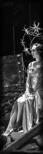
Agree 100%. This is the photo that made me want to see the show at the Kennedy Center. Even if they wanted to use an image of just the girls, I'm much more intrigued by their creepy doll look earlier in the show, as in this photo, than the generic '20s showbiz look they went with on the poster. I don't think the poster is horrible in and of itself, but if I didn't know anything about the show, it would not spark my interest in the least. And it would not even enter my mind to think they were conjoined; they just look like two blond ladies standing next to each other. I get wanting to play up the glitzy side of the show to attract audiences, but I have to imagine there are others who would be more attracted to the "freak" aspects. Shouldn't there be at least some attempt to attract not just ANY audience, but an audience that will actually like the show?
Updated On: 8/25/14 at 02:07 PM