
RENT - OBCR Cover or New Movie Poster(?)
Rentaholic2
Broadway Legend Joined: 3/14/04
#0RENT - OBCR Cover or New Movie Poster(?)
Posted: 8/5/05 at 1:14amWhich do you prefer if you know what I'm talking about. The new poster (or atleast what was at the today show) has richer color and more defined pictures...a little less artsy and sketchy. I can't decide, I like them both so much.

Marquise
Broadway Legend Joined: 6/1/04
#1re: RENT - OBCR Cover or New Movie Poster(?)
Posted: 8/5/05 at 1:35am
They're both great because they have ONE THING IN COMMON.
They have IDINA in BOTH!
YaaaaaaaaaaaaaaaaaaaY!!! IdiNA RoXX!!!!!! You GotTA <3 HeR!!!

#2re: RENT - OBCR Cover or New Movie Poster(?)
Posted: 8/5/05 at 1:41amI personally like the OBC one better, but the Movie one is really nice also. The OBC one just seems so much more grittier and more real. I dunno if u know what I mean, haha.

#3re: RENT - OBCR Cover or New Movie Poster(?)
Posted: 8/5/05 at 1:42amThe movie one is on my other thread, for those of you who haven't seen it (The Rent picture one): https://forum.broadwayworld.com/readmessage.cfm?lastpage=on&thread=862163&dt=080505013042
Updated On: 8/5/05 at 01:42 AM
Marquise
Broadway Legend Joined: 6/1/04
#4re: RENT - OBCR Cover or New Movie Poster(?)
Posted: 8/5/05 at 1:43amNo I don't. Ha Ha. Tee Hee. *Burp*
Marquise
Broadway Legend Joined: 6/1/04
#5re: RENT - OBCR Cover or New Movie Poster(?)
Posted: 8/5/05 at 1:44amThenard, the pic has been ciculating on the web since this afternoon. EVERYONE who iz ANYONE has seen it!!!!!
#6re: RENT - OBCR Cover or New Movie Poster(?)
Posted: 8/5/05 at 1:46am
I'm sorry.
I was at Bryant Park all day.

And have a billion of the damn posters.
Updated On: 8/5/05 at 01:46 AM
Marquise
Broadway Legend Joined: 6/1/04

#8re: RENT - OBCR Cover or New Movie Poster(?)
Posted: 8/5/05 at 1:50am
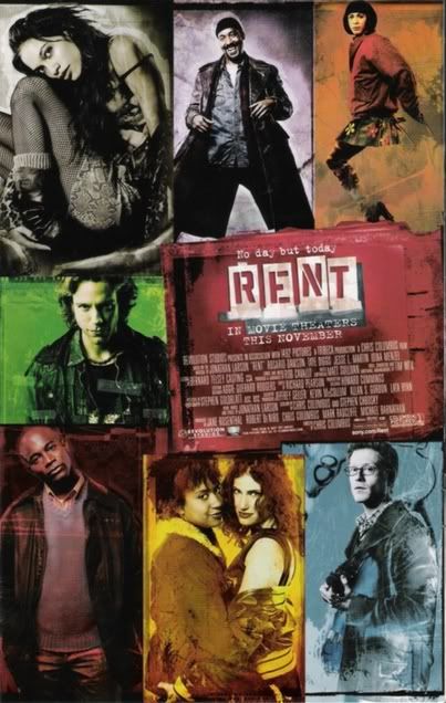
![]()
I like mine...with Tracie and Idina together...and Idina is grabbing Tracie's booty
Marquise
Broadway Legend Joined: 6/1/04
#9re: RENT - OBCR Cover or New Movie Poster(?)
Posted: 8/5/05 at 1:51amI like yours too because ROSARIO GOT TOP BILLING!!! YaaaaaaaY ROSARIO!!!! she's THE STAR!!!!! :P
Marquise
Broadway Legend Joined: 6/1/04
#11re: RENT - OBCR Cover or New Movie Poster(?)
Posted: 8/5/05 at 2:00am
Yesssssssssss! Rosario gets Top Billing!!
It should have read:

janvier_neige
Swing Joined: 10/2/04
#12re: RENT - OBCR Cover or New Movie Poster(?)
Posted: 8/5/05 at 3:24am
it's in alphabetical order, from what i can make out. dawson. diggs. martin. menzel. but apparently, anthony, adam, wilson, and tracie aren't really in the movie. it's all a ploy! ![]()
Updated On: 8/5/05 at 03:24 AM
.jpg)
#13re: RENT - OBCR Cover or New Movie Poster(?)
Posted: 8/5/05 at 5:15am
Marquise, I love that wallpaper that you posted. I think I like the new movie artwork more than that for the OBC; the colors are what get me.
Updated On: 8/5/05 at 05:15 AM
AngusN
Broadway Star Joined: 3/23/05
#14re: RENT - OBCR Cover or New Movie Poster(?)
Posted: 8/5/05 at 6:33am
Yeh, I agree I like the vibrant colours. However, I don't like the picture of Collins, he looks like he is about to kill someone.
Also, it is NOT Rosario's show, the rest of the cast developed these roles alongside Jonathan.
I am sure she is an excellent addition.

kas
Broadway Star Joined: 1/8/05
#15re: RENT - OBCR Cover or New Movie Poster(?)
Posted: 8/5/05 at 6:38amI like the movie poster better, i think. although, they should've had angel doing his jump. yeah, it is weird though that they stopped the names after idina.

#16re: RENT - OBCR Cover or New Movie Poster(?)
Posted: 8/5/05 at 6:40amThe new logo photos look like the "RENT Home For The Aged".
"Winning a Tony this year is like winning Best Attendance in third grade: no one will care but the winner and their mom."
-Kad
"I have also met him in person, and I find him to be quite funny actually. Arrogant and often misinformed, but still funny."
-bjh2114 (on Michael Riedel)
-Kad
"I have also met him in person, and I find him to be quite funny actually. Arrogant and often misinformed, but still funny."
-bjh2114 (on Michael Riedel)
AngusN
Broadway Star Joined: 3/23/05
#17re: RENT - OBCR Cover or New Movie Poster(?)
Posted: 8/5/05 at 6:52amWanna be a foster? Who is on the photo on ur profile?

#18re: RENT - OBCR Cover or New Movie Poster(?)
Posted: 8/5/05 at 7:29amBoth have amazing pictures. I just like the Mimi one better on the OBC.
And the other thing about the Phantom Lady was, Bert, she realized, in the city that never sleeps...
What did she realize, Kitten?
That all the songs she'd listened to, all the love songs, that they were only songs.
What's wrong with that?
Nothing, if you don't believe in them. But she did, you see. She believed in enchanted evenings, and she believed that a small cloud passed overhead and cried down on a flower bed, and she even believed there was breakfast to be had...
Where?
On Pluto. The mysterious, icy wastes of Pluto.
Chlydomnestra
Understudy Joined: 1/20/05
#19re: RENT - OBCR Cover or New Movie Poster(?)
Posted: 8/5/05 at 7:36amI love Idina and Tracie, but I struggle to understand why the two of them are in a frame together on the advance for the poster. It looks out of place compared with the rest of the poster. Out of the three love stories in the show, Maureen's and Joanne's is (don't kill me, because I am struggling for words) not as flame powerful as that of Collins/Angel or Roger/Mimi. This is not to say that they aren't a great couple, but why those two in a frame together...why any "couple" in a frame together? It just took away from the grit in my opinion, and looked really weird. I love the poster, but I say if they were merely going to update the OBC poster, and put each in a box, they shouldn't pull out one couple to frame up. Just my opinion, but it is beautiful.
Marquise
Broadway Legend Joined: 6/1/04
#20re: RENT - OBCR Cover or New Movie Poster(?)
Posted: 8/5/05 at 8:29amI don't care the Dawson girls name is first. That's all that matters. Her picture should be bigger too.

#21re: RENT - OBCR Cover or New Movie Poster(?)
Posted: 8/5/05 at 9:26am
I really don't want to start anything here, but Dawson isn't the "STAR" of RENT. She might have a bigger part than others, but remember we havn't seen the movie yet, but it is an ENSEMBLE. In my opinion, off of the OBC, Mark would be the lead role because he is the narrartor.
I get the feeling if this turns out to be a big hit, like it should be, there is going to be a lot of things going around about how, "Dawson saved this role", "she's the 'star' that needs to get all the credit".
Parents of future RENTheads unite!!
Marquise
Broadway Legend Joined: 6/1/04
#22re: RENT - OBCR Cover or New Movie Poster(?)
Posted: 8/5/05 at 9:47amIt's ALL ABOUT ROSARIO. Who you kidding?

#23re: RENT - OBCR Cover or New Movie Poster(?)
Posted: 8/5/05 at 9:53am
Thenardier, if you really have too many of the posters, you can send a few my way. ![]()
Marquise
Broadway Legend Joined: 6/1/04
#24re: RENT - OBCR Cover or New Movie Poster(?)
Posted: 8/5/05 at 10:02am

Updated On: 8/5/05 at 10:02 AM
Videos