

9 to 5 Art Work

#19 to 5 Art Work
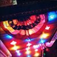
Posted: 3/17/09 at 6:20pmI was looking at the marquee above the Marquis Theater...and I thought..."Is that the best they could do?" I mean bubble numbers and a big post it note? I'm sure the show is going to be a blast, and am looking forward to seeing it...but the art work is kind of dull and boring.
"The price of love is loss, but still we pay; We love anyway."

jacobsnchz14
Broadway Legend Joined: 12/13/06
#2re: 9 to 5 Art Work
Posted: 3/17/09 at 6:25pm
I honestly think that this:

is better than this:

It doesn't look so bad. It is better in three-dimensions than it was before drawn out in flat numbers.


#2re: 9 to 5 Art Work
Posted: 3/17/09 at 6:27pmI think it's boring too. It doesn't necessarily make me want to rush to get tickets.
I'm a professional. Whenever something goes wrong on stage, I know how to handle it so no one ever remembers. I flash my %#$&.
"Jayne just sat there while Gina flailed around the stage like an idiot."

#3re: 9 to 5 Art Work
Posted: 3/17/09 at 6:31pmIf they could fit the ladies on it without it looking jumbled it would have looked nice, but you don't want it to be too cluttered, and they wanted to do something that was new and not like the movie logo, so, I'm sure there is a reason for it being so simple
#4re: 9 to 5 Art Work
Posted: 3/17/09 at 6:32pmI wish it looked more vintage...but does the show take place in the present or the 80's?
jacobsnchz14
Broadway Legend Joined: 12/13/06
#6re: 9 to 5 Art Work
Posted: 3/17/09 at 7:01pm

I imagine that they wanted to work with the foundation already provided by the movie. People will look at the marquee and recognize not only the title but the imagery of the women and the font of the title itself. I guess they're hoping to pick up the marginal business that little things like that gain.
logan0215
Broadway Legend Joined: 7/22/05
#7re: 9 to 5 Art Work
Posted: 3/17/09 at 7:07pmI find the marquee to be rather hideous and really crowded.

#8re: 9 to 5 Art Work
Posted: 3/17/09 at 7:21pm
People will look at the marquee and recognize not only the title but the imagery of the women and the font of the title itself.
It's not the same font as the film logo. It's similar, but it's not the same.
#9re: 9 to 5 Art Work
Posted: 3/17/09 at 7:33pm
Sorry, I should have been clearer. The font is not exactly the same, but the similarities in the logo will reinforce the connection to the movie that may positively influence some passerby to see the show.
Of course, whether people like the artwork is a different matter.
Craww
Broadway Legend Joined: 12/13/06
#10re: 9 to 5 Art Work
Posted: 3/17/09 at 11:11pm
I love the art design for this show. It definitely contributes to my wanting to see it.
I can see why people wouldn't respond to the aesthetic, or would find the color scheme unattractive, but it's certainly not poorly done by any stretch of the imagination.
I just wish that the "to" in 9 to 5 was fully opaque.

jonartdesigns
Broadway Legend Joined: 5/15/04
#11re: 9 to 5 Art Work
Posted: 3/18/09 at 2:13am
i can see why the removed the ladies from the marquee whereas the actual shape of the marquis theater sign simply doesn't have enough vertical space. the only other option would have been to stick them on the side ala the millie marquee 
However the added benefit of not having a big picture of the 3 leads is there is no need to change it for eventual replacements.
"Grease," the fourth revival of the season, is the worst show in the history of theater and represents an unparalleled assault on Western civilization and its values. - Michael Reidel
#12re: 9 to 5 Art Work
Posted: 3/18/09 at 2:39amI like the color scheme and it definitely pops when your walking up to it, but it is rather boring looking.
"Anybody that goes to the theater, I think we’re all misfits, so we ended up on stage or in the audience.” --- Patti LuPone.
jonartdesigns
Broadway Legend Joined: 5/15/04
#13re: 9 to 5 Art Work
Posted: 3/18/09 at 3:58am
a cool approach they could have (and could still) taken that i just whipped up

"Grease," the fourth revival of the season, is the worst show in the history of theater and represents an unparalleled assault on Western civilization and its values. - Michael Reidel
#14re: 9 to 5 Art Work
Posted: 3/18/09 at 4:27amThat would be really cute and creative!
"Anybody that goes to the theater, I think we’re all misfits, so we ended up on stage or in the audience.” --- Patti LuPone.
PiraguaGuy2
Broadway Legend Joined: 10/10/08
#15re: 9 to 5 Art Work
Posted: 3/18/09 at 7:20am
Again, as soon as one of them leaves, they'd have no choice but to change it.
Ironic, but the Marquis really has an awful marquee.
Formerly SirNotAppearing - Joined 3/08
#16re: 9 to 5 Art Work
Posted: 3/18/09 at 8:43am
jonartdesigns, that looks great!
And there are / have been plenty of shows that have pictures of the lead(s) on their marquees. They have no trouble changing it, so why would it be an issue for 9 To 5?
#17re: 9 to 5 Art Work
Posted: 3/18/09 at 12:57pmIn the end the marquee gets the point it is supposed to across.. the name of the show.. really.. get over it people.. It is the tiniest of things in the big picture.
#18re: 9 to 5 Art Work
Posted: 3/18/09 at 1:35pm
I get the numbers- especially when compared to the photo from the film. I think it's the post it note that I think is unfortunate. Does anyone else remember the TV show with Rita Moreno?
BTW...speaking of the Marquis marquee...has anyobe else noticed that when ABC does their "live" shot of time square at the beginning of NIGHTLINE...that the marquee still has the sign up for either The Drowsey Chaperone or Cry-Baby?
"The price of love is loss, but still we pay; We love anyway."
Videos