An American in Paris Poster Revealed
#2An American in Paris Poster Revealed
Posted: 10/8/14 at 9:05pmNow that is the way to do a poster.
#4An American in Paris Poster Revealed
Posted: 10/8/14 at 9:31pmI was expecting a lot more color, but it actually works with just the blue and yellow.
#5An American in Paris Poster Revealed
Posted: 10/8/14 at 9:50pmThat's the kind of poster that gets you interested in the show.
#7An American in Paris Poster Revealed
Posted: 10/8/14 at 10:34pm
So sweet, low key, and appropriate. The little shock of yellow and the deconstructionist Eiffel Tower are perfect. And the free and easy font for the title is fresh and nostalgic at the same time.
We may actually have a positive review from After Eight... if there's no dry humping during the nightclub scenes.
#8An American in Paris Poster Revealed
Posted: 10/8/14 at 10:57pm
This is the poster for the Broadway engagement, not (as the article states) for the Chatelet run in Paris.
The Paris artwork is here http://chatelet-theatre.com/en/event/an-american-in-paris
#10An American in Paris Poster Revealed
Posted: 10/8/14 at 11:10pmUtterly charming! It makes me want to see this show!
#11An American in Paris Poster Revealed
Posted: 10/8/14 at 11:15pmThe Chatelet artwork looks like the logo for something like the Olympics. It's so modern and commercial. French Diet Coke?
#12An American in Paris Poster Revealed
Posted: 10/9/14 at 12:00am
The french reminds me of the original NO STRINGS artwork.
And it is oddly sleekly modern for the material.
#13An American in Paris Poster Revealed
Posted: 10/9/14 at 12:05amI am so excited for this show. Speaking of No Strings, I'd love to see a revival (Roundabout?)
#14An American in Paris Poster Revealed
Posted: 10/9/14 at 12:54amCan someone please explain to me the logic behind testing out a show for an American audience, in PARIS?!? I know we live in a global economy, but Paris doesn't doesn't have the greatest reputation when it comes to musicals. There have been a few shows that tested in Germany, but the German people are known to love musicals. Even when a show is tested in Germany there is at least a year between the German opening and Broadway run so that translations and changes can be made to suit American audiences. The turnaround for An American in Paris is barely 3 months including previews. Yes testing An American in Paris in Paris France is a great marketing idea, but so is testing it in Paris, Texas, where you know they speak English!!
#15An American in Paris Poster Revealed
Posted: 10/9/14 at 1:29amI like the colors and look of this, but what is the giant fire hydrant on the right of the poster?
#16An American in Paris Poster Revealed
Posted: 10/9/14 at 1:38am

I believe it's meant to be one of the things at the top right corner of this picture. I don't know what they're called.
Pasdechat
Understudy Joined: 4/17/14
#17An American in Paris Poster Revealed
Posted: 10/9/14 at 3:10amAdvertising pillar? The poster is all over Paris (subway, bus station etc.) in various sizes and very catching between the tons of other advertising. looks clean and fresh. The American version looks like the book cover of a chic lit-novel.
#18An American in Paris Poster Revealed
Posted: 10/9/14 at 6:47amMakes me want to go back to Paris. Beautiful!
#19An American in Paris Poster Revealed
Posted: 10/9/14 at 7:18amI can't wait to see Robbie Fairchild in this! Beautiful poster.
#20An American in Paris Poster Revealed
Posted: 10/9/14 at 12:45pm
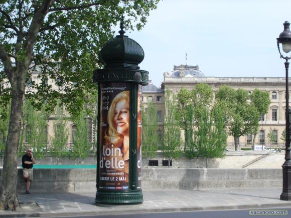
They're called Colonnes Morris apparently
#21An American in Paris Poster Revealed
Posted: 10/9/14 at 1:18pm
It's pretty. I'm just a little surprised it's so low-key. I would have thought they might highlight the dance aspect of the show a bit more like in the original movie poster. Brings more life and energy one might expect to see in the show itself.
And yeah, the Colonnes are nearly as iconic as the Eiffel Tower itself. Next year, they will be celebrating their 160th anniversary of their installation.
#22An American in Paris Poster Revealed
Posted: 10/9/14 at 1:28pmI agree with the chick lit comment, It's a nice graphic but doesn't really say to me Broadway musical
#23An American in Paris Poster Revealed
Posted: 10/9/14 at 1:36pmFor some reason, it makes me think of Prelude to a Kiss. It looks more like a small romantic play.
#24An American in Paris Poster Revealed
Posted: 10/9/14 at 3:42pmLove it.
Videos
