Love the art work. The slogan, not so much.
I really love that.
It sort of reminds me a little bit of Once Upon A Time.
Ehh... I liked the last tour artwork better. And I hope that tagline is no indication of the type of jokes in Douglass Carter Bean's book, cause that's just sad.
Theatre posters are looking more and more movie posterish.
I like the visual of her in the shoe outline but it looks like a cartoon.
I do really love the art and the title treatment although they should make the ON BROADWAY part a little less faded because it does look like a movie. HATE the tagline.
Love the artwork. Not a fan of that tag line. At first I was cool with it, but like CATS said, I hope it's no indication of the kind of jokes they have in store...
It looks like the minimalist posters they used to create for the early Menken Disney films.
I like it.
And yea, that tag line is just embarrassingly awful.
A lot of people w think this IS a DISNEY show,
this will add to the confusion (and may sell tkts).
The silhouette reminds me the most of the Disney Princess and the Frog poster.
It's the "so" that gets me in the tagline. I wish it just said "GLASS SLIPPERS ARE BACK." I like that much better.
Aside from that...I >love the artwork!
Broadway Star Joined: 7/29/12
It's nice, not fantastic. The silhouette DEFINITELY looks like Tiana from Princess and the Frog. At first, I thought it was. The artwork though is without a doubt a combination of previous Menken Disney films. It looks a little to Photoshop-y though to me. The more I look at it, the less I think "magical" and the more I think "amateur Photoshop."
I'm thinking that the similarity to the Disney posters was intentional.
Who knows? Maybe they'll find a way to shoehorn Someday My Prince Will Come into the score.
Broadway Star Joined: 7/29/12
Not sure that's going to "pop" on the marquee. But they've got plenty of time to change it.
Gorgeous! I love the little details in this; simple and really beautifully capturing the magic of the piece (from what I remember).
However: dumb, horrible, awful, no-good slogan.
Proper Villain should design the artwork... Their posters and artwork are absolutely beautiful.
Thanks, bway! You're sweet (and your check is in the mail).
This is so beautiful it ALMOST counteracts the tacky slogan. I applaud them for going with the classiest logo I've seen in a long time.
Broadway Legend Joined: 4/10/12
I Love it, but nothing tops the 2000 /01 tour poster.
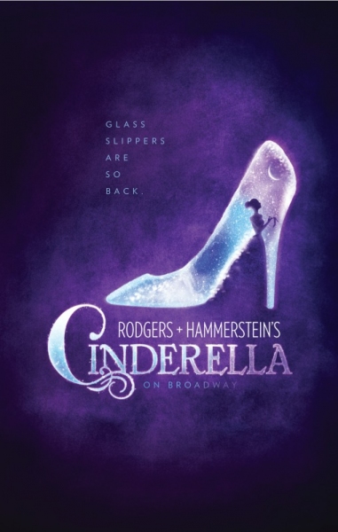
^This one, Johny? I can't find a bigger version! It's basically the same idea with the slipper, but better executed, in my opinion.
AND I'll never have anything but praise for that production. The script, score, design and Eartha Kitt were all brilliant. I wish that version had played on Broadway. We might have gotten a cast recording.
Marshalls! Classic.
Videos