I don't get the tagline. This holiday, be Italian (or Spanish, American, French, Australian, and Irish). Gorgeous poster otherwise though.
Updated On: 11/23/09 at 11:36 PM
In the retro poster, Kidmans's sight line is off compared w the others who all seem to be watching Guido. She is staring directly at the viewer. This somewhat corected on the "modern" view by her photos positioning. Thats what made me unconfotable w the retro on. Just sl askew.
Broadway Legend Joined: 12/13/06
The problem I have with that first poster is just...poor Photoshopping. The concept isn't sold because the proper lighting/perspective/filtering isn't done to make it more realistic.
Specifically, the poster within a poster is too clear and stands out too much. You don't buy it as actually being plastered to that wall because the photos are too clear and it's missing the right shadowing. Then, on top of that, his figure in front of it has all sorts of unexplained light sources around his outline. It's easy to remove a photo from its background and lay it over something else, but it's not easy to make it look correct.
I tried to do this quick chop job to show what I meant, but I guess it's hard to see the difference.
Movie Poster design isn't what it used to be. It's all photo manipulation, airbrushing and sticking people's heads on other people's bodies.
I used to love it when movie poster designs were bold, creative and produced lasting, iconic images from some of the greatest designers in the field: Robert McGinnis, Richard Amsel, Saul Bass, Howard Terpning. Bob Peak, Mitchell Hook, Drew Struzan among others.
Movie posters of today are just BLAH. This one included. Hope the film is better.
My problem with the poster-within-the-poster looks far too modern. If you're going for the 60s, then do it. While the concept may have been the 60s, nothing else about the faux poster "peeling" on the walls looks anything other than the 21st century. Personally, I think it looks like rather sloppy execution. The paparazzi poster just looks like poor photoshop from a Gossip Girl ad campaign. I actually like the Japanese poster and the last one is a very striking photo, but it doesn't seem to represent much of the characters or the story. It's just a cool photo.
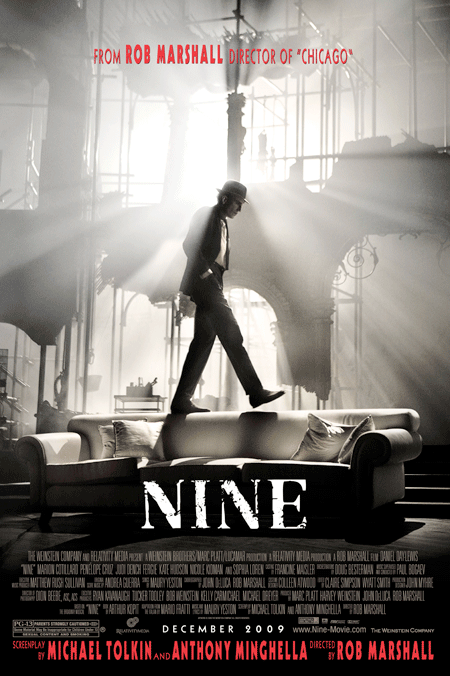
"I don't get the tagline. This holiday, be Italian (or Spanish, American, French, Australian, and Irish). Gorgeous poster otherwise though."
Well, considering "Be Italian" is one of the songs being pushed to represent the show, and the movie deals with Italian characters, and is itself based off of an Italian movie by an Italian filmmaker, the tagline makes sense.
It's just not a very good tagline.
I really don't love anything about these posters. I know really creative movie posters are few and far between these days, but they do emerge. For example, the poster for Precious is extremely striking (and itself arguably a work of art), and the character posters for Inglorious Basterds were superb. And both of these examples captured the movie perfectly.
I don't understand the reason behind the screenplay credit and directing credit being so huge on the poster and all the way at the bottom when they're already listed above with the rest of the credits. It looks weird. I've never seen that done before in a movie poster.
I dont really understand either Marquise, unless they are trying to point out that the late Anthony Minghella worked on the film.
Videos