

Pre opening artwork

#25Pre opening artwork
Posted: 7/10/13 at 8:08pm
^Did Memphis play at TheatreWorks prior to Broadway? I don't remember that. The artwork for the La Jolla Playhouse run was similar to the artwork used on Broadway, but executed differently.
Updated On: 7/10/13 at 08:08 PM
Wildcard
Broadway Legend Joined: 6/21/06
#26Pre opening artwork
Posted: 7/10/13 at 8:15pm
![]()
FYI, that Bring It On image wasn't the pre-opening artwork. That version was designed to have the lights behind it (which is considered the National Tour art) and that one with the white background is a bastardization of it. The original artwork used by Bring It On in Atlanta is above
loliveve
Broadway Legend Joined: 6/24/12
#27Pre opening artwork
Posted: 7/11/13 at 1:12amI love this thread! I really like the WICKED art with Elphaba bent over the rose held by the Strawman, though it does give away that part of the story. Also, I prefer the SISTER ACT logo with the mic and cross rather than the art eventually used on Broadway!
loliveve
Broadway Legend Joined: 6/24/12

WiCkEDrOcKS
Broadway Legend Joined: 6/13/04
#29Pre opening artwork
Posted: 7/11/13 at 1:35am


-- 
-- 
-- 
-- 
-- 
-- ![]()
-- 
-- 
-- 

-- 
-- 
-- 
-- 
-- 
-- 

-- 
-- 
-- 
-- 
-- 
-- 
-- 
-- 
-- 
--
(Sorry this one is so small...it was the only one I could find. A very, very, very bizarre CGI-rendered image of Gugino, Schrieber, and Dennehy from the Goodman Theater run of DESIRE UNDER THE ELMS): 
-- 
-- 
-- 
-- 
-- 
-- 


-- ![]()
![]()

-- 
-- 
-- 
--

-- 
-- 
Updated On: 7/11/13 at 01:35 AM
broadwayman17
Broadway Star Joined: 10/27/07
#30Pre opening artwork
Posted: 7/11/13 at 2:38am


Yes, but sometimes people have a third deeper layer thats the same as the first. Like pie. Dr. Horrible
Updated On: 7/11/13 at 02:38 AM
qazdannywsx
Chorus Member Joined: 10/1/12
#31Pre opening artwork
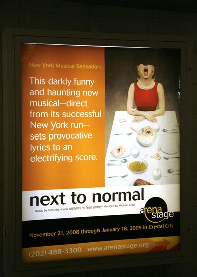
Posted: 7/11/13 at 3:01amWow, I love the Light in the Piazza one! And those Next to Normal ones are really bizarre...
#32Pre opening artwork
Posted: 7/11/13 at 9:26am
That BRIEF ENCOUNTER artwork is gorgeous.
Some other London transfers I've found:
From the Menier Chocolate Factory 

I'm not sure if JERUSALEM played the Royal Court with this artwork but this is the cover of their published version of the script: 
And lastly, in the National's inimitable style 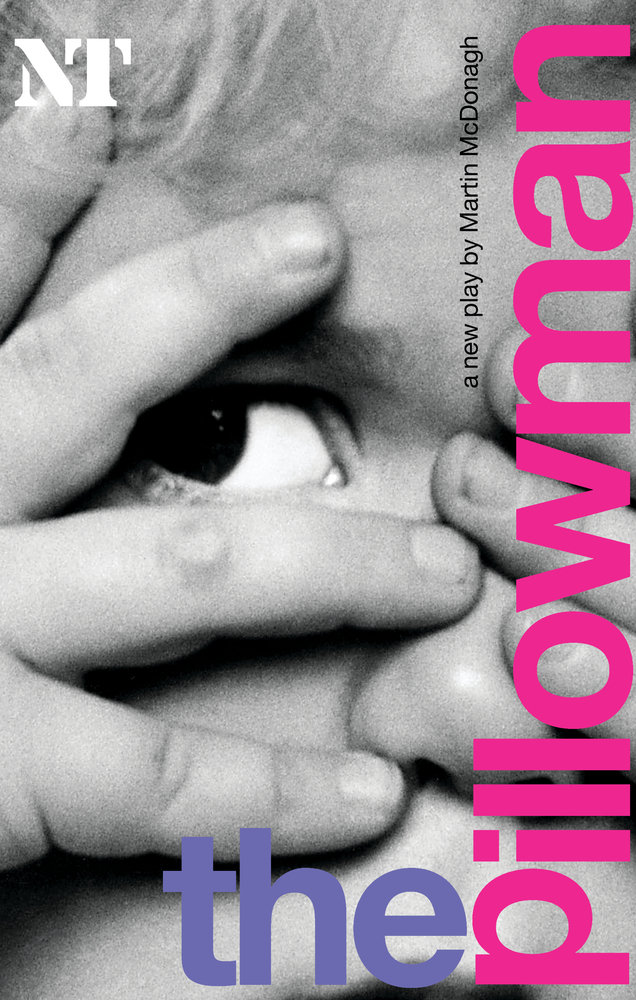
Words don't deserve that kind of malarkey. They're innocent, neutral, precise, standing for this, describing that, meaning the other, so if you look after them you can build bridges across incomprehension and chaos. But when they get their corners knocked off, they're no good anymore…I don't think writers are sacred, but words are. They deserve respect. If you get the right ones in the right order, you can nudge the world a little.
#33Pre opening artwork
Posted: 7/11/13 at 10:04am
"This thread reads like a series of White House memos." — Mister Matt

mpd4165
Leading Actor Joined: 8/6/09
#35Pre opening artwork
Posted: 7/11/13 at 1:49pmThat NT Pillowman cover is just creepy and excellent.
Wildcard
Broadway Legend Joined: 6/21/06

jacobsnchz14
Broadway Legend Joined: 12/13/06

#38Pre opening artwork
Posted: 7/11/13 at 11:50pmSome of those Miss Saigon posters are downright offensive. I can't believe they were ever considered.
jacobsnchz14
Broadway Legend Joined: 12/13/06
#39Pre opening artwork
Posted: 7/11/13 at 11:54pmThey may just be preliminary designs; probably not seriously considered. While some are offensive, I love seeing the progression to the final product, though.
#40Pre opening artwork
Posted: 7/11/13 at 11:54pmThose are all in the "making of" video. I felt the same way.
"This thread reads like a series of White House memos." — Mister Matt
#41Pre opening artwork
Posted: 7/12/13 at 12:23amI love the LuPone Gypsy art that Wickedrocks posted. I've seen that art on a shirt before. I would love to have that shirt.