Pre opening artwork
#1Pre opening artwork
Posted: 7/3/13 at 5:52pm
I was looking at some interactive features on the New York Times website and was curious to see the development of posters prior to a shows Broadway opening. I was wondering, does anyone have any photos of artwork that was developed but eventually dropped. Here's some I've found:
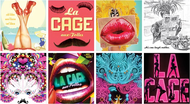
La Cage
http://www.nytimes.com/interactive/2009/09/13/theater/20090913-ragtime-feature.html?_r=0
Ragtime feature
#2Pre opening artwork
Posted: 7/3/13 at 6:13pm

I far preferred the pre-Broadway AIDA artwork.
With Irma you gotta do something!
#2Pre opening artwork
Posted: 7/3/13 at 6:19pm

The most immediate recent example I could think of, Roundabout's announcement logo for THE BIG KNIFE before they launched their Saul Bass-inspired brand redesign.
Words don't deserve that kind of malarkey. They're innocent, neutral, precise, standing for this, describing that, meaning the other, so if you look after them you can build bridges across incomprehension and chaos. But when they get their corners knocked off, they're no good anymore…I don't think writers are sacred, but words are. They deserve respect. If you get the right ones in the right order, you can nudge the world a little.
Updated On: 7/3/13 at 06:19 PM
jacobsnchz14
Broadway Legend Joined: 12/13/06

#4Pre opening artwork
Posted: 7/3/13 at 6:30pm
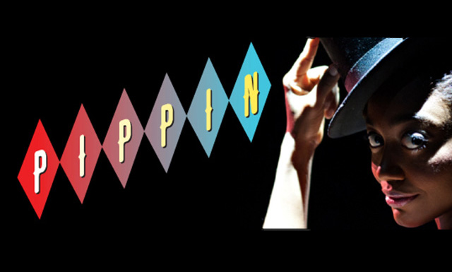
PIPPIN's initial launch artwork was pretty uninspired, compared to the beautiful work they have now.
Words don't deserve that kind of malarkey. They're innocent, neutral, precise, standing for this, describing that, meaning the other, so if you look after them you can build bridges across incomprehension and chaos. But when they get their corners knocked off, they're no good anymore…I don't think writers are sacred, but words are. They deserve respect. If you get the right ones in the right order, you can nudge the world a little.
#5Pre opening artwork
Posted: 7/3/13 at 6:32pm
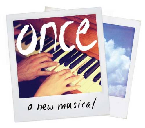
Ditto for ONCE's bland artwork from NYTW.
Words don't deserve that kind of malarkey. They're innocent, neutral, precise, standing for this, describing that, meaning the other, so if you look after them you can build bridges across incomprehension and chaos. But when they get their corners knocked off, they're no good anymore…I don't think writers are sacred, but words are. They deserve respect. If you get the right ones in the right order, you can nudge the world a little.
broadwayman17
Broadway Star Joined: 10/27/07
#6Pre opening artwork
Posted: 7/3/13 at 6:37pm

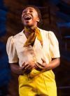
Spring Awakening while at Atlantic
Yes, but sometimes people have a third deeper layer thats the same as the first. Like pie. Dr. Horrible
#7Pre opening artwork
Posted: 7/4/13 at 11:30am

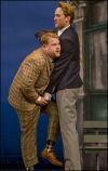
A Doll's Life had inferior artwork out of town compared to what landed on Broadway.
With Irma you gotta do something!
#8Pre opening artwork
Posted: 7/5/13 at 3:40am
This is my favorite O K !!!
http://www.broadwayworld.com/board/readmessage.cfm?thread=972787#3631451
http://www.broadwayworld.com/board/readmessage.cfm?thread=963561#3533883
http://www.broadwayworld.com/board/readmessage.cfm?thread=955158#3440952
http://www.broadwayworld.com/board/readmessage.cfm?thread=954269#3427915
http://www.broadwayworld.com/board/readmessage.cfm?thread=955012#3441622
http://www.broadwayworld.com/board/readmessage.cfm?thread=954344#3428699
#9Pre opening artwork
Posted: 7/5/13 at 5:32am
Wicked Protype Poster designs... you know when they apparently didn't care about spoiling it before you even walked in the door...


Updated On: 7/5/13 at 05:32 AM

#10Pre opening artwork
Posted: 7/5/13 at 11:27am
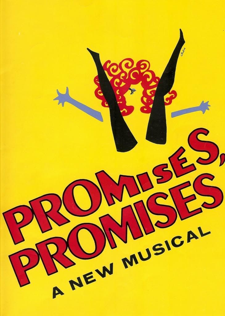
PROMISES, PROMISES utilized the girls and key illustration during their out of town tryouts both on the program and the playbill. Once they moved to Broadway they utilized a completely different design illustrated by Talivaldis Stubis who also designed the show logos for ANYONE CAN WHISTLE and FUNNY GIRL.
The Stubis illustration depicts a girl with her legs open, which was kind of racy for its time.
United Artists Records used the girls and key illustration for the cover of the Original Broadway Cast Album.
For the London production starring Betty Buckley and Tony Roberts the posters used the girls/key illustration and the program used the Stubis illustration.
The girls/key logo. Boston Tryout Program:
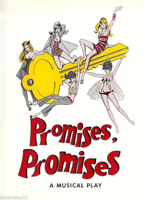
Talivadis Stubis logo design. Broadway Program:
Updated On: 7/5/13 at 11:27 AM
#11Pre opening artwork
Posted: 7/10/13 at 3:08pm
love this thread!!!!
...wasn't there a feature on NYT about the development of the Ragtime (revival) logo?
JohnyBroadway
Broadway Legend Joined: 4/10/12
#13Pre opening artwork
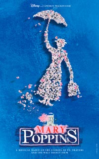
Posted: 7/10/13 at 3:29pmThe Mary Poppins artwork developed over the years. From west end to broadway.
WiCkEDrOcKS
Broadway Legend Joined: 6/13/04
#14Pre opening artwork
Posted: 7/10/13 at 4:23pm
RED: http://www.nytimes.com/interactive/2011/09/04/theater/20110904-red.html?_r=0
REASONS TO BE PRETTY: http://www.nytimes.com/interactive/2009/02/22/theater/20090222_REASONS_INTERACTIVE.html
RAGTIME: http://www.nytimes.com/interactive/2009/09/13/theater/20090913-ragtime-feature.html
#15Pre opening artwork
Posted: 7/10/13 at 5:18pm

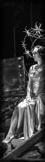
I've been really enjoying this thread, too. I find developmental art for pre-Broadway runs fascinating in hindsight. Anyone else think this art for LIMELIGHT (soon to be CHAPLIN), while less ornate, strikes the more appropriate tone for the show?
Words don't deserve that kind of malarkey. They're innocent, neutral, precise, standing for this, describing that, meaning the other, so if you look after them you can build bridges across incomprehension and chaos. But when they get their corners knocked off, they're no good anymore…I don't think writers are sacred, but words are. They deserve respect. If you get the right ones in the right order, you can nudge the world a little.
Updated On: 7/10/13 at 05:18 PM

#16Pre opening artwork
Posted: 7/10/13 at 5:49pm^I remember seeing that artwork in the TV commercials when Limelight was playing here. It definitely made a lot more sense than the artwork that was used in New York. The show was mostly designed in black and white. I'm not sure why that aesthetic screamed yellow and purple to the Broadway marketing firm.
#17Pre opening artwork
Posted: 7/10/13 at 6:39pm
I also think La Jolla's art for LIMELIGHT was better than its art for HANDS ON A HARDBODY.
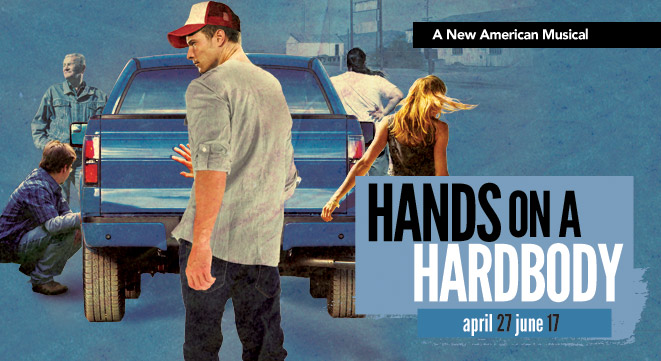
I preferred the ultimate Broadway artwork, even though the rest of the marketing really let the show down.
Some other fun ones I've found, a pair of other shows launched from NYTW:
PETER AND THE STARCATCHER 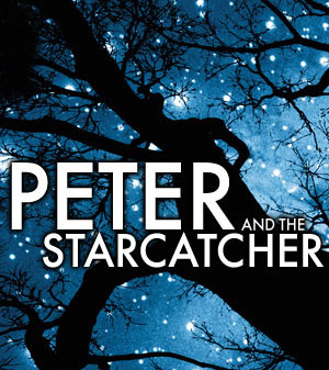
and the original run of RENT 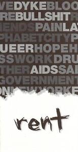
Words don't deserve that kind of malarkey. They're innocent, neutral, precise, standing for this, describing that, meaning the other, so if you look after them you can build bridges across incomprehension and chaos. But when they get their corners knocked off, they're no good anymore…I don't think writers are sacred, but words are. They deserve respect. If you get the right ones in the right order, you can nudge the world a little.
Wildcard
Broadway Legend Joined: 6/21/06
#20Pre opening artwork
Posted: 7/10/13 at 8:00pm
Words don't deserve that kind of malarkey. They're innocent, neutral, precise, standing for this, describing that, meaning the other, so if you look after them you can build bridges across incomprehension and chaos. But when they get their corners knocked off, they're no good anymore…I don't think writers are sacred, but words are. They deserve respect. If you get the right ones in the right order, you can nudge the world a little.
broadwayman17
Broadway Star Joined: 10/27/07
#21Pre opening artwork
Posted: 7/10/13 at 8:01pm


Yes, but sometimes people have a third deeper layer thats the same as the first. Like pie. Dr. Horrible
Wildcard
Broadway Legend Joined: 6/21/06
#22Pre opening artwork
Posted: 7/10/13 at 8:01pmI wouldn't really count Mary Poppins as pre-opening artwork since that was used for a major production. It's like saying the Broadway art for Into The Woods was the pre-opening artwork for the London "wolf' version.
#23Pre opening artwork
Posted: 7/10/13 at 8:05pm

Words don't deserve that kind of malarkey. They're innocent, neutral, precise, standing for this, describing that, meaning the other, so if you look after them you can build bridges across incomprehension and chaos. But when they get their corners knocked off, they're no good anymore…I don't think writers are sacred, but words are. They deserve respect. If you get the right ones in the right order, you can nudge the world a little.
jacobsnchz14
Broadway Legend Joined: 12/13/06