

Most Creative Logo For a Musical

#50re: Most Creative Logo For a Musical
Posted: 7/23/06 at 7:42pmthreadjack- monica- love the signature. hahahaha.
Broadway Star Joined: 12/31/69
#51re: Most Creative Logo For a Musical
Posted: 7/23/06 at 7:51pm
Thanks. :)
Also, I adore the She Loves Me one.
Dover
Leading Actor Joined: 4/29/06
#52re: Most Creative Logo For a Musical
Posted: 7/24/06 at 3:23pmOn the Saigon logo, in addition to the helicopter and face, I've also had it pointed out that the logo can also be seen to spell SEX. I had to look at it again to remember exactly how, and it is a bit of a stretch. The S is the main part of the helicopter body, but it's a backwards S. The E is in the same spot, if you look at it a different way. There are a number of X's, either the blades of the helicopter on top, or the smaller X that forms the eye of the face, or the one below that. I guess you can pick any one. I have no idea if it was intentional, but it was something that people sometimes talked about when I worked on the show. Maybe people with too much time on their hands staring at that logo, but it would be in keeping with the theme of the show.
#53re: Most Creative Logo For a Musical
Posted: 7/24/06 at 4:25pm

I love spelling bee's logo with the spellers. they also have the updated (i guess you could call it that) one: 
they're so happy and colorful.
I also Like Q's logo and TMM's.
"Labels are for cans, not for people."
--anthony Rapp
Cruel_Sandwich
Broadway Legend Joined: 6/30/05

SporkGoddess
Broadway Legend Joined: 7/27/05
#55re: Most Creative Logo For a Musical
Posted: 7/24/06 at 5:08pm

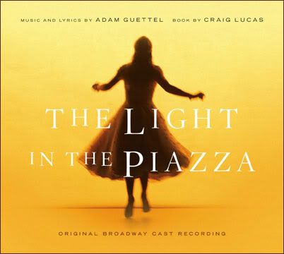
I also love the newer L5Y logo, the black and white one, but I am out of room for the picture posting. ![]() I also know that I'm probably alone on the LitP poster but I love it. I do adore the CD cover as well thoug; it was my desktop wallpaper for a while!
I also know that I'm probably alone on the LitP poster but I love it. I do adore the CD cover as well thoug; it was my desktop wallpaper for a while!
I haven't seen the new RENT logo; what's it look like? I did some searches but I'm not sure exactly what I'm looking for.
And, YES, I love the new She Loves Me logo! And Miss Saigon's; that was what I was gonna say, but others beat me to it.
Jimmy, what are you doing here in the middle of the night? It's almost 9 PM!
Updated On: 7/24/06 at 05:08 PM
SDav 10495
Broadway Star Joined: 7/21/06
#56re: Most Creative Logo For a Musical
Posted: 7/24/06 at 5:25pm
"I haven't seen the new RENT logo; what's it look like?"

That one. I don't think it's terrible...I like that they've done something other than take "cool and edgy" photos of the current cast and mindlessly imitate the original poster, but that original poster was definitely special.
"If there is going to be a restoration fee, there should also be a Renaissance fee, a Middle Ages fee and a Dark Ages fee. Someone must have men in the back room making up names, euphemisms for profit."
(Emanuel Azenberg)
Flahooley
Leading Actor Joined: 11/17/05
#57re: Most Creative Logo For a Musical
Posted: 7/26/06 at 3:11pm
For me there is only one.
The original poster for A LITTLE NIGHT MUSIC.
I had seen the poster a thousand times, but never noticed the naked Swedes screwing in the tree. When I discovered it I thought that is just "perfect."
Updated On: 7/26/06 at 03:11 PM
mejusthavingfun
Broadway Legend Joined: 4/12/06
#58re: Most Creative Logo For a Musical
Posted: 7/26/06 at 3:49pmi've always loathed the wicked poster.
Marguerite Chauvelin
Broadway Star Joined: 7/19/05
#59re: Most Creative Logo For a Musical
Posted: 7/26/06 at 4:14pm
I think that the Mackintosh produced show posters are rather brilliant (Phantom, Cats, Les Mis, Saigon, etc...). I mean the symbol itself can tell many exactly what show it is.
I also love the Assassins revival poster.
If Percy Blakeney were in Les Mis....
Percy: Sink me! If it isn't Javvurt!
Javert: Zsah-vair, it's pronounced Zsah-vair.
Pecry: But it's spelled J-A-V-E-R-T Javvurt.
Javert: Repeat after me Zsah...Zsah....
Percy: Oh! Zsa-Zsa! Like the Gabor sister! Well I personally have always prefered Eva.
Javert: (Looks for gun)
Percy: Sink me! If it isn't Javvurt!
Javert: Zsah-vair, it's pronounced Zsah-vair.
Pecry: But it's spelled J-A-V-E-R-T Javvurt.
Javert: Repeat after me Zsah...Zsah....
Percy: Oh! Zsa-Zsa! Like the Gabor sister! Well I personally have always prefered Eva.
Javert: (Looks for gun)

#60re: Most Creative Logo For a Musical
Posted: 7/26/06 at 4:27pm
I think most of you mean favorite "key art" actually, not favorite logo.
(…or you mean "favorite show poster")
A logo is usually text-driven with minimal solid design elements.
On some of these examples here, the actual logo isn't much more than a common serif or sans-serif font. I don't think you're getting all gaga over that, are you?
"Jaws is the Citizen Kane of movies."
blocked: logan2, Diamonds3, Hamilton22
Updated On: 7/26/06 at 04:27 PM
blocked: logan2, Diamonds3, Hamilton22
queenbee2
Featured Actor Joined: 7/13/06
#61re: Most Creative Logo For a Musical
Posted: 7/26/06 at 4:31pmI don't know about MOST creative, but I always loved the Sweeney Todd (original) art work with Sweeney and Mrs. Lovett looking totally possessed as characatures. The Miss Saigon face/helicopter was cool. And I guess CATS was interesting for its time, although I don't love the show.

theaterlover45
Broadway Star Joined: 8/21/05
#62re: Most Creative Logo For a Musical
Posted: 7/26/06 at 5:33pm
The Lion King
Hairspray
All Shook Up
Dirty Rotten Scoundrels
Sweet Charity
The Wedding Singer
Fosse76
Broadway Legend Joined: 3/21/05
#63re: Most Creative Logo For a Musical
Posted: 7/26/06 at 5:38pm
"Even though you were talking about Wicked's slogan, ActingAndy, I will say that it has a good logo too. The green and white contrast is very striking."
I hated it when I first saw it, and I hate it now. It looks like a rejected logo from the sixties when they didn't use much color on their posters.
Broadway Legend Joined: 12/31/69
#64re: Most Creative Logo For a Musical
Posted: 7/26/06 at 5:38pmI actually like Rent, The Wedding Singer, and Hairspray.

#65re: Most Creative Logo For a Musical
Posted: 7/26/06 at 5:49pm
lo·go n. pl. lo·gos
A name, symbol, or trademark designed for easy and definite recognition, especially one borne on a single printing plate or piece of type.
Technically speaking, a logo ought to actually contain the name of the show in a textual fashion, but for many shows the key art or emblem became, in effect, the show's logo. Phantom, Cats, and Les Miz are probably the very best examples, as the mask, eyes, and Cosette became so famous that they were basically as recognizable as the show's written title. Cameron Mackintosh was very big on "branding" his shows in this manner, and one can hardly argue that it wasn't effective.
Many of the examples listed above, however, are not logos or even key art. They are full show card designs. Strictly speaking, RENT's logo is just the block name with the crooked N, and Wicked's logo is the name of the show with the little witch dotting the i. One could make an argument for She Loves Me's logo being just the title or the title with the jumping man below it.
A good test of whether artwork can be called a logo or not is whether it can be "stamped" -- either literally as in the definition above, or more generally as a simple emblem. The Rent logo can easily be stamped on a shirt or hat, while the full artwork cannot.
This is not to discredit any of the brilliant artwork noted above, simply to clarify (as best12bars did) the difference in terminology.
Robos89
Broadway Legend Joined: 6/20/06
#66re: Most Creative Logo For a Musical
Posted: 8/2/06 at 1:21pm
I really like SPELLING BEE's! I've got a question though...I don't really know the character names, but - howcome 64 went from a green suit, to the red cap, blue jacket and pants. And 29 went from red cape and striped shirt w/ jeans...to a boy scout.
Was the first poster made before the show opened or something?
?
#67re: Most Creative Logo For a Musical
Posted: 8/2/06 at 2:26pm
I don't love the show, but Miss Saigon has a really interesting logo. I like Sunday in the Park's original logo (not the current UK one).
However, Follies' original logo wins hands down.


Wildcard
Broadway Legend Joined: 6/21/06
#69re: Most Creative Logo For a Musical
Posted: 8/2/06 at 5:35pmI think someone should post a visual illustration here of what a logo/mark, tagline, poster/branding art each look like, hopefully from the same show just so folks know the difference (since obviously, some just don't get it).
#70re: Most Creative Logo For a Musical
Posted: 8/2/06 at 6:06pmI think most people know the difference, but not many shows feature actual 'logos' these days. While the thread started out asking about the Most Creative Logo for a Musical, I think its turned into Favorite Poster Art for a Musical.
TheMecca
Stand-by Joined: 3/19/06
#71re: Most Creative Logo For a Musical
Posted: 8/2/06 at 6:33pmrobos- the poster was probably made before the show opened. After a few months, they changed it to reflect the actual images of the actors (including the costume changes you mentioned, and of course Logainne replacing that girl that had nothing to do with anything).
Robos89
Broadway Legend Joined: 6/20/06
#72re: Most Creative Logo For a Musical
Posted: 8/2/06 at 7:23pmYeah, that's what I thought...thanks for answering my question!!!
?
#73re: Most Creative Logo For a Musical
Posted: 8/2/06 at 7:26pm

the best!
(I cannot take credit for it)
and I like this one too, which is real
It is ridiculous to set a detective story in New York City. New York City is itself a detective story...
AGATHA CHRISTIE, Life magazine, May 14, 1956
Updated On: 8/2/06 at 07:26 PM
#74re: Most Creative Logo For a Musical
Posted: 8/7/06 at 8:37pm
My faves (I'm slightly biased as they are all London versions!): 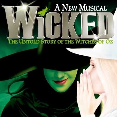
A lot of people prefer the old one but I really like the revamp thats been made to "Wicked".
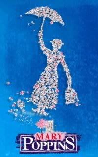
The old Mary Poppins poster- I like the silhouette made with the flowers, and Mary Poppins's name written in crayon.
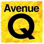
The London Avenue Q logo is just simple and bright (I love the NY one too though)
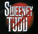
The London logo for Sweeney Todd- one of my favourite shows ever! Though I like how the razor with the eyes has been added on the Broadway poster.
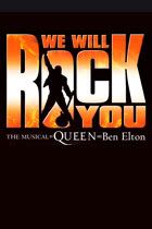
The show isn't the best but I like Freddie Mercury's silhouette in the O.
"...if you rearrange the letters in the word unemployed, it spells OPPORTUNITY!"
- Gary Coleman, Ave. Q
Updated On: 8/7/06 at 08:37 PM