
Company logo?

Roger246
Featured Actor Joined: 3/4/06
#0Company logo?
Posted: 8/16/06 at 4:25pmThe logo that appeared on this site when the opening date was announced, is that really the logo? Cause they have the same one on broadway.com, anybody know?

#1re: Company logo?
Posted: 8/16/06 at 4:31pmYeah I saw that on broadway.com too. So I guess that is it then...

#3re: Company logo
Posted: 8/16/06 at 4:47pmI love it. I like the "ice cube" look.
"You never really understand a person until you consider things from his point of view - until you climb into his skin and walk around in it."
To Kill A Mockingbird
To Kill A Mockingbird
SorryGrateful
Broadway Legend Joined: 5/10/05
#4re: Company logo
Posted: 8/16/06 at 4:50pm
I liked the one from Cincy. But this one's cool, too. It's definitely flashier.
You promised me poems. ~Tricky
Updated On: 8/16/06 at 04:50 PM
fiyero8132
Broadway Star Joined: 4/27/05
#5re: Company logo
Posted: 8/16/06 at 5:05pmI think it's a piece of crap. I'm working on a production of Company right now and that logo just makes me shudder. Don't they know Company is pink? Always pink!!! In all sincerity - it just isn't very innovative. It just doesn't make you say: "Let's spend $100 on a ticket to this show."

#6re: Company logo
Posted: 8/16/06 at 5:06pmI, personally, hate it soooo much. It just doesn't seem like a good representation of the show. It's more like a creative font than a logo for a show.
"Are you sorry for civilization? I am sorry for it too." ~Coast of Utopia: Shipwreck
fiyero8132
Broadway Star Joined: 4/27/05
#8re: Company logo
Posted: 8/16/06 at 5:19pmIt looks like it was created in Windows' "Paint" program.
"I love talking about nothing. It is the only thing I know anything about." - Oscar Wilde
#9re: Company logo
Posted: 8/16/06 at 5:30pmI... er... well, yeah, I'm not crazy about it. I don't hate it, it's just not what I expected.

#10re: Company logo
Posted: 8/16/06 at 5:32pmwow. I wish I could make something like that on paint.

#11re: Company logo
Posted: 8/16/06 at 5:32pmI'm not loving it.
I recognize the addiction to being alive.

#12re: Company logo
Posted: 8/16/06 at 5:33pmyeah i wasn't impressed that much with it either. i wish they could have at least made them look like presents or something.

#13re: Company logo
Posted: 8/16/06 at 5:38pm

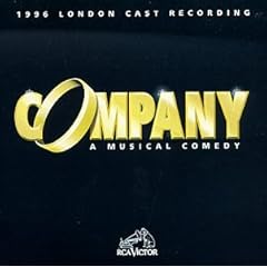
It's nothing special, but it's not terrible either. I really liked the '96 London revival's logo, with the wedding ring in it.

#14re: Company logo
Posted: 8/16/06 at 5:39pm
I saw it... not impressed.
I like the original better.
Updated On: 8/16/06 at 05:39 PM
#15re: Company logo
Posted: 8/16/06 at 5:48pm
I really prefer the design they used for the playbills in Cincinnati -- similar to the 1996 London revival, color-wise, but taller, skinnier letters. The 'O' was an engagement ring.
Updated On: 8/16/06 at 05:48 PM
ThankstoPhantom
Broadway Legend Joined: 10/13/05
#16re: Company logo
Posted: 8/16/06 at 5:52pmI've found almost all commercial runs of Company (including the original) to have rather boring, ugly, and uninteresting logos, and this one joins that club.
How to properly use its/it's:
Its is the possessive. It's is the contraction for it is...
Roger246
Featured Actor Joined: 3/4/06
#18re: Company logo
Posted: 8/16/06 at 5:57pm
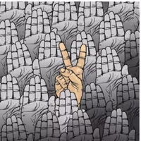
<
Took some hunting around, but I found it.
Updated On: 8/16/06 at 05:57 PM
ThankstoPhantom
Broadway Legend Joined: 10/13/05
#19re: Company logo
Posted: 8/16/06 at 5:59pm
I agree, that does look much better.
How to properly use its/it's:
Its is the possessive. It's is the contraction for it is...
Updated On: 8/16/06 at 05:59 PM
Roger246
Featured Actor Joined: 3/4/06
#21re: Company logo
Posted: 8/16/06 at 6:05pm
the Cincy logo is spiffier, but still nothing very special.
What bothers me is that the logo doesn't hint much at the feel of the production it's advertising. This is a Company that is very intimate, very psychological (in the sense that it seems to take place almost within Bobby's psyche). The actor-musicianship here becomes a metaphor for intimate communication and commitment. None of those really neat aspects of the production are even hinted at by the ice-cube logo, nor is fact that the plot is about the conflict associated with settling down and committing to a relationship. On the other hand, it's also not very flashy or market-driven. In short, the logo fails to do its job for me, and I say that as someone who is predisposed to buy tickets and really get into the show.
Marguerite Chauvelin
Broadway Star Joined: 7/19/05
#22re: Company logo
Posted: 8/16/06 at 6:08pmI prefer the Cinci lettering to what they're using now. However, a lot of the Playhouse lettering is similar for their shows.
If Percy Blakeney were in Les Mis....
Percy: Sink me! If it isn't Javvurt!
Javert: Zsah-vair, it's pronounced Zsah-vair.
Pecry: But it's spelled J-A-V-E-R-T Javvurt.
Javert: Repeat after me Zsah...Zsah....
Percy: Oh! Zsa-Zsa! Like the Gabor sister! Well I personally have always prefered Eva.
Javert: (Looks for gun)
Percy: Sink me! If it isn't Javvurt!
Javert: Zsah-vair, it's pronounced Zsah-vair.
Pecry: But it's spelled J-A-V-E-R-T Javvurt.
Javert: Repeat after me Zsah...Zsah....
Percy: Oh! Zsa-Zsa! Like the Gabor sister! Well I personally have always prefered Eva.
Javert: (Looks for gun)
#23re: Company logo
Posted: 8/16/06 at 6:10pm

I sort of liked the artwork they used in Cincy too, though I think on the whole it's too bright, but it does sort of tell you that the show is very urban, modern, and about relationships.
gustof777
Broadway Legend Joined: 6/8/04
#24re: Company logo
Posted: 8/16/06 at 6:17pmyeah as much as I can't wait for the show I'm not a huge fan of their art work. I hate their logo and I really hate the ones from Cincy. Company is just a hard show to pull off poster wise I guess. I really don't like any of the logos. Except I loved the DC Sondheim Festival poster. It was really cool
RIP Natasha Richardson. ~You were a light on this earth ~
Videos